
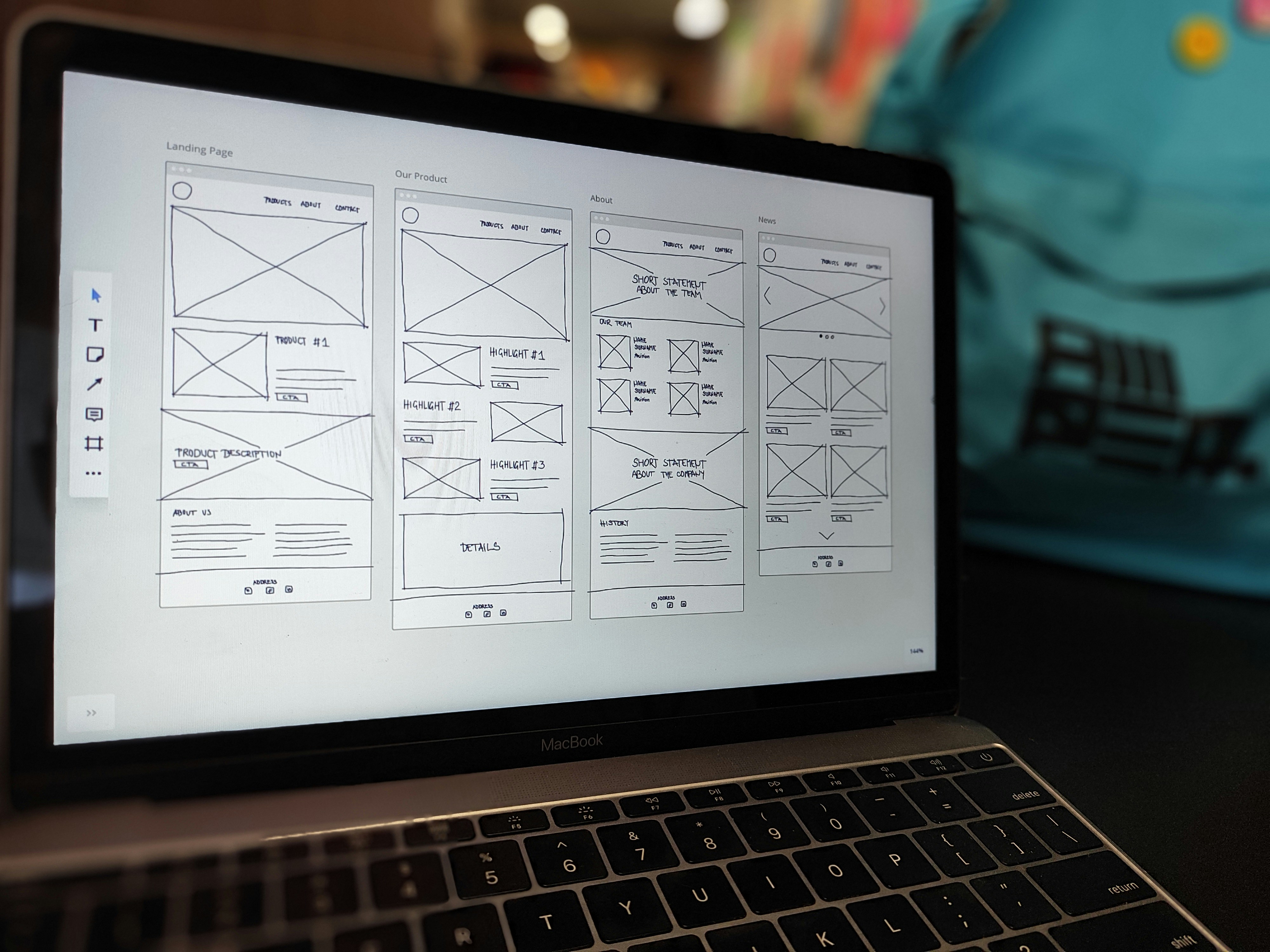
Effective navigation is essential in digital design to ensure a seamless and intuitive user experience. Users should effortlessly navigate through interfaces, understanding their progress and options at every step. Let’s explore some key strategies and tools that you can leverage to optimise navigation and improve user engagement. Continue reading “Mastering Navigation Design for a Better User Experience”
Tag: User Experience
User Experience
The Power of a Single Click: Buttons vs. Links

Knowing the difference between a button and a link is a fundamental skill that can make or break a user’s journey.
Continue reading “The Power of a Single Click: Buttons vs. Links”
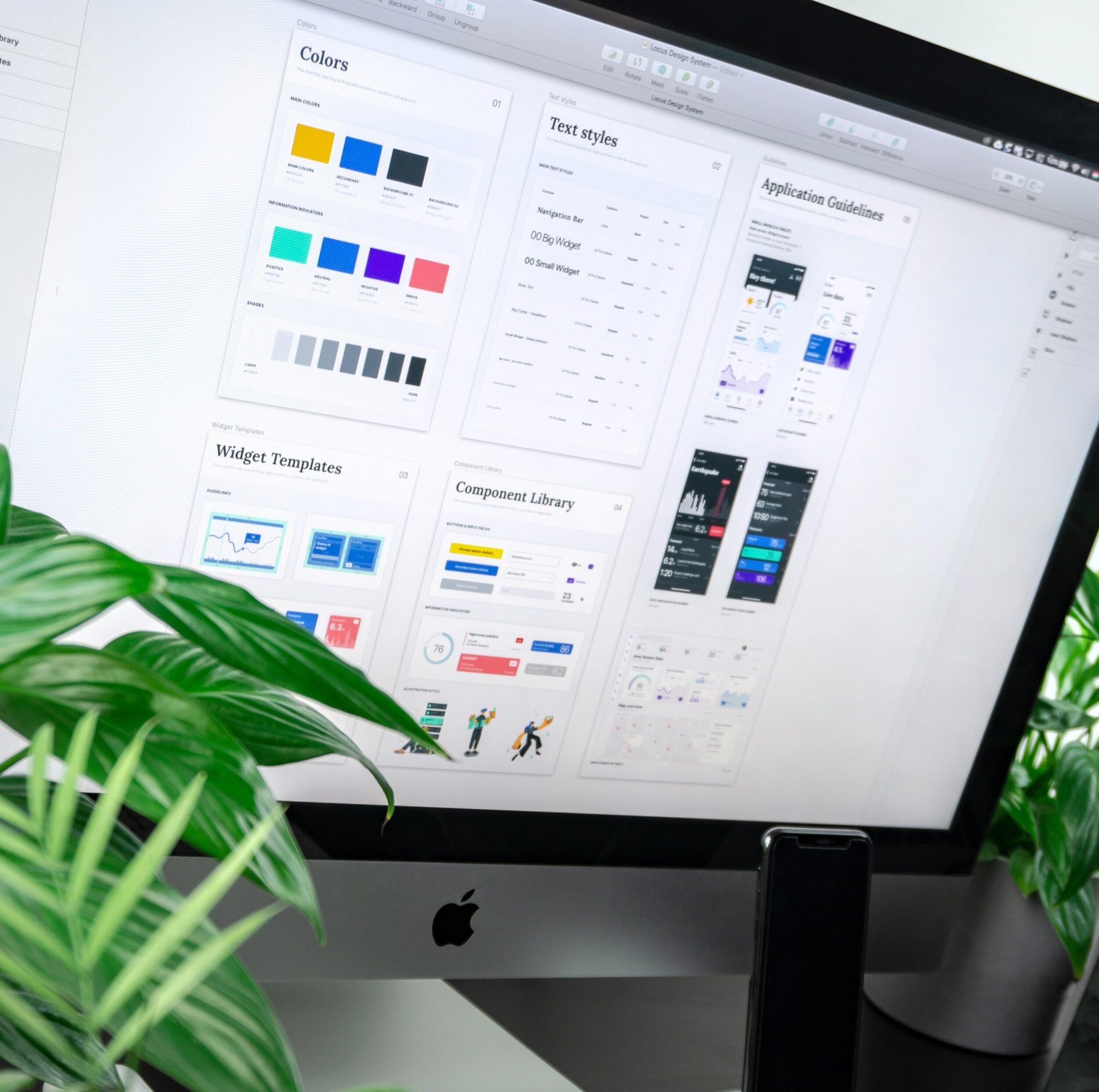
Optimising your Assets for Better User Experiences
As part of our UX Guidelines series we’re going to take a deep dive into the different types of assets and their best practices. You may have already seen our previous blogs on How to improve User Experience on Forms or Build your Landing Pages with UX in mind, however we’re going to look into some specifics within these assets. Continue reading “Optimising your Assets for Better User Experiences”
Enhancing User Experience with Clear Text

In digital design, typography plays a crucial role in shaping user experience (UX). It’s not merely about selecting beautiful fonts, it’s about ensuring readability, accessibility, and clarity of communication. In this blog, we’ll delve into the principles of typography and its application in UX design to create interfaces that are both aesthetically pleasing and user-friendly.
Choosing the right typeface
The first step in choosing effective typography is to select the appropriate typeface. While decorative fonts may seem appealing, they can often compromise readability. Sans-serif typefaces, with their clean lines and modern appeal, are recommended for digital interfaces, ensuring legibility without sacrificing style.
This experiment about font readability showed impressive results, as readers took almost twice as long to read decorative fonts.
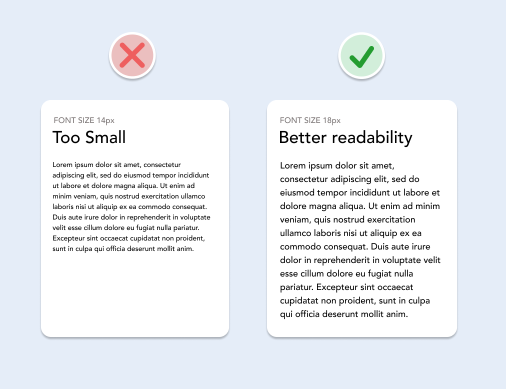
Font weights and sizes
Consistency in font weights and sizes is key to maintaining visual hierarchy and reducing cognitive load for users. Reserve bold font weights for headings to draw attention and guide users through content. For body text, use regular weights and ensure adequate font sizes. For long text set the minimum font size to 18px for optimal readability across devices.
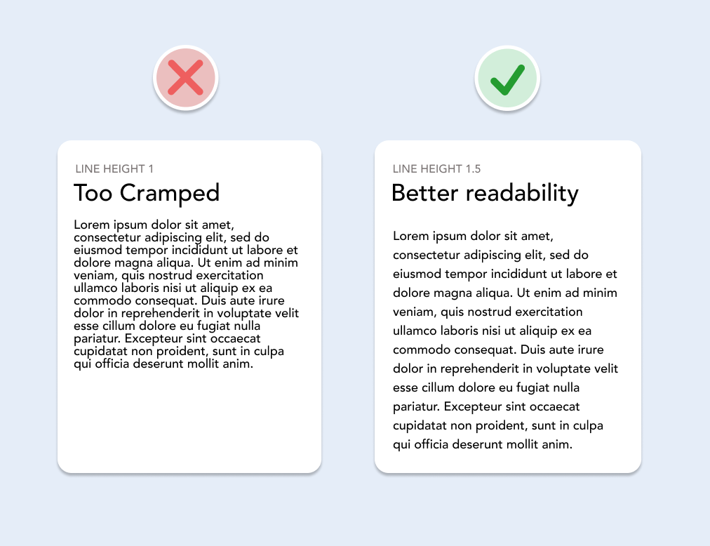
Line height and alignment
Ensuring comfortable reading experiences involves setting appropriate line heights. Aim for a minimum line height of 1.5 for long body text to prevent text from feeling cramped and improve legibility.
When it comes to text alignment, left alignment is recommended for English text, as it follows the natural reading flow. Centred alignment can be used sparingly for headings or short snippets of text to create emphasis. Avoid centre alignment for long body text, as it can disrupt the reader’s rhythm. Additionally, maintain consistency in alignment throughout the interface to avoid visual clutter.
Copywriting for clarity
Effective typography is complemented by clear and concise copywriting, ensuring that content is easily digestible and actionable for users. Break down information into scannable sections with descriptive headings and subheadings to facilitate navigation and comprehension. Utilise numerals for numbers to improve readability and differentiation, especially in email newsletters or web forms.
By following the principles of readability, consistency, and clarity and carefully selecting typefaces, font weights, sizes, line heights, and alignment, you can transform interfaces into intuitive, accessible, and visually pleasing experiences for your users. Implementing these principles not only improves the overall UX but also fosters effective communication and engagement with your users.
This blog is part of our series on User Experience. You can check out the other blogs here.
Unlocking User Experience: Layout and Spacing

Creating an intuitive and organised interface is essential for a positive user experience. One effective approach is to break down information into smaller, related groups. This blog will go into detail about some practical methods to achieve this. Continue reading “Unlocking User Experience: Layout and Spacing”
Understanding the Role of Colours in UX Design

In UX design, every element, including colours, plays a crucial role in shaping the users’ interactions and perceptions. Colours have the power to evoke emotions, convey messages, and guide users through digital experiences. Continue reading “Understanding the Role of Colours in UX Design”
All You Need, Is Less!

In today’s fast-paced digital world, capturing the user’s attention and engagement in their journey with you is becoming more challenging than ever. Users are constantly bombarded with information, so it’s essential to create a simple and effective customer experience.
In this blog, we will explore strategies to minimise cognitive load while effectively delivering a seamless and enjoyable user experience.
Unlocking User Experience: An Introduction to UX Guidelines
User experience, often referred to as UX, is exactly what it says on the tin. It’s the experience of a user when engaging or interacting with an asset. Continue reading “Unlocking User Experience: An Introduction to UX Guidelines”