You might have heard the expression “Solve for one, extend to many” – the mantra of inclusive design, which is a huge part of UX conversations. When it comes to Account Engagement Landing Pages, I believe this methodology is about making your pages easy to use for everyone.
It could be new or existing prospects, people with or without disabilities, and anyone who prefers dark mode versus light mode – you should include them all. So why not build your Landing Pages with UX in mind?
In this blog post, I’ll walk you through 3 main areas of Landing Pages where UX could be improved easily: Structure, Design, and Imagery.
Structure
Depending on their use case, they can be simple, short pages with a straightforward call to action or longer, more descriptive pages with lots of sections involved. In all cases though it is essential that you use Headings in the right way. But what is the right way?
- Follow a hierarchical order, similar to how we use it on documents. Start with H1 all the way to H6 one by one, depending on how many levels of content you have.
- Be specific but not keyword-focused. The headings should inform people what that section is about to provide enough context to influence the expected action.
- Style them according to their hierarchy to showcase the difference between the different levels.
In addition, setting a clear Heading structure can not only make your pages accessible but can also help you with Search Engine indexing.
The role of heading elements are now about telling search engines what a section of content is about. Each section of a page of content is generally about something specific. Heading tags make it easier for search engines to know what a page is about. And that helps them rank the page for the topic. – Search Engine Journal
Design
When it comes to the design of the pages, your hands are a little bit tied. It must follow your company’s brand guidelines and should be aligned with your website. But there are a few solutions you can adopt to improve UX on your Landing Pages.
- Use your brand colours on the background to break down the different types of sections. Users will then quickly identify which part of the page are they at: the content with all the information, the form where they can submit their details, or the footer where they can see company information.
- Apply sufficient contrast between your text and background colours. This will allow everyone to read your content without experiencing any visual issues.
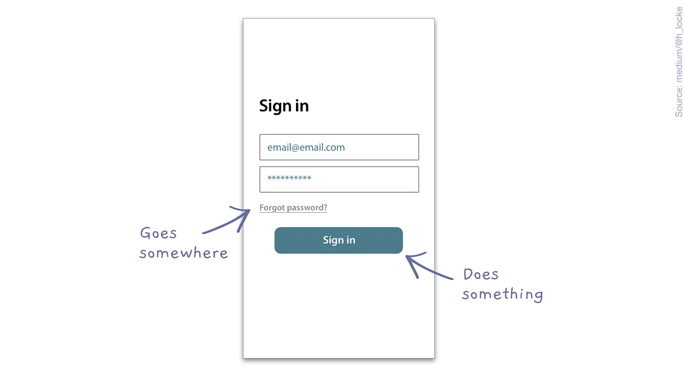
- Differentiate between links and buttons from a user’s perspective. I quite like this simple but spot-on summary from Medium.com: “A button does something; a link goes somewhere.” Either way, make sure your pages are not full of links and buttons or your prospects may not click on anything.
Imagery
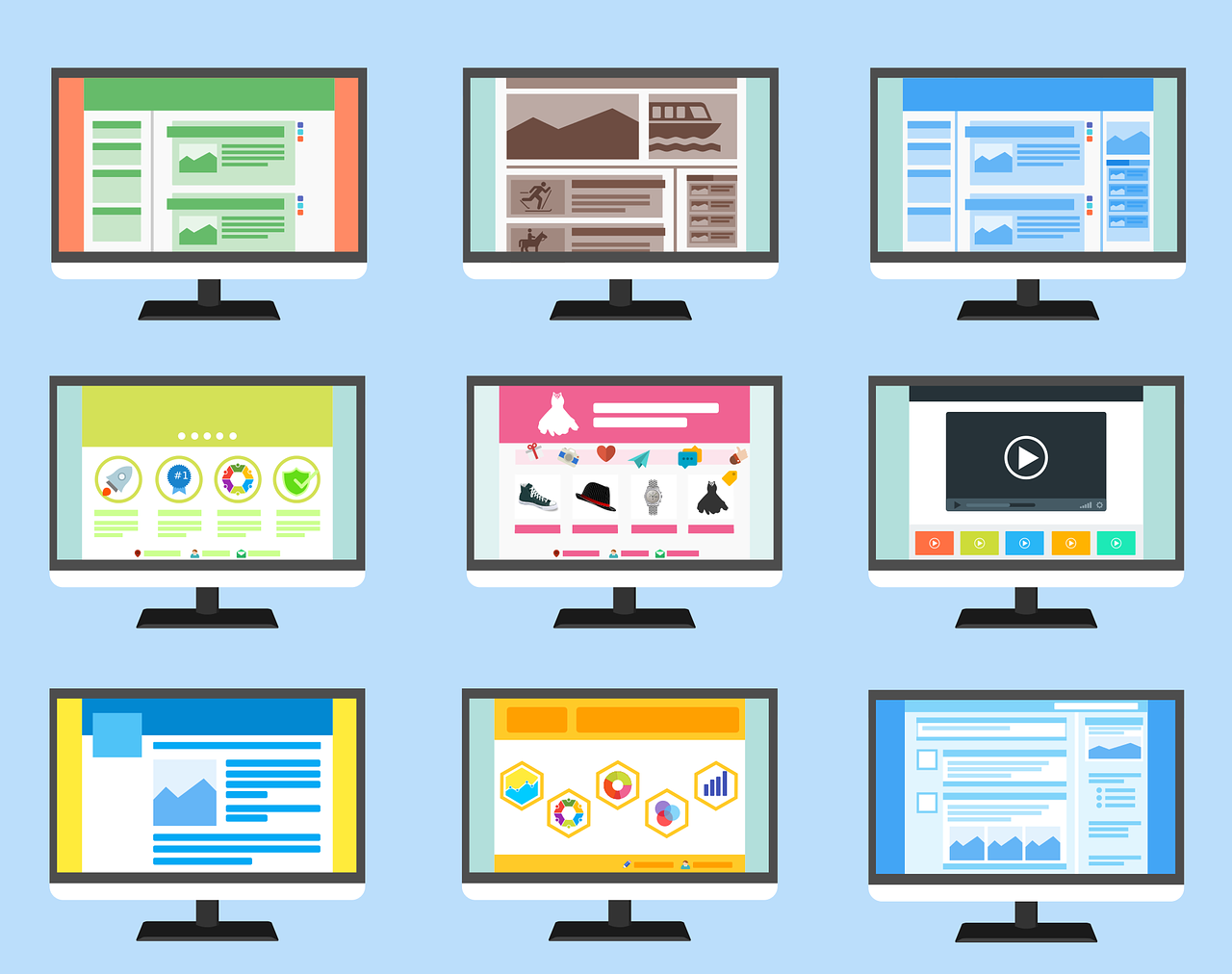
Since the most common use cases of Account Engagement Landing Pages are related to marketing campaigns, I expect you’re using images on your pages. But before you add them in the future, I’d like you to ask one question: What is the point of these images?
Depending on their location, they can function as informative or decorative images.
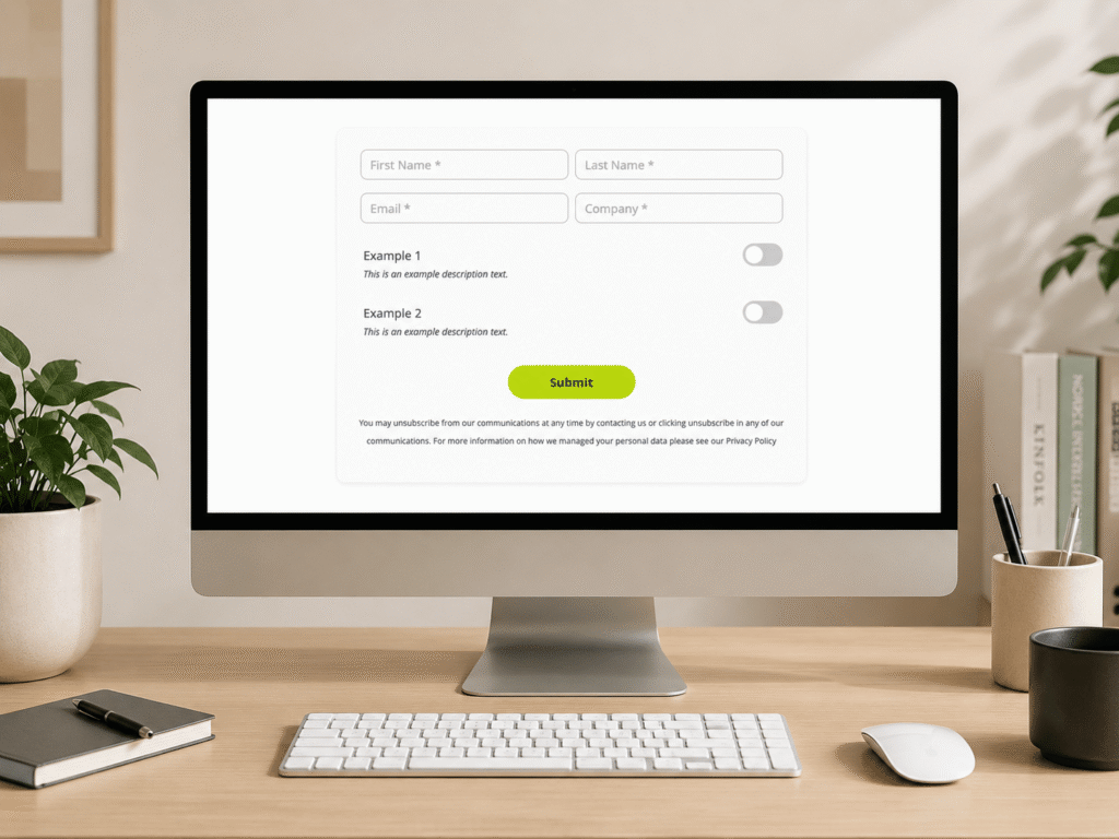
- Informative images have a purpose and are crucial to be present on your page (e.g. to show an example – like the image in the above section), most likely in a visible section.
- Decorative images on the other hand could make your pages less text-heavy or help to set the mood (e.g. the feature image of this blog post).
Both are essential on your Landing Pages, however, I’d recommend using them with ease and always questioning their purpose.
Knowing the purpose of your used images is also important for setting the Alt (Alternative) text. Alt text is used by screen readers and search engine indexing and is displayed if the image fails to load. In those cases, if the image is informative then it’s crucial to describe what it represents as it adds value to users. However, if it’s a decorative image, adding an alt text is not helpful at all, it can be quite distracting at times.
What’s Next?
Now that you read through my recommendations, head over to your Account Engagement and review your Landing Pages. If you notice anything that can be improved based on my notes, have a try and see how you can build UX-friendly pages. If everything looks amazing already, take a look at my 3 top picks to enhance UX on Forms and elevate your users’ experience.