User experience, often referred to as UX, is exactly what it says on the tin. It’s the experience of a user when engaging or interacting with an asset.
By assets, this could be anything from written documentation to an interactive website. This first in our series of UX blogs is all about the key principles of UX; breaking down the guidelines and giving you our tips to ensure you are designing with the user in mind. UX covers all aspects of design, so it is important to understand the key principles before you get started.
Key principles of UX design
- Users always come first
- The first question you should ask when designing is who are the users? These users are your customers, but if you build an external platform they could be your customer’s customers too (especially when building in Account Engagement).
- Simplicity
- What is the most simple way for your users to reach their end goal? Does your user need to take 4 actions to complete their task, when it could be done in 2?
- Hierarchy
- Clear hierarchy allows users to understand and navigate the asset to get what they need out of it. You should be designing in a way that guides the user’s attention to the most important elements of the asset first.
- Consistency
- This helps unify user experience by keeping it recognisable and familiar.
- For example, suppose something is usually located in the same place across similar assets, but on yours, it’s somewhere completely different. In that case, this will be confusing for users to find – preventing them from reaching their end goal.
- Functionality first, then design
- Of course, everyone wants their design to look great. But having an aesthetically pleasing interface without the functionality needed for the user to reach their end goal will be confusing and frustrating. These two need to go hand in hand. So, focus on making it work, then think about the look and feel.
Have a logical reason for every design detail
When designing an interface, you are designing the user’s experience with the product. To create a good user experience, you need to use objective logic rather than subjective opinion. It’s important to have a logical reason for each design decision you make.
Minimise interaction cost
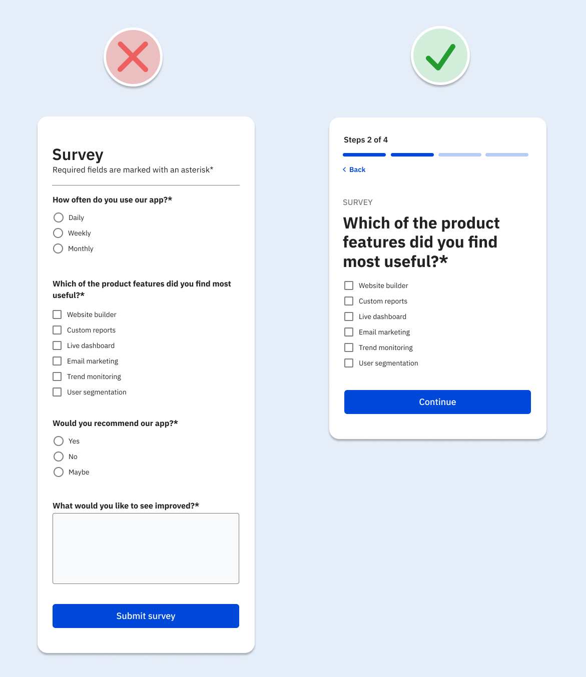
Interaction cost is the amount of physical and mental effort required to achieve a task – looking, scrolling, searching, reading, clicking, waiting, typing, thinking and remembering. The lower the interaction cost, the better the usability of the asset. The longer it takes to navigate your page, the less likely it is to have the desired effect on the user.
How can you minimise this cost?
- Arrange any related actions near each other on a page
- Reduce distractions – eg, animated banners, pop-ups, unnecessary visuals
- Minimise choice – keep options to a minimum to speed up the decision-making process
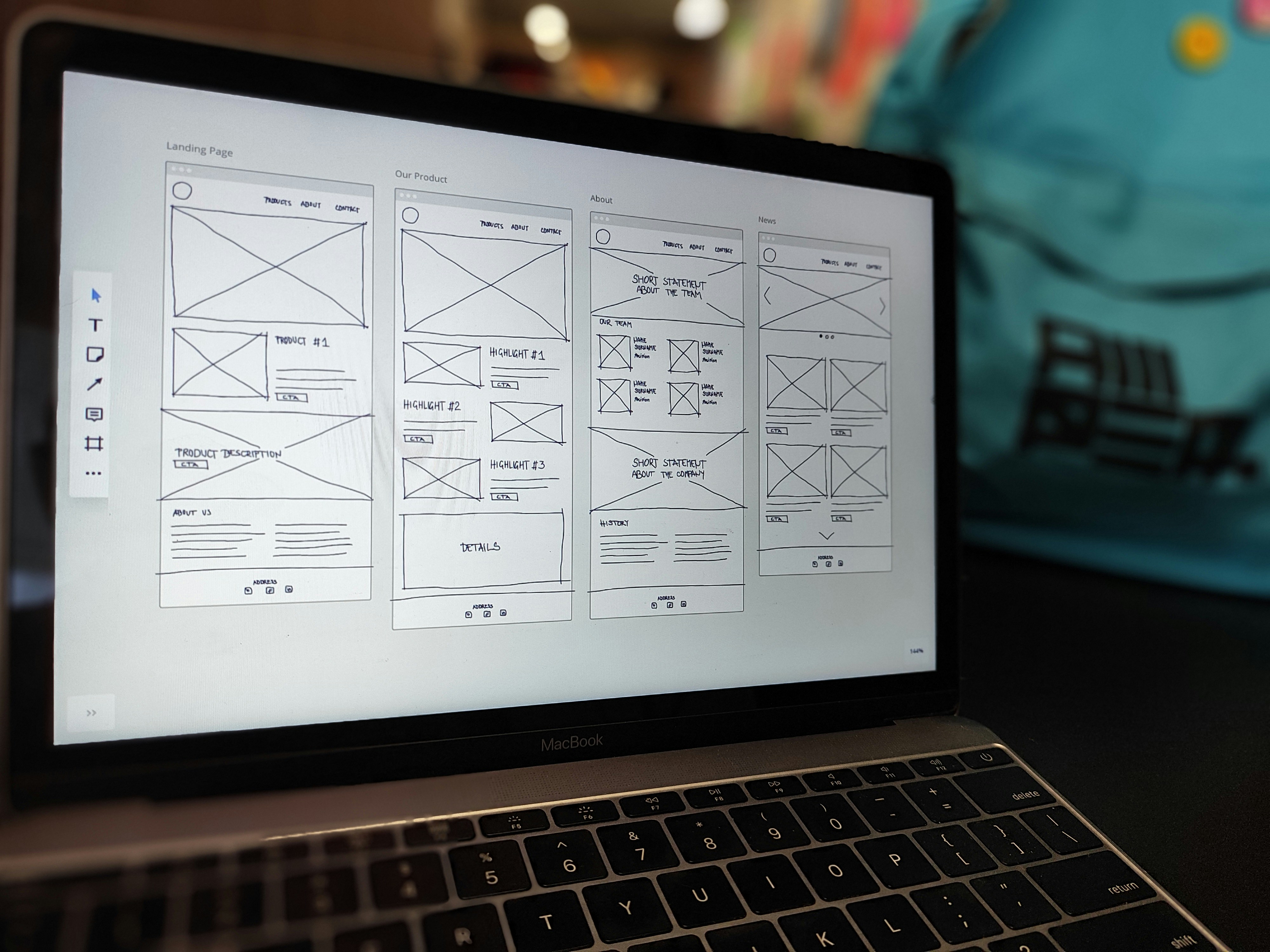
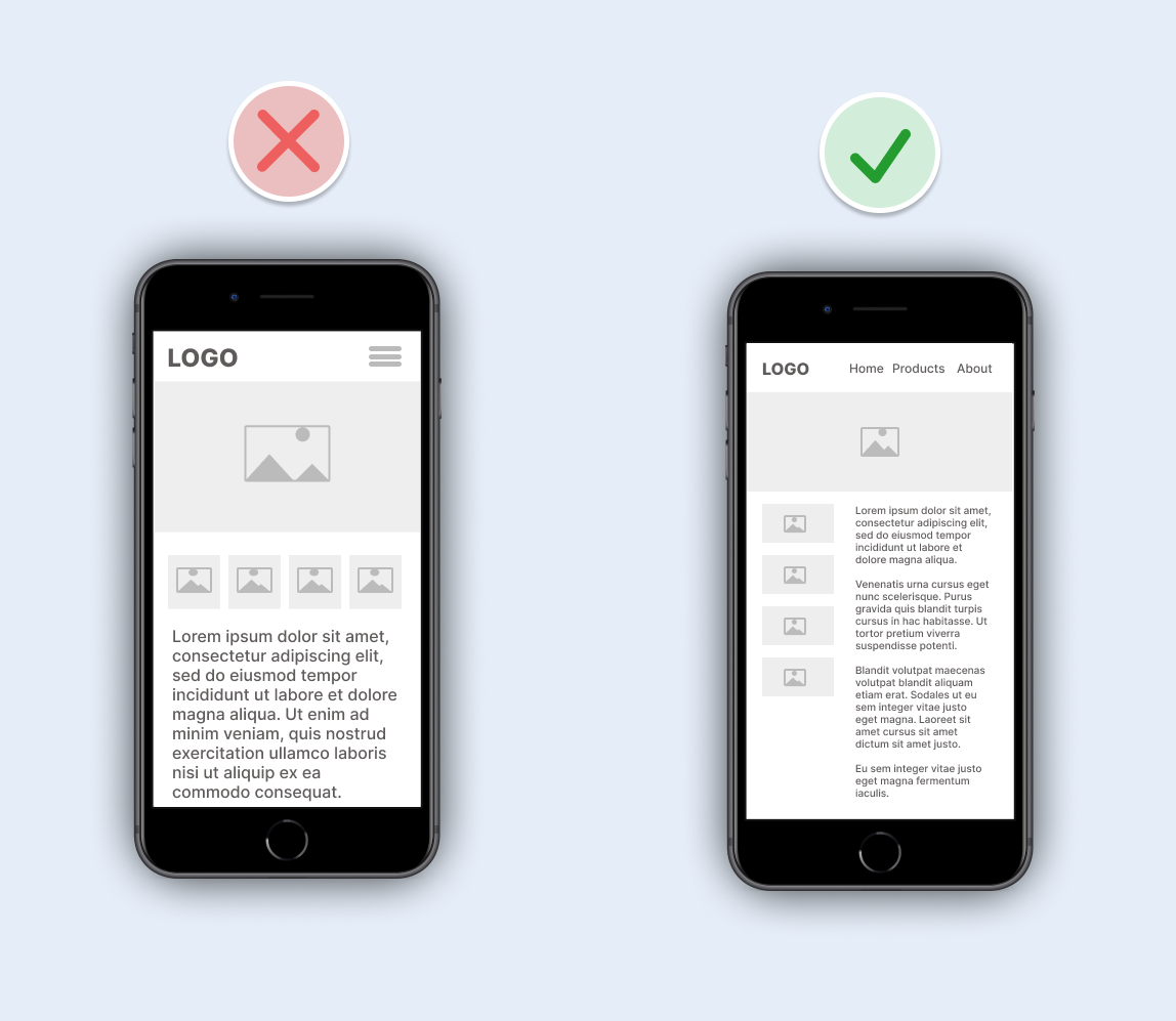
How does the design look on a phone screen?
Assuming your product will be used across a range of different screen sizes, start designing on the smallest size first. Over 50% of users will likely be viewing your designs on a mobile device. So, have you considered how your design will look to them? The restricted space will force you to prioritise important elements and remove unnecessary ones. This should also ensure your interface is simpler on larger screens too. If you start to design for larger screens first, it can be tempting to fill the screen with more information, which can increase the interaction cost.
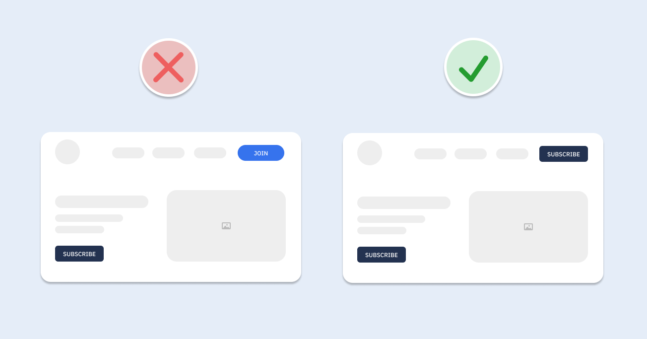
Give users the experience they expect – consistency
Your users want to get things done, not spend extra time learning how to use your product. Don’t reinvent the wheel; make it easy to use.
You should aim to build upon established patterns:
- Forms that allow simple data entry, easy movement between the fields, and a clear Submit or Save button
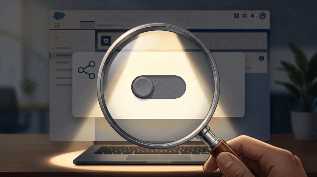
- Toggle controls that adjust a setting to be either on or off
- Obvious controls, for example, links that are easily identifiable as links – these should use a different colour to stand out from standard text. Similarly, your buttons should be clear to the user so they understand what happens when they click them.
- A search function that works quickly and displays the most relevant items first
When you have a consistent design and branding style, users know where to expect certain elements. For example, having a button to take you to the settings page featured on the top right-hand side of every page allows users to find this button at all times. Having it on the top right on one page and bottom left on another will take the user longer to find the button they’re looking for, leaving them frustrated.
There are a lot of key elements to consider when designing with UX in mind. But this doesn’t have to make it overwhelming and complicated! After all, the main aim of good UX is to keep your designs simple and user-friendly. Keep an eye on our blog for the next in our UX series, where we will go into more detail about each aspect you need to consider.