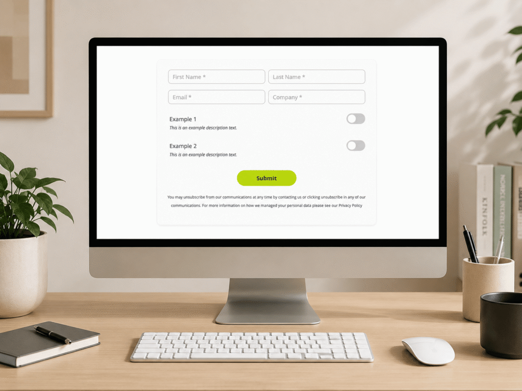
If you would like to modernise your forms, provide a slicker user experience, and match contemporary web design, follow our mini guide that helps you convert standard Account Engagement form radio buttons into modern, user-friendly toggle switches.
Why make the change
Better UX: Toggles are often easier and more satisfying to use, especially on mobile devices.
Modern Look: The look and feel are consistent with modern web design and many customers use them in their branding.
Clarity: For simple “Yes/No” or “On/Off” options, a toggle is visually clearer than a radio button.
How it works
This solution requires a bit of custom CSS and JavaScript added to your layout templates. Here are the snippets you’ll add to your Account Engagement Layout Template. CSS The code below hides the original Radio Button and creates a new class to style and align the toggle on the right of the field label and description:
/* Field Container */
.form-field.toggle-right {
position: relative;
display: flex;
justify-content: space-between;
align-items: center;
margin-bottom: 20px !important;
padding-bottom: 10px;
width: 100%;
}
/* Vertically Align the Label */
.form-field.toggle-right > .field-label {
padding-top: 0 !important;
padding-bottom: 0 !important;
margin-bottom: 0 !important;
}
/* Style The Description Text */
#pardot-form .toggle-right span.description {
position: absolute;
bottom: 0;
left: 0;
display: block;
margin-top: 0;
padding-left: 10px;
font-size: 1.4rem;
}
/* Hide Original Radio Buttons */
.toggle-right input[type="radio"],
.toggle-right label.inline {
display: none !important;
}
/* Style the JS switch */
.rm-switch {
position: relative;
display: inline-block;
width: 60px;
height: 34px;
background-color: #ccc;
border-radius: 34px;
cursor: pointer;
transition: background-color 0.3s;
}
.rm-slider {
position: absolute;
height: 26px;
width: 26px;
left: 4px;
bottom: 4px;
background-color: white;
border-radius: 50%;
transition: transform 0.3s;
}
/* Style the ON toggle */
.rm-switch.is-checked {
background-color: #bdda0b;
}
.rm-switch.is-checked .rm-slider {
transform: translateX(26px);
}
JavaScript The solution below creates a switch element to manage the state of the radio button. This script will run when the above class is used in the CSS (.toggle-right):
// Ragio Buttons to Toggle JS
document.addEventListener("DOMContentLoaded", function() {
// Find all radio button fields you've marked for conversion
var toggleFields = document.querySelectorAll('.toggle-right');
toggleFields.forEach(function(field) {
var label = field.querySelector('.field-label');
var valueContainer = field.querySelector('span.value');
var radios = field.querySelectorAll('input[type="radio"]');
// Make sure we have two radio buttons to work with
if (radios.length === 2) {
// Create the visual toggle switch element
var switchElement = document.createElement('label');
switchElement.className = 'rm-switch';
var sliderElement = document.createElement('span');
sliderElement.className = 'rm-slider';
switchElement.appendChild(sliderElement);
// Add the new switch to the form
valueContainer.appendChild(switchElement);
// Function to update the switch's appearance
function updateSwitchState() {
if (radios[0].checked) {
switchElement.classList.add('is-checked');
} else {
switchElement.classList.remove('is-checked');
}
}
// Add a click listener to our new visual switch
switchElement.addEventListener('click', function() {
// Toggle between the two radio buttons
if (radios[0].checked) {
radios[1].checked = true;
} else {
radios[0].checked = true;
}
updateSwitchState();
});
// Set the initial state of the switch when the page loads
updateSwitchState();
}
});
});
Stay updated with our latest news & insights
Find all our recent updates, tips, strategies and hot takes from the Salesforce ecosystem. Written by experts, read by experts.
Implementation Steps
Update the Layout template by adding the CSS inside the <style> tag.
Scroll down at the bottom of your layout template and add the JavaScript before the <body> closing tag.
Navigate to your Form and create or update your radio button field/s.
Go to the field’s ‘Advanced tab’ and add toggle-right in the CSS Class field. 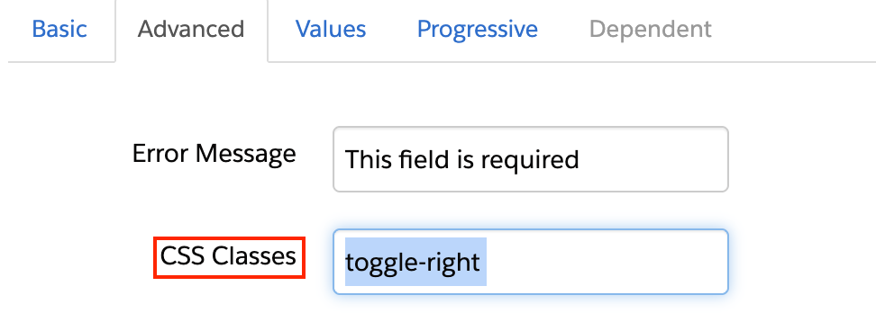
Navigate to the field’s Values tab and add your two options (e.g., True and False). Make sure you add a label for each value, and you leave it empty. 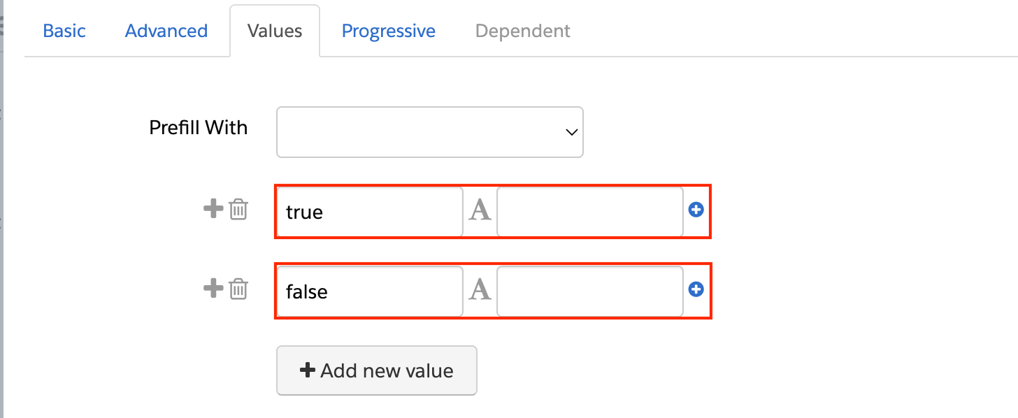
Save and test
Conclusion
This might seem like a small change, but in marketing, every single interaction counts. By reducing friction and improving your UX, you’re not just modernising your look, you’re making it that little bit easier for a prospect to say “yes”. These small, polished details build trust and can make a real difference to your conversion rates. If you would like to take a strategic look at your wider marketing automation and optimise your customer journeys, get in touch with our team of experts.


