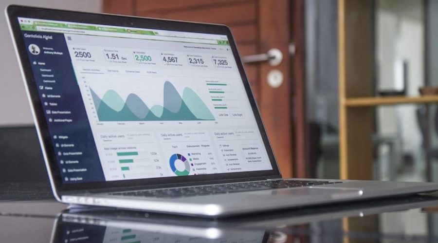
Charts in dashboards are used to help tell stories on your data. They help us to quickly identify the progress towards Key Performance Indicators (KPI’s), identify trends and patterns within your data. If you chose the wrong chart type, you risk users not being able to identify the information they need quickly, or worse, confusing them.
Choosing the right chart type
Salesforce and Einstein Analytics provide you will multiple chart types that can be used within your dashboard. Some people make the common mistake of trying to fit in a variety of chart types rather than choosing the correct one for the data they are representing.
When deciding on a chart type, you should consider the audience and what is important about the information you are displaying. Many chart types can be used for different purposes, but not all chart types should be used.
Composition of data
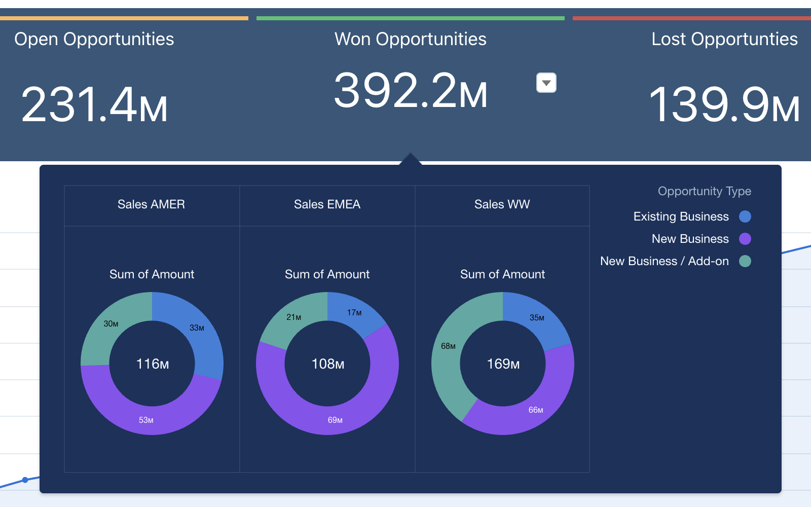
When you are looking at the composition of your data. For example, the number of records per type. You should be using a pie/doughnut chart type to break your data into segments. These charts are very common. However, there is a common mistake people make, and that is trying to fit in too much data.
Doughnut charts should have a minimal amount of values (ideally keeping it below 5). Any more than this, and it becomes difficult to differentiate between small values, and it reduces the usability of the chart.
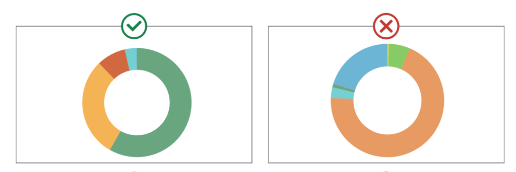
Doughnut/Pie charts should have a maximum of 5 values starting with the largest segment at 12 o’Clock and working around clockwise.
As picklist values can be used multiple times in a dashboard, you should assign a set colour to each value. This helps users when they are viewing different charts using the same picklist. For example, you have a doughnut chart showing type with ‘New Business’ set as blue, you also have a stacked bar chart showing sales type for each consultant where ‘New Business’ is represented in green. This can lead to a lot of confusion.
Comparison of data
The humble bar chart is ubiquitous in reports and is ideal when comparing data. However, again these charts are often not optimally set up. To ensure your data is reflected accurately. You should always ensure that the measure starts at 0. Otherwise, you could be misrepresenting your data.
Unless you are using a stacked chart, each value should remain the same colour. Otherwise, it becomes harder to compare each bar. Although each bar represents something different, the length of the bar is representing the same value.
If you are looking to compare the composition of data, you should not use multiple doughnut charts as it is challenging to make a side-by-side comparison. Instead, opt for a stacked bar chart. A stacked bar chart gives you the comparison power from a bar chart and the composition power of a doughnut chart.
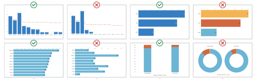
When using bar charts, start the baseline at 0, sort the data in ascending or descending order and don’t add colours for decorative purpose.
Trending data
Line charts are ideal for reporting trends over time. However, they can easily become confusing. You can have multiple lines on a chart, but you should always aim to keep this to a minimum. Otherwise, the charts can become hard to read.
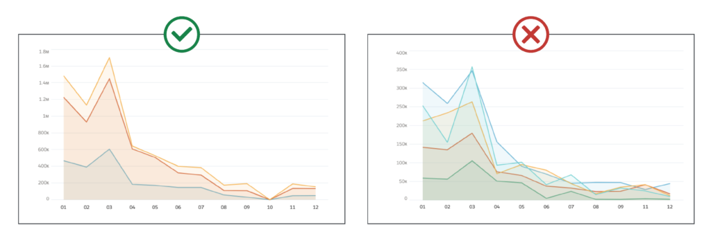
When using line charts, keep to a maximum of four lines and don’t compare values on vastly different scales.
If you are using multiple lines, ensure that you use the right scale. Otherwise, you risk misrepresenting the data. If you are comparing something like opportunity count and opportunity value trends, always use multiple axes. Otherwise, it will be impossible to see the record count line.
How do I start optimising my chart types?
Remember, you are trying to tell a story with your data. Work with stakeholders to identify the story they are trying to tell and decide on the chart types that most clearly reflect this.
There is a limited amount of customisation that you can make with standard Salesforce dashboards. So if they are not fitting your needs, you may need to consider other tools such as Einstein Analytics.
Although we have only gone over a handful of examples, there are many types of reports, including relationships, distribution, metrics, location and pipeline. These should always be aligned with the right chart type.
If you are struggling to get your dashboards to work for you, or are considering an upgrade to Einstein Analytics, get in touch.