In the realm of data analysis and reporting, CRM Analytics stands out in the way that it empowers the end user, the dashboard viewer. Its visualisation features offer a user-friendly interface that transforms complex data into understandable and interactive visuals.
In this blog, I will guide you through the journey of a viewer interacting with these features.
Engaging with Interactive Dashboards
The first stop on our journey is interactive dashboards. In our blog Unlock Data Insights with CRM Analytics Visualisations, we have seen the power of insightful visualisations in CRM Analytics dashboards. These dashboards serve as a canvas where data comes alive. This allows viewers to interact with the information in a meaningful way. By applying filters, sorting data, or drilling down into specific dimensions, viewers can unearth hidden insights and trends.

Salesforce have shared a helpful guide for CRM Analytics viewers which includes tips and useful resources.
 Chris TaylorPrincipal Salesforce Consultant
Looking for help with Analytics?

Looking for help with Analytics?
Interacting with Dashboard through Versatile Views
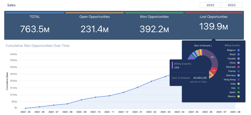
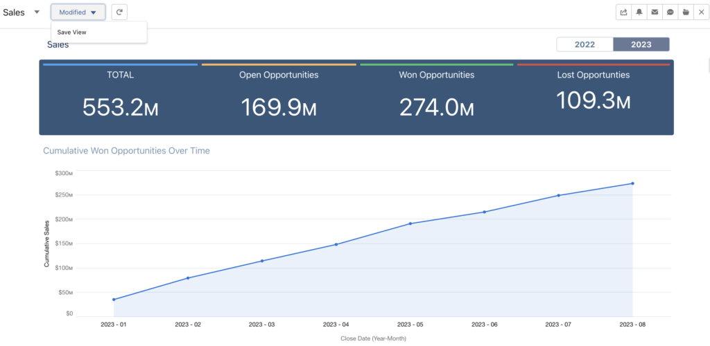
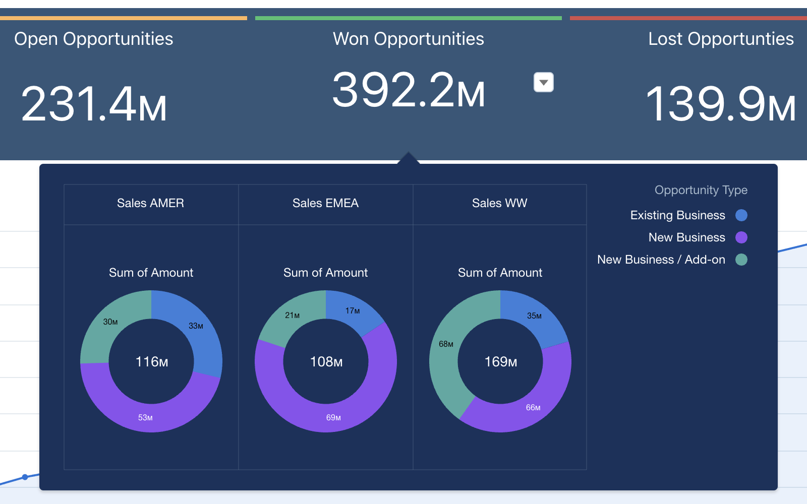
As we delve deeper, we encounter the versatile array of filters, KPI numbers, and charts that CRM Analytics supports. From the simplicity of bar and pie charts to the complexity of heat maps and geographical maps, the platform offers a broad spectrum of visualisation types. Each visualisation type serves a unique function, not only representing data but also empowering viewers to interact with it. By selecting filters and manipulating visual elements, viewers can unravel data insights effectively. This is empowering but also can be time-consuming if repetitive. Did you know viewers can save their selections as a view? Viewers can even select one of their views as default so that the dashboard opens with it.

With the right training for viewers, we turn CRM analytics dashboards into much more versatile tools. This is important because, as dashboard builders, we no longer have to duplicate the dashboard for a subset of viewers or make nearly as many customisations that would be specific to just some of our viewers, or for example, some of the processes the dashboard analyses.
Salesforce provides us with straightforward step-by-step documentation for the dashboard views feature. It’s good to highlight that dashboard views are a viewer feature. It’s generated for, and specific to the viewer.

If a particular view needs to be shared, we make sure that it is selected and then use the dashboard share link of which, as you can see above, the view is part of the link parameters. The link then opens the dashboard using the view, which means the viewer can save the view as one of their own.
Conclusion
CRM Analytics provides powerful tools for viewers to interact with and understand data. By engaging with interactive dashboards, viewers can unearth insights with filtering, sorting, and selections, and easily return to these with dashboard views. All of these features empower the viewer to extract meaningful information from the data. This, in turn, allows them to make better decisions.


