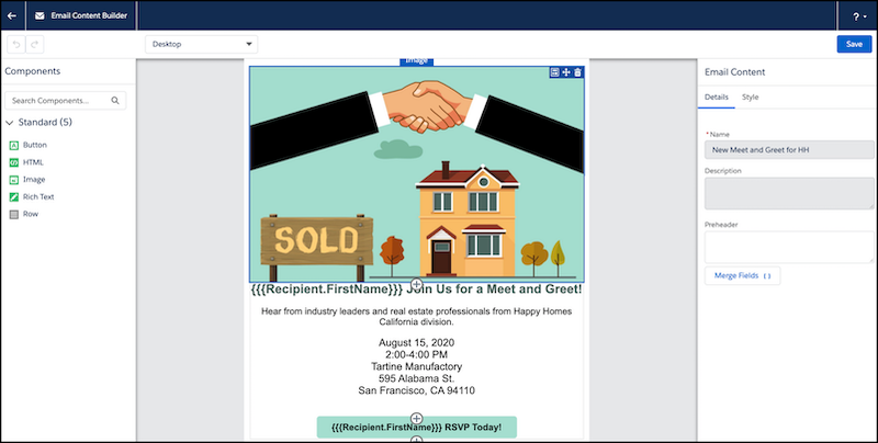
Recently, Salesforce ran a webinar demonstrating the new drag and drop Pardot Lightning Email Builder. This feature has been a long time coming for the Pardot community, so I was excited to see what it had to offer. I’m going to break down the best features I saw, and explain what else this tool needs to offer to make it viable for Pardot users around the world. So here it is – the story so far!
Prerequisites
First things first, here’s what you’ll need to enable in order to use the Email Builder. As the email builder isn’t going to be generally available until mid-October, I’d definitely recommend setting these up now:
Problems solved by the new Pardot Lightning Email Builder
1. No HTML Experience required
This is a big one for marketeers currently using Pardot email templates, which require emails to be built from scratch and made Pardot-friendly. Everything in this drag and drop system solves that issue. Let’s take a look at a couple of instances:
Pre-header
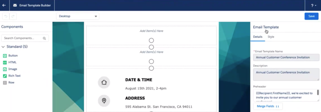
Pre-headers are often forgotten about when they are only possible through custom code. The builder solves this issue by having a user-friendly box to write copy in.
Buttons
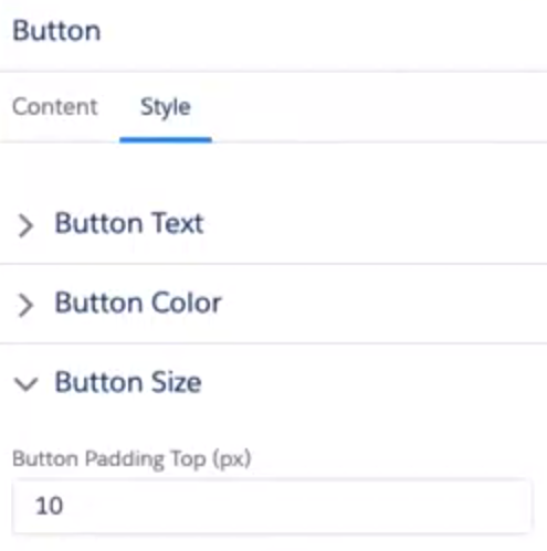
Creating buttons styled just as we want them with code can be tricky. With so many ways to do this using code, so it can be hard to know which one to choose. The builder solves this by using a straight forward button editing element:
Image alt-text
Any of my clients reading this will be laughing that I’ve flagged this one in particular. Alt text is so important and many people forget to add it. The image component now provides a box to add in alt-text, which will be a game-changer for many users.
Column management
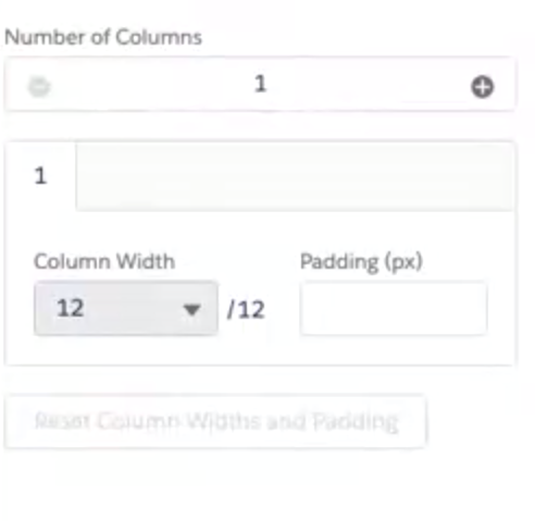
Another issue with existing Pardot email Templates is having to use code to manage columns. The new editor addresses this issue with simple column-add functionality.
For those of you worried about wanting to add in custom HTML content, you can still do this using the ‘HTML’ component. You can also toggle between HTML and editor mode in any rich text component.
2. Resend process
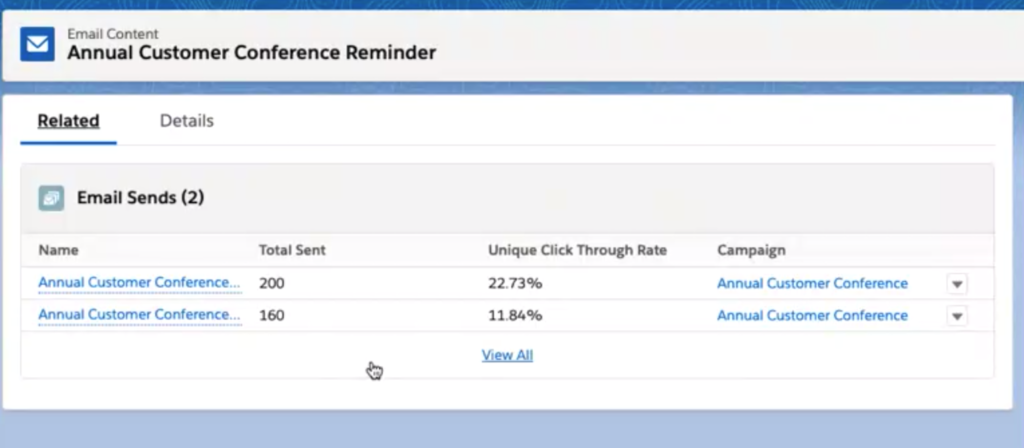
Each individual send is recorded and can be seen on the email record. To do a resend currently, you have to copy your list email and then set up a new send. The new process is much simpler, and involves no copying, and no creation of any lists. This is going to make those resends much easier. While this does pose a slight problem of the potential of over-mailing prospects, the benefits are definitely more extensive.
3. Recipient list management
A new piece of functionality has been added in to ensure that you cannot select a list as a suppression list if it has already been selected as a recipient list. This will cut down on human-error during the send process.
4. Mobile view while building
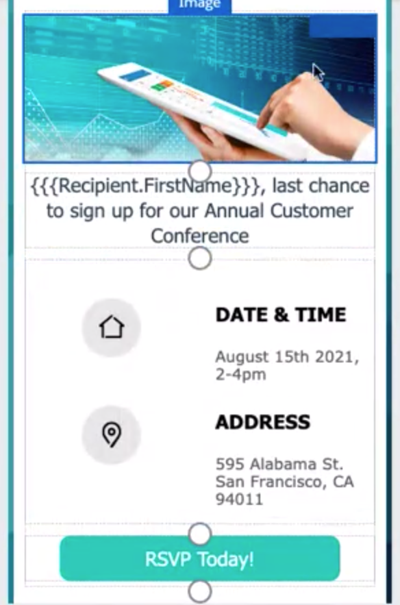
Seeing how our emails will render on mobile is usually something we have to run a Litmus test for. With the new builder, you can toggle between desktop and mobile views to see how your email will respond on mobile.
5. Image search and thumbnails
Gone are the days of selecting an image from file storage without knowing what it looks like! The search functionality has been massively improved. You can now search for your images, and up will come not just the name of your image, but a thumbnail preview of the image. You also have the ability to toggle between small and large thumbnails to get a real idea of your images.
Not included with the new builder
While I was watching the webinar, I started thinking about what pieces of functionality were missing or problematic, and how useful the tool is going to be for my customers. These were the areas I identified:
1. Custom fonts
There is currently no way to add custom fonts into the email builder. 100% of the customers I work with use custom fonts, be it via a Google font @import method or otherwise. Brand fonts are such a huge part of brand identity, and while the fonts being used in the editor are web-safe, I see this being an issue for users.
2. Lack of Litmus
Aside from being able to send to test lists, and individual emails, there is no rendering test functionality. This means you can’t see how your email renders across all desktop and mobile devices. There was some suggestion that you may be able to use Pardot Classic alongside the new email builder, but it was unclear whether you would be able to Litmus test drag and drop emails through Pardot Classic. (Salesforce did reassure us that their HTML emails work across all email clients and devices, but years spent battling with Outlook has left me a bit sceptical).
3. Dynamic Sender profiles
In Pardot Classic, you can send emails from assigned users or account owners dynamically. This functionality appeared to be missing from the new email builder sending process. 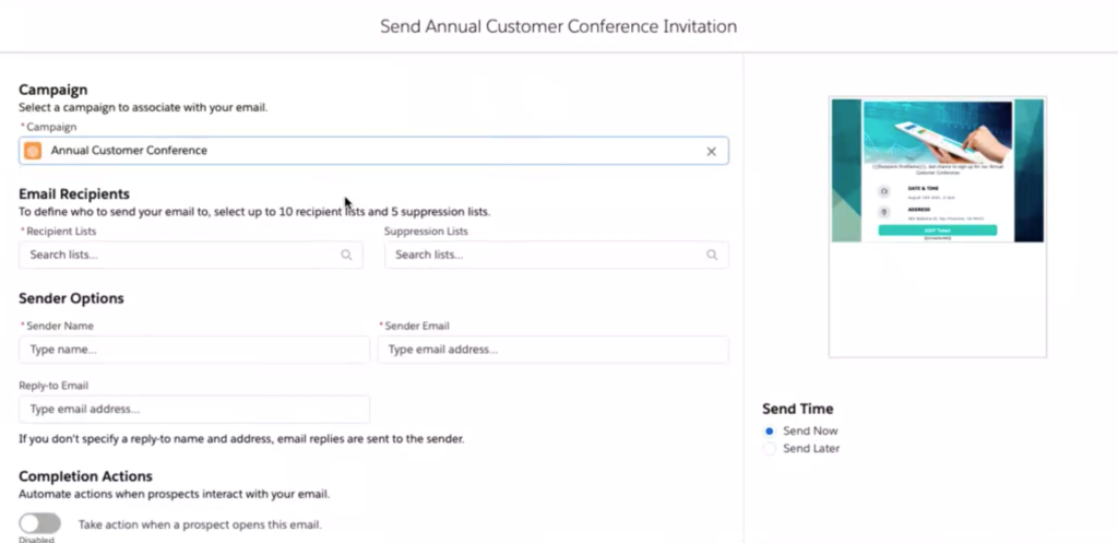
4. No control over mobile responsive design
One of the things we have control over when building emails using HTML/CSS is how our email looks on mobile. We can choose to stack, shrink, hide etc. While the example shown of the mobile design didn’t seem to have any major flaws, it would be incredible to have a drag and drop mobile editor too.
5. Setting styling at a template level
With the new drag and drop editor, you have to style each individual element as you go along. There is no way to set the styling at the template level. This means all your fonts, colours, buttons etc would have to be created each time. This seems like a nightmare, especially if you’re a global team trying to maintain consistency across your emails. Considering how important branding is in emails, this is one I was really shocked to hear wasn’t possible.
6. A/B testing
Another piece of functionality straight out of the email marketers handbook that hasn’t been included in the editor is A/B testing. The editor focuses specifically on creating and sending list emails, and this seems like a pretty big area to have missed out.
Yet to find out
There were a couple of areas which were unclear on the webinar in terms of functionality. These may actually be possible, but we’re going to need clarity on this from Salesforce.
1. Coping with Outlook & iPhone
We’re constantly having to put code fixes in place for Outlook and iPhones. Whether it’s sorting out line heights, font fallbacks, alignment issues or background images – we have to put specific fixes in for all of it. It wasn’t made clear how the drag and drop editor will deal with these scenarios, or how it will keep up with the ever changing requirements of email clients.
2. Unsubscribe functionality
During the demo of the email build process, it seemed to be possible to save an email without an unsubscribe or email preference center link in place. I hope this isn’t the case and is just a quirk of the demo we saw, however if it is possible it’s going to cause issues for all users.
3. Spacer component
While the amount of components that have been included is impressive, there was one thing missing for me. Spacers. You will see in all the screenshots of the email I saw demonstrated, the spacing is very squished. While you could potentially add an empty rich text box in to create the illusion of a spacer, it would be great to see a proper spacer component added with the ability to set the height of the spacer. It may be that this is in there but was not demonstrated, so we’ll have to wait and see on this!
What’s next?
More functionality
The team on the webinar addressed a couple of the shortfalls, and the next steps look to be the addition of more functionality into the email builder.
Landing pages
The plan seems to be to eventually roll out the same functionality to landing pages. This is exactly the right direction to be taking landing page development. Landing pages are a feature that so many of my customers use, and yet the current set up is definitely not the most user friendly. Hopefully the new editor will refresh the whole process.
How to find the Lightning Email Builder
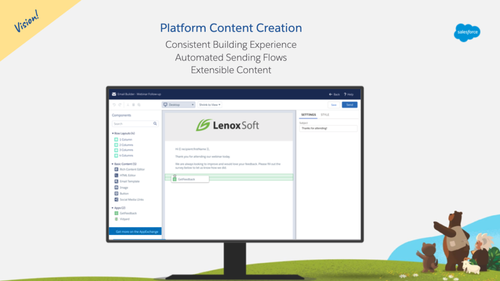
Once your org is using the Winter ’21 release, you will be able to access ‘Email Content’ from the Salesforce App Launcher.

Each email will exist as a Salesforce record (Email Content record). The ‘Edit in Builder’ action (button) will take you to the builder.
Will you use the new Lightning Email Builder?
I think the new builder is going to solve a lot of problems for teams who don’t have HTML resource in house and who aren’t working with a consultancy to build their emails at the moment. Right now, I think there are far too many drawbacks for customers who are happily using well-built email templates, as they will have access to good templates and all the functionality that they would miss out on if they moved to the lightning builder.
I’m really keen to hear your thoughts on whether you will be making the jump as soon as the feature is ready. Let me know what you think on twitter – @we_are_nebula.


