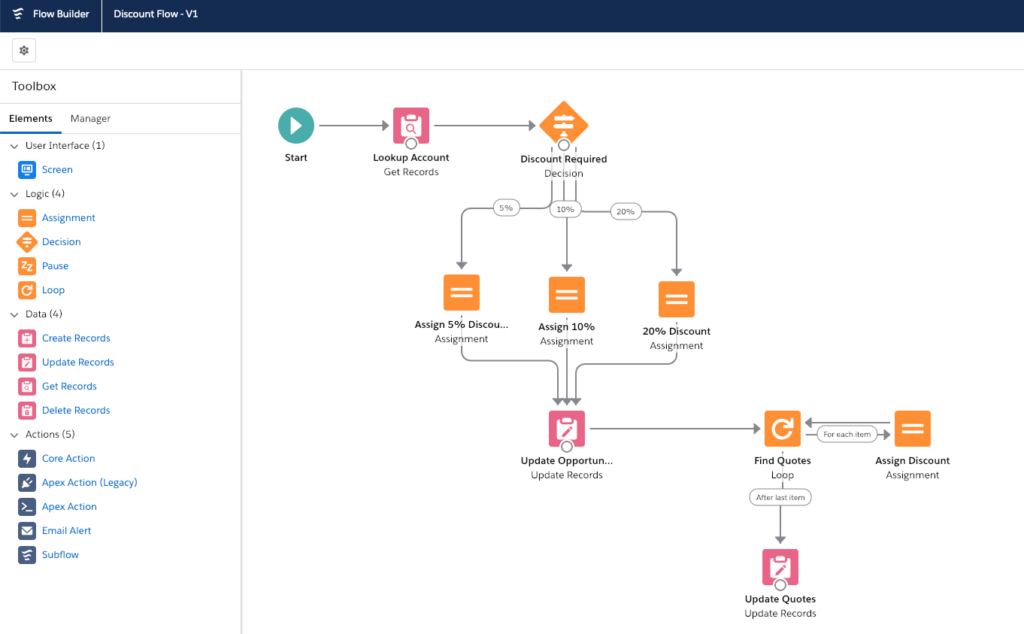
In Spring’19, Salesforce is introducing an update to the flow designer moving it out of flash and into the world of lightning.
This update is a game changer because this is not just a new lick of paint; you are also getting additional functionality.
With the migration over to lighting, Flow has been getting even more powerful. Admins who have the confidence to add & configure components in Lightning pages and use Process Builder should now have the confidence to start using Flow and unleash the additional power it holds.
For new users, this update should remove some barriers. With terminology that could be confusing to understand, a look & feel that is unfamiliar and sometimes requiring the writing on Visualforce & Apex to get your automation to work as expected.
This should empower admins that prefer to use clicks over code to achieve things previously thought impossible without code. This could include replacing JavaScript buttons that can’t be replaced using quick actions, displaying related records without writing Visualforce and identifying and batch updating records without writing Apex.

Simpler to use
With Lightning, Salesforce has been looking to align the User Experience (UX) across the whole platform. They have even made it public with the Lightning Design System. One of the more recent areas of this design has been on builders.
So whether you are using flow, app builder or even Pardot Engagement studio as a user you should feel like you are in a familiar place, feel comfortable and be able to get an idea of where things are and how they work.
When you open a Flow in the new builder, you can clearly see what actions are being taken. The bright colours differentiate the different types of actions, with standard icons used to make it clear the action being performed at each step.
This means that anybody familiar with Lightning Experience will see how the new builder aligns with the rest of the Lightning platform. The cleaner interface is simpler to understand, easier to map out and quicker to edit.
Along with this single & fast object actions have been merged, instead, asking you questions during the setup of actions to see if you require individual or multiples records. This should help newcomers getting up to speed with bulk actions.
 New Screen options
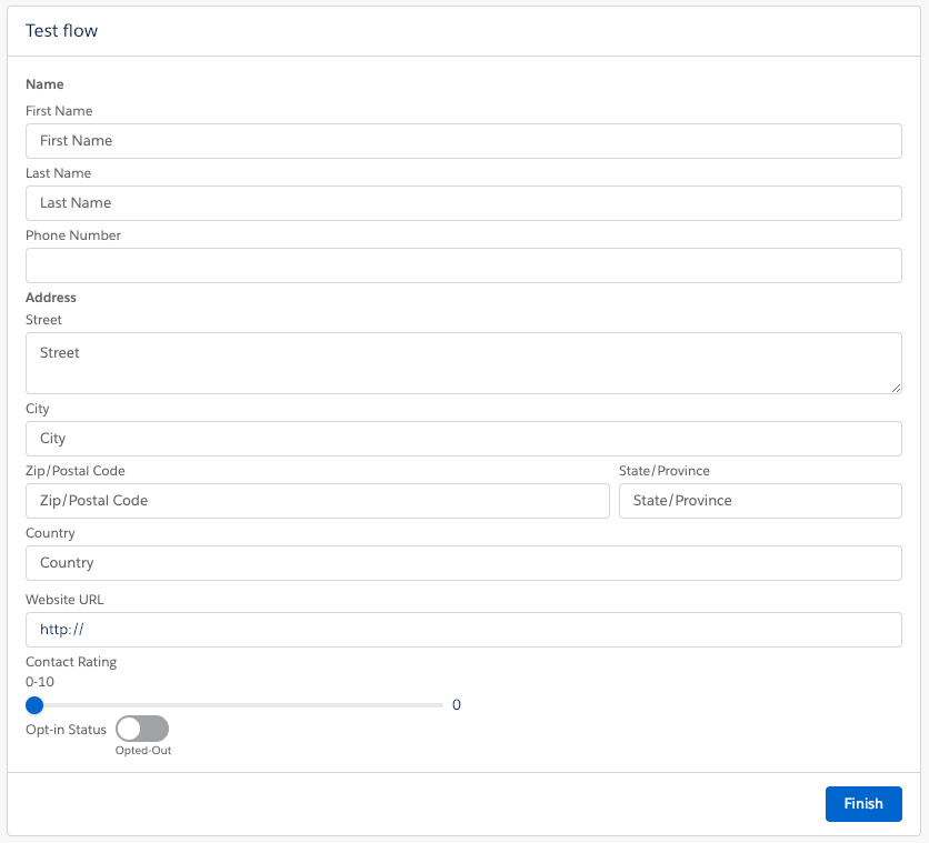
Screen flows are a powerful tool to collect data from lightning pages quickly.
These have had a facelift working in the same way as lightning app builder. This list now includes Name, Phone, Address & URL as standard.
On top of this, standard components are more straightforward to add & edit. This makes it simpler to change the way a user can interact with data, these include:
- Slider – Set a level between 0-100 where a user can select a number on a sliding scale, making it simpler to use than a drop down or number field
- Toggle – A switch that can be on or off; this can replace checkboxes, radio buttons or picklists for a more visually appealing way to enter data
These can be used alongside lightning components or the new flow solutions available on the AppExchange.
So what are you waiting for?
Now that the Flow builder has more functionality, is simpler to use and easier to navigate there is no excuse not to use it.
For anybody already using flow, no need to panic, your current flows will be automatically converted in the new builder.
So why not let 2019 be the year you go with the flow!


