Way back in 2016, Salesforce developed an analytics tool called B2B Marketing Analytics. The idea behind this was to allow data analysis from both Pardot and Salesforce.
You can read more about this fantastic tool here, but today I’m going to walk you through some of the out of the box dashboards.
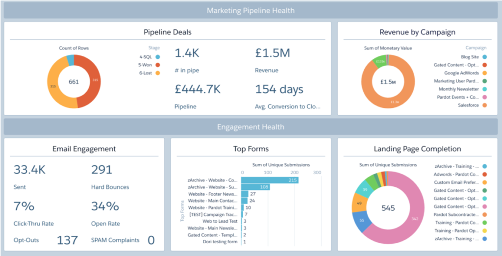
Dashboard 1: Marketing Manager
The Marketing Manager dashboard offers a quick look into the health of your business and which campaigns are yielding the best results. From this dashboard, you can drill into the Engagement and Pipeline dashboards (see below).
It surfaces the most important relevant data about pipeline, campaigns, and engagement, and it comes with two filters, ‘year’ and ‘quarter’, which reveal overall marketing pipeline health using time as a benchmark.
Dashboard 2: Multi Touch
This dashboard is actually multi-functional.
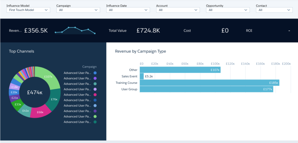
Let’s take the example that you need to decide which channels and programs to invest more heavily in an upcoming quarter.
You’d start by looking at the first touch attribution model to see which campaigns are best at driving awareness.
First Touch
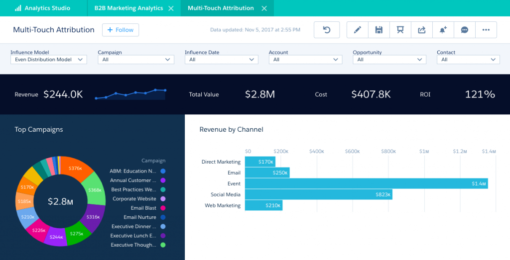
Next, you may want to know which campaigns are working best at all stages of the funnel.
Even Distribution
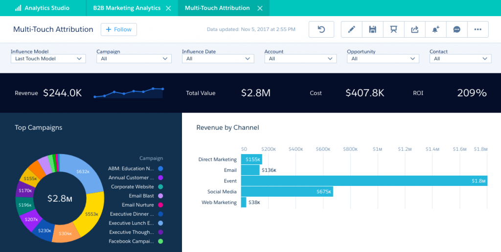
Finally, you might want to know which campaigns are helping sales drive deals to close.
Last Touch
Dashboard 3: Account Based Marketing
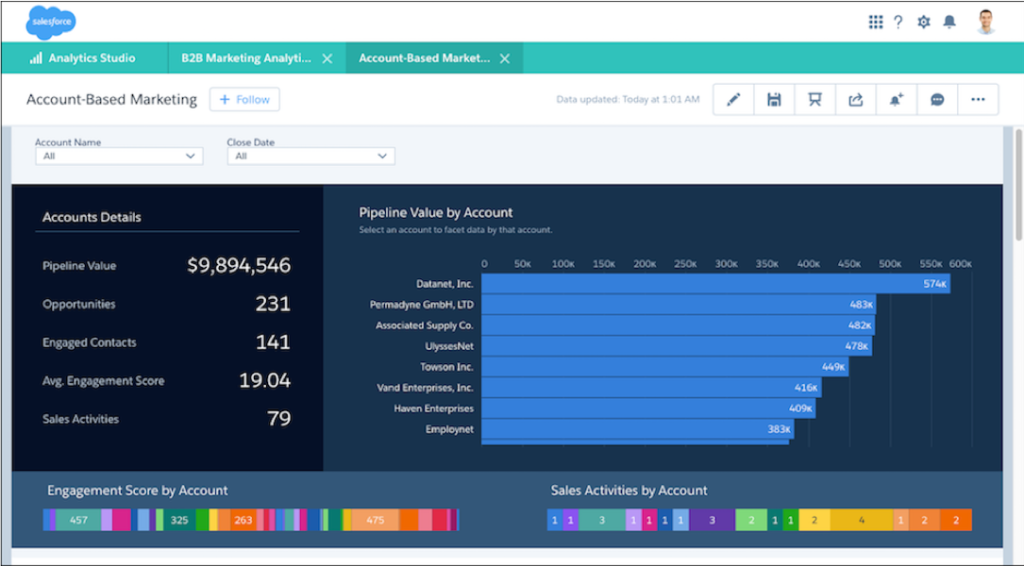
Account-Based Marketing dashboards will help you to understand how opportunities and contacts from one account engage with your marketing and sales assets.
Dashboard 4: Engagement
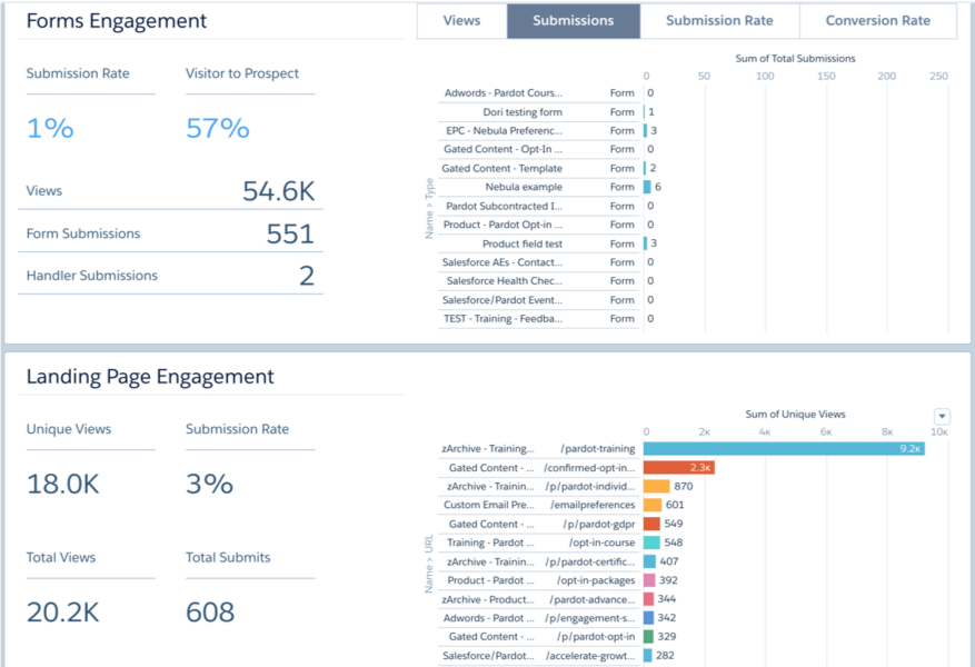
This dashboard shows how your primary marketing assets perform and how they contribute to the sales pipeline and opportunity lifecycle.
Dashboard 5: Pipeline
The Pipeline dashboard shows your sales funnel from visitors to prospects, right through to opportunities you’ve won. This dashboard is helpful for sales and marketing, as they can see which assets and campaigns push the most deals.

What next?
You can, of course, build your own custom dashboards if the out of the box ones don’t work for you… or you can enlist our help!

