Salesforce
Salesforce is the world’s leading platform for generating and managing sales. It helps you to sell in the way you want, and connect to customers in the way they want.
Getting it right for your business leads to better user adoption, streamlined processes and efficiencies that directly impact your bottom line.
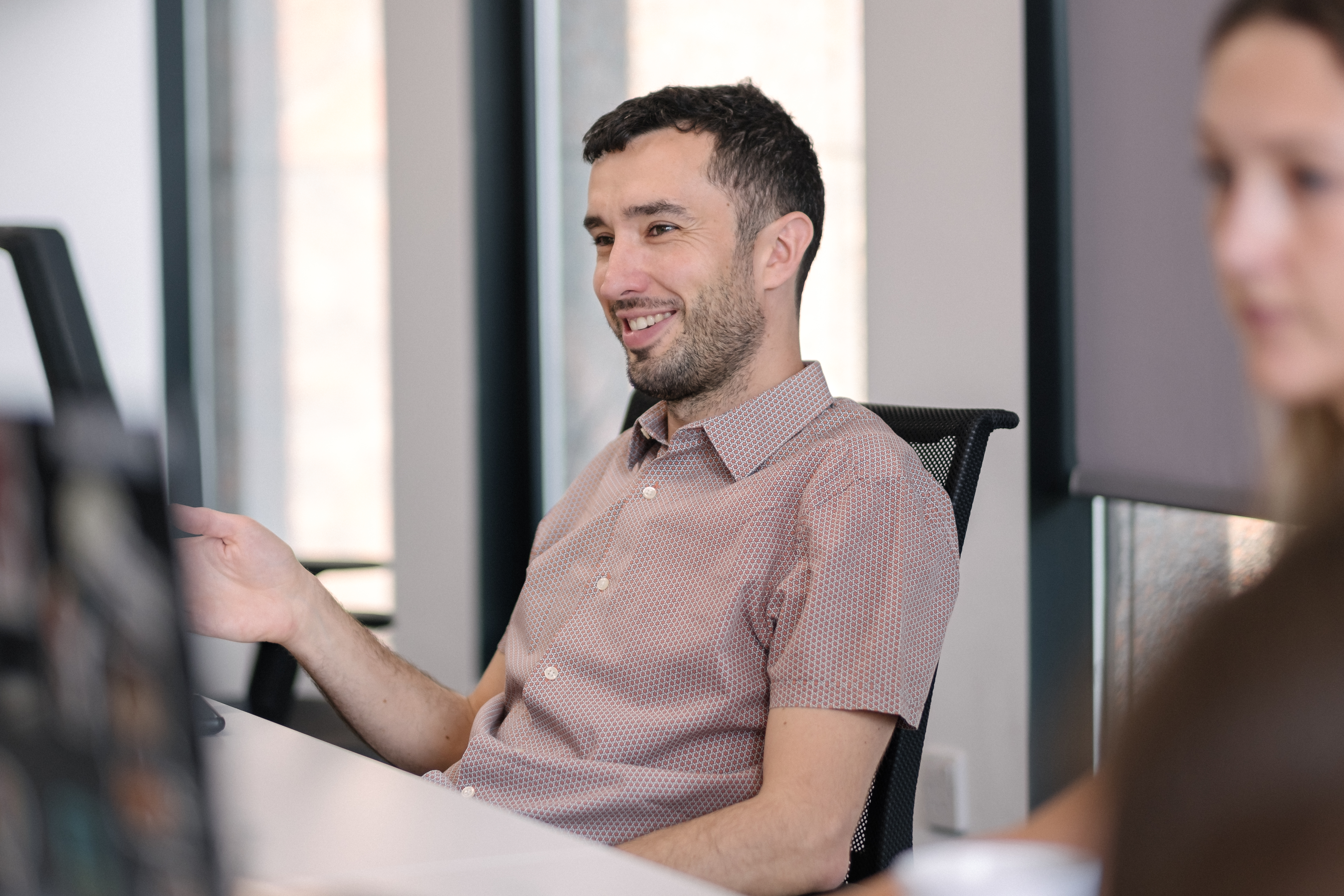
See the real difference
From your leads through to your loyal customers, Nebula can harness the benefits of Salesforce for your business at every stage. Whether you’re starting out with Salesforce or have been using it for years, we can ensure you get the most out of your investment.
Seamless Integrations
Bespoke Development
System Health Check
Personalised Training
Advanced Support
A best-in-class experience
We make it easy to talk to customers in a single, unified way. You’ll leverage your data more effectively, your people will perform better and you’ll generate more revenue.
Whether the project is delivered on-site or remotely, phase by phase or via a single push, our philosophy is to work alongside you as an extension of your team.
Breadth and depth of knowledge
The great strengths of Salesforce include its scope and flexibility, which means it can be tailored to suit the needs of any business. However, that generates challenges in itself – with business processes changing faster than ever, and with Salesforce producing three major releases every year, the Salesforce ecosystem can be an overwhelming place.
After hundreds of implementations across many sectors and experience with countless different sales processes, we know precisely what works best and why. Our expertise is not just deep, but broad.

Salesforce training
As part of any implementation, we are happy to offer Salesforce training to ensure user adoption. This can either be remotely or at your office and as no two implementations are ever the same, training will always be customised to suit your particular needs.
We’ve trained thousands of people on Salesforce tools and can offer everything from a brief refresher or release update through to in-depth training across all areas. It’s very much your call.

The Nebula difference
We’re excellent in technical matters and we’re better still on the business side – our professionals all have extensive industry experience, which means you can be sure we understand your objectives and how best to realise them.
We work with the full range of Salesforce tools including Marketing Cloud, Revenue Cloud and Experience Cloud, helping you to seek, sell to and keep customers in the most efficient way. Best of all, what we offer is proven – some of our customers have been working with Nebula since we were founded back in 2012.

Advanced Salesforce Support
Whether you're new to Salesforce or you’ve had it for years, ongoing support can make a major difference, especially with three releases a year to factor in. We offer both technical and strategic assistance helping you to optimise Salesforce and its integrated tools. First, we'll take a health check of your system so we can build a long-term development plan together.
Get in touch
Nebula has the business experience and technical expertise in the Salesforce ecosystem to help you to succeed with Sales Cloud, from implementation through to advanced support. Get in touch to find out how we can help you succeed.
Salesforce Insights
You can find all the latest information about Salesforce here.
@charset "UTF-8";
/* ------------------------------------
Optional: load Open Sans (pick one)
------------------------------------ */
/* Option A: Google Fonts */
@import url("https://fonts.googleapis.com/css2?family=Open+Sans:wght@400;600&display=swap");
/* Option B: Self-host */
/*
@font-face {
font-family: 'Open Sans';
src: url('/assets/fonts/OpenSans-Regular.woff2') format('woff2'),
url('/assets/fonts/OpenSans-Regular.woff') format('woff');
font-weight: 400;
font-style: normal;
font-display: swap;
}
@font-face {
font-family: 'Open Sans';
src: url('/assets/fonts/OpenSans-SemiBold.woff2') format('woff2'),
url('/assets/fonts/OpenSans-SemiBold.woff') format('woff');
font-weight: 600;
font-style: normal;
font-display: swap;
}
*/
:root {
--primary-dark: #81b236;
}
/* ---------------------------
Global Typography
---------------------------- */
html, body {
font-family: "Open Sans", sans-serif;
font-weight: 400;
-webkit-font-smoothing: antialiased;
-moz-osx-font-smoothing: grayscale;
}
h1, h2, h3, h4, h5, h6,
.heading, .section-title {
font-family: "Open Sans", sans-serif;
font-weight: 600;
margin: 0;
}
strong, b {
font-weight: 600;
}
/* Ensure form controls inherit the font */
input, select, textarea, button {
font-family: inherit;
font-weight: inherit;
}
/* Width */
[data-aos=fade-up-short] {
transform: translateY(50px);
transition-property: transform, opacity;
}
[data-aos=fade-up-short].aos-animate {
transform: translateY(0);
}
#__bs_notify__ {
top: 95% !important;
right: 10px !important;
border-radius: 15px !important;
height: 60px !important;
}
/*========================================
Photoshop Letter Spacing
==========================================*/
/*========================================
Font Sizing
==========================================*/
/*--------------------------------------------------------------
>>> TABLE OF CONTENTS:
----------------------------------------------------------------
# Normalize
# Typography
# Elements
# Forms
# Navigation
## Links
## Menus
# Accessibility
# Alignments
# Clearings
# Widgets
# Content
## Posts and pages
## Comments
# Infinite scroll
# Media
## Captions
## Galleries
--------------------------------------------------------------*/
/*--------------------------------------------------------------
# Normalize
--------------------------------------------------------------*/
/* normalize.css v8.0.0 | MIT License | github.com/necolas/normalize.css */
/* Document
========================================================================== */
/**
* 1. Correct the line height in all browsers.
* 2. Prevent adjustments of font size after orientation changes in iOS.
*/
/* Sections
========================================================================== */
/**
* Remove the margin in all browsers.
*/
body {
margin: 0;
}
/**
* Correct the font size and margin on `h1` elements within `section` and
* `article` contexts in Chrome, Firefox, and Safari.
*/
/* Grouping content
========================================================================== */
/**
* 1. Add the correct box sizing in Firefox.
* 2. Show the overflow in Edge and IE.
*/
hr {
box-sizing: content-box; /* 1 */
height: 0; /* 1 */
overflow: visible; /* 2 */
}
/**
* 1. Correct the inheritance and scaling of font size in all browsers.
* 2. Correct the odd `em` font sizing in all browsers.
*/
pre {
font-family: monospace, monospace; /* 1 */
font-size: 1em; /* 2 */
}
/* Text-level semantics
========================================================================== */
/**
* Remove the gray background on active links in IE 10.
*/
a {
background-color: transparent;
}
/**
* 1. Remove the bottom border in Chrome 57-
* 2. Add the correct text decoration in Chrome, Edge, IE, Opera, and Safari.
*/
abbr[title] {
border-bottom: none; /* 1 */
text-decoration: underline; /* 2 */
-webkit-text-decoration: underline dotted;
text-decoration: underline dotted; /* 2 */
}
/**
* Add the correct font weight in Chrome, Edge, and Safari.
*/
b,
strong {
font-weight: bolder;
}
/**
* 1. Correct the inheritance and scaling of font size in all browsers.
* 2. Correct the odd `em` font sizing in all browsers.
*/
code,
kbd,
samp {
font-family: monospace, monospace; /* 1 */
font-size: 1em; /* 2 */
}
/**
* Add the correct font size in all browsers.
*/
small {
font-size: 80%;
}
/**
* Prevent `sub` and `sup` elements from affecting the line height in
* all browsers.
*/
sub,
sup {
font-size: 75%;
line-height: 0;
position: relative;
vertical-align: baseline;
}
sub {
bottom: -0.25em;
}
sup {
top: -0.5em;
}
/* Embedded content
========================================================================== */
/**
* Remove the border on images inside links in IE 10.
*/
img {
border-style: none;
}
/* Forms
========================================================================== */
/**
* 1. Change the font styles in all browsers.
* 2. Remove the margin in Firefox and Safari.
*/
button,
input,
optgroup,
select,
textarea {
font-family: inherit; /* 1 */
font-size: 100%; /* 1 */
line-height: 1.15; /* 1 */
margin: 0; /* 2 */
}
/**
* Show the overflow in IE.
* 1. Show the overflow in Edge.
*/
button,
input { /* 1 */
overflow: visible;
}
/**
* Remove the inheritance of text transform in Edge, Firefox, and IE.
* 1. Remove the inheritance of text transform in Firefox.
*/
button,
select { /* 1 */
text-transform: none;
}
/**
* Correct the inability to style clickable types in iOS and Safari.
*/
button,
[type=button],
[type=reset],
[type=submit] {
-webkit-appearance: button;
}
/**
* Remove the inner border and padding in Firefox.
*/
button::-moz-focus-inner,
[type=button]::-moz-focus-inner,
[type=reset]::-moz-focus-inner,
[type=submit]::-moz-focus-inner {
border-style: none;
padding: 0;
}
/**
* Restore the focus styles unset by the previous rule.
*/
button:-moz-focusring,
[type=button]:-moz-focusring,
[type=reset]:-moz-focusring,
[type=submit]:-moz-focusring {
outline: 1px dotted ButtonText;
}
/**
* Correct the padding in Firefox.
*/
fieldset {
padding: 0.35em 0.75em 0.625em;
}
/**
* 1. Correct the text wrapping in Edge and IE.
* 2. Correct the color inheritance from `fieldset` elements in IE.
* 3. Remove the padding so developers are not caught out when they zero out
* `fieldset` elements in all browsers.
*/
legend {
box-sizing: border-box; /* 1 */
color: inherit; /* 2 */
display: table; /* 1 */
max-width: 100%; /* 1 */
padding: 0; /* 3 */
white-space: normal; /* 1 */
}
/**
* Add the correct vertical alignment in Chrome, Firefox, and Opera.
*/
progress {
vertical-align: baseline;
}
/**
* Remove the default vertical scrollbar in IE 10+.
*/
textarea {
overflow: auto;
}
/**
* 1. Add the correct box sizing in IE 10.
* 2. Remove the padding in IE 10.
*/
[type=checkbox],
[type=radio] {
box-sizing: border-box; /* 1 */
padding: 0; /* 2 */
}
/**
* Correct the cursor style of increment and decrement buttons in Chrome.
*/
[type=number]::-webkit-inner-spin-button,
[type=number]::-webkit-outer-spin-button {
height: auto;
}
/**
* 1. Correct the odd appearance in Chrome and Safari.
* 2. Correct the outline style in Safari.
*/
[type=search] {
-webkit-appearance: textfield; /* 1 */
outline-offset: -2px; /* 2 */
}
/**
* Remove the inner padding in Chrome and Safari on macOS.
*/
[type=search]::-webkit-search-decoration {
-webkit-appearance: none;
}
/**
* 1. Correct the inability to style clickable types in iOS and Safari.
* 2. Change font properties to `inherit` in Safari.
*/
::-webkit-file-upload-button {
-webkit-appearance: button; /* 1 */
font: inherit; /* 2 */
}
/* Interactive
========================================================================== */
/*
* Add the correct display in Edge, IE 10+, and Firefox.
*/
details {
display: block;
}
/*
* Add the correct display in all browsers.
*/
summary {
display: list-item;
}
/* Misc
========================================================================== */
/**
* Add the correct display in IE 10+.
*/
template {
display: none;
}
/**
* Add the correct display in IE 10.
*/
[hidden] {
display: none;
}
/*--------------------------------------------------------------
# Typography
--------------------------------------------------------------*/
body,
button,
input,
select,
optgroup,
textarea {
color: #404040;
font-family: sans-serif;
font-size: 16px;
font-size: 1rem;
line-height: 1.5;
}
h1, h2, h3, h4, h5, h6 {
clear: both;
}
dfn, cite, em, i {
font-style: italic;
}
blockquote {
margin: 0 1.5em;
}
address {
margin: 0 0 1.5em;
}
pre {
background: #eee;
font-family: "Courier 10 Pitch", Courier, monospace;
font-size: 15px;
font-size: 0.9375rem;
line-height: 1.6;
margin-bottom: 1.6em;
max-width: 100%;
overflow: auto;
padding: 1.6em;
}
code, kbd, tt, var {
font-family: Monaco, Consolas, "Andale Mono", "DejaVu Sans Mono", monospace;
font-size: 15px;
font-size: 0.9375rem;
}
abbr, acronym {
border-bottom: 1px dotted #666;
cursor: help;
}
mark, ins {
background: #fff9c0;
text-decoration: none;
}
big {
font-size: 125%;
}
/*--------------------------------------------------------------
# Elements
--------------------------------------------------------------*/
html {
box-sizing: border-box;
}
*,
*:before,
*:after {
/* Inherit box-sizing to make it easier to change the property for components that leverage other behavior; see https://css-tricks.com/inheriting-box-sizing-probably-slightly-better-best-practice/ */
box-sizing: inherit;
}
body {
background: #fff;
/* Fallback for when there is no custom background color defined. */
}
hr {
background-color: #ccc;
border: 0;
height: 1px;
margin-bottom: 1.5em;
}
ul, ol {
margin: 0 0 1.5em 1em;
}
ul {
list-style: disc;
}
ol {
list-style: decimal;
}
li > ul,
li > ol {
margin-bottom: 0;
margin-left: 1.5em;
}
dt {
font-weight: bold;
}
dd {
margin: 0 1.5em 1.5em;
}
img {
height: auto;
/* Make sure images are scaled correctly. */
max-width: 100%;
/* Adhere to container width. */
}
figure {
margin: 1em 0;
/* Extra wide images within figure tags don't overflow the content area. */
}
table {
margin: 0 0 1.5em;
width: 100%;
}
/*--------------------------------------------------------------
# Forms
--------------------------------------------------------------*/
button,
input[type=button],
input[type=reset],
input[type=submit] {
border: 1px solid;
border-color: #ccc #ccc #bbb;
border-radius: 3px;
background: #e6e6e6;
color: rgba(0, 0, 0, 0.8);
font-size: 12px;
font-size: 0.75rem;
line-height: 1;
padding: 0.6em 1em 0.4em;
}
button:hover,
input[type=button]:hover,
input[type=reset]:hover,
input[type=submit]:hover {
border-color: #ccc #bbb #aaa;
}
button:active, button:focus,
input[type=button]:active,
input[type=button]:focus,
input[type=reset]:active,
input[type=reset]:focus,
input[type=submit]:active,
input[type=submit]:focus {
border-color: #aaa #bbb #bbb;
}
input[type=text]:focus,
input[type=email]:focus,
input[type=url]:focus,
input[type=password]:focus,
input[type=search]:focus,
input[type=number]:focus,
input[type=tel]:focus,
input[type=range]:focus,
input[type=date]:focus,
input[type=month]:focus,
input[type=week]:focus,
input[type=time]:focus,
input[type=datetime]:focus,
input[type=datetime-local]:focus,
input[type=color]:focus,
textarea:focus {
color: #111;
}
select {
border: 1px solid #ccc;
}
textarea {
width: 100%;
}
/*--------------------------------------------------------------
# Navigation
--------------------------------------------------------------*/
/*--------------------------------------------------------------
## Links
--------------------------------------------------------------*/
a {
color: royalblue;
}
a:visited {
color: purple;
}
a:hover, a:focus, a:active {
color: midnightblue;
}
a, a:active, a:focus{
outline: none;
}
a:hover, a:active {
outline: 0;
}
/*--------------------------------------------------------------
## Menus
--------------------------------------------------------------*/
.main-navigation {
clear: both;
display: block;
float: left;
width: 100%;
}
.main-navigation ul {
display: none;
list-style: none;
margin: 0;
padding-left: 0;
}
.main-navigation ul ul {
box-shadow: 0 3px 3px rgba(0, 0, 0, 0.2);
float: left;
position: absolute;
top: 100%;
left: -999em;
z-index: 99999;
}
.main-navigation ul ul ul {
left: -999em;
top: 0;
}
.main-navigation ul ul li:hover > ul,
.main-navigation ul ul li.focus > ul {
left: 100%;
}
.main-navigation ul ul a {
width: 200px;
}
.main-navigation ul li:hover > ul,
.main-navigation ul li.focus > ul {
left: auto;
}
.main-navigation li {
float: left;
position: relative;
}
.main-navigation a {
display: block;
text-decoration: none;
}
/* Small menu. */
.menu-toggle,
.main-navigation.toggled ul {
display: block;
}
@media screen and (min-width: 37.5em) {
.menu-toggle {
display: none;
}
.main-navigation ul {
display: block;
}
}
.site-main .comment-navigation, .site-main .posts-navigation,
.site-main .post-navigation {
margin: 0 0 1.5em;
overflow: hidden;
}
.comment-navigation .nav-previous,
.posts-navigation .nav-previous,
.post-navigation .nav-previous {
float: left;
width: 50%;
}
.comment-navigation .nav-next,
.posts-navigation .nav-next,
.post-navigation .nav-next {
float: right;
text-align: right;
width: 50%;
}
/*--------------------------------------------------------------
# Accessibility
--------------------------------------------------------------*/
/* Text meant only for screen readers. */
.screen-reader-text {
border: 0;
clip: rect(1px, 1px, 1px, 1px);
clip-path: inset(50%);
height: 1px;
margin: -1px;
overflow: hidden;
padding: 0;
position: absolute !important;
width: 1px;
word-wrap: normal !important; /* Many screen reader and browser combinations announce broken words as they would appear visually. */
}
.screen-reader-text:focus {
background-color: #f1f1f1;
border-radius: 3px;
box-shadow: 0 0 2px 2px rgba(0, 0, 0, 0.6);
clip: auto !important;
clip-path: none;
color: #21759b;
display: block;
font-size: 14px;
font-size: 0.875rem;
font-weight: bold;
height: auto;
left: 5px;
line-height: normal;
padding: 15px 23px 14px;
text-decoration: none;
top: 5px;
width: auto;
z-index: 100000;
/* Above WP toolbar. */
}
/* Do not show the outline on the skip link target. */
#content[tabindex="-1"]:focus {
outline: 0;
}
/*--------------------------------------------------------------
# Alignments
--------------------------------------------------------------*/
.alignleft {
display: inline;
float: left;
margin-right: 1.5em;
}
.alignright {
display: inline;
float: right;
margin-left: 1.5em;
}
.aligncenter {
clear: both;
display: block;
margin-left: auto;
margin-right: auto;
}
/*--------------------------------------------------------------
# Clearings
--------------------------------------------------------------*/
.clear:before,
.clear:after,
.entry-content:before,
.entry-content:after,
.comment-content:before,
.comment-content:after,
.site-header:before,
.site-header:after,
.site-content:before,
.site-content:after {
content: "";
display: table;
table-layout: fixed;
}
.clear:after,
.entry-content:after,
.comment-content:after,
.site-header:after,
.site-content:after {
clear: both;
}
/*--------------------------------------------------------------
# Widgets
--------------------------------------------------------------*/
.widget {
margin: 0 0 1.5em;
/* Make sure select elements fit in widgets. */
}
.widget select {
max-width: 100%;
}
/*--------------------------------------------------------------
# Content
--------------------------------------------------------------*/
/*--------------------------------------------------------------
## Posts and pages
--------------------------------------------------------------*/
.sticky {
display: block;
}
.hentry {
margin: 0 0 1.5em;
}
.updated:not(.published) {
display: none;
}
.page-content,
.entry-content,
.entry-summary {
margin: 1.5em 0 0;
}
.page-links {
clear: both;
margin: 0 0 1.5em;
}
/*--------------------------------------------------------------
## Comments
--------------------------------------------------------------*/
.comment-content a {
word-wrap: break-word;
}
.bypostauthor {
display: block;
}
/*--------------------------------------------------------------
# Infinite scroll
--------------------------------------------------------------*/
/* Globally hidden elements when Infinite Scroll is supported and in use. */
.infinite-scroll .posts-navigation,
.infinite-scroll.neverending .site-footer {
/* Theme Footer (when set to scrolling) */
display: none;
}
/* When Infinite Scroll has reached its end we need to re-display elements that were hidden (via .neverending) before. */
.infinity-end.neverending .site-footer {
display: block;
}
/*--------------------------------------------------------------
# Media
--------------------------------------------------------------*/
.page-content .wp-smiley,
.entry-content .wp-smiley,
.comment-content .wp-smiley {
border: none;
margin-bottom: 0;
margin-top: 0;
padding: 0;
}
/* Make sure embeds and iframes fit their containers. */
embed,
iframe,
object {
max-width: 100%;
}
/* Make sure logo link wraps around logo image. */
.custom-logo-link {
display: inline-block;
}
/*--------------------------------------------------------------
## Captions
--------------------------------------------------------------*/
.wp-caption {
margin-bottom: 1.5em;
max-width: 100%;
}
.wp-caption img[class*=wp-image-] {
display: block;
margin-left: auto;
margin-right: auto;
}
.wp-caption .wp-caption-text {
margin: 0.8075em 0;
}
.wp-caption-text {
text-align: center;
}
/*--------------------------------------------------------------
## Galleries
--------------------------------------------------------------*/
.gallery {
margin-bottom: 1.5em;
}
.gallery-item {
display: inline-block;
text-align: center;
vertical-align: top;
width: 100%;
}
.gallery-columns-2 .gallery-item {
max-width: 50%;
}
.gallery-columns-3 .gallery-item {
max-width: 33.33%;
}
.gallery-columns-4 .gallery-item {
max-width: 25%;
}
.gallery-columns-5 .gallery-item {
max-width: 20%;
}
.gallery-columns-6 .gallery-item {
max-width: 16.66%;
}
.gallery-columns-7 .gallery-item {
max-width: 14.28%;
}
.gallery-columns-8 .gallery-item {
max-width: 12.5%;
}
.gallery-columns-9 .gallery-item {
max-width: 11.11%;
}
.gallery-caption {
display: block;
}
* {
margin: 0;
padding: 0;
}
*,
*:after,
*:before {
box-sizing: border-box;
}
html {
font-size: 100%; /* 1rem = 16px */
scroll-behavior: smooth;
}
body {
position: relative;
font-size: 1.125rem; /* 18px */
line-height: 1.556; /* ≈28/18 for comfy reading */
font-family: "Open Sans", sans-serif;
font-weight: 400; /* body should be 400 */
color: var(--secondary);
-webkit-font-smoothing: antialiased;
}
.section--primary {
background-color: var(--primary);
}
.section--primary-light {
background-color: var(--primary-v-light);
}
.section--secondary {
background-color: var(--secondary);
color: #fff;
}
.section--secondary h1, .section--secondary h2, .section--secondary h3, .section--secondary h4, .section--secondary p, .section--secondary li, .section--secondary a:not(.btn) .section--secondary a:not(.lnk){
color: #fff !important;
}
.section--white {
background-color: var(--white);
}
.section--grey, .section--neutral {
background-color: var(--neutral);
}
.section--lightgreen {
background-color: var(--lightgreen);
}
a {
transition: all 0.3s ease-in-out;
}
.btn {
display: inline-flex;
position: relative;
padding: 14px 25px;
background-color: var(--primary);
color: #2C3242;
font-family: 'Open Sans', sans-serif;
font-size: 16px;
font-weight: 700;
text-decoration: none;
border-radius: 999px;
border: 2px solid var(--primary);
cursor: pointer;
z-index: 1;
overflow: hidden;
}
.btn .button-content {
display: flex;
align-items: center;
padding-right: 12px;
}
.btn::before {
content: '';
position: absolute;
top: 0;
left: 0;
width: 0;
height: 100%;
background-color: var(--primary-v-light);
border-radius: calc(infinity * 1px);
transition: width 0.3s ease;
z-index: -1;
}
.btn::after {
content: '';
width: 20px;
height: 20px;
background-image: url("img/icon_arrow_right.svg");
background-size: contain;
background-repeat: no-repeat;
transition: transform 0.3s ease;
margin: 3px 0 5px 12px;
}
.btn:hover::before {
width: 100%;
}
.btn:hover::after {
transform: translateX(3px);
}
.section--primary .btn {
background-color: var(--secondary);
color: #fff !important;
}
.section--primary .btn:hover {
color: var(--secondary) !important;
}
.btn:visited {
color: var(--secondary);
}
.lnk {
display: inline-flex;--primary
align-items: center;
padding: 10px 0;
font-weight: 700;
color: var(--primary);
text-decoration: none;
}
.lnk:hover {
background-color: transparent;
}
.lnk:hover:after {
transform: translateX(3px);
}
.section--white .lnk {
color: var(--secondary) !important;
}
.section--white .lnk--arrow:after {
background-image: url("img/icon_arrow_right.svg") !important;
}
.btn:hover:after {
transform: translateX(3px);
}
.lnk:visited {
color: var(--primary);
}
.lnk--arrow:after {
content: "";
display: block;
width: 18px;
height: 18px;
margin: 5px 0 0 16px;
background-image: url("img/icon_arrow_right_green.svg");
background-size: contain;
background-repeat: no-repeat;
background-position: 50% 50%;
transition: all 0.3s ease-in-out;
}
@media (min-width: 64em) {
.btn {
/* keep for future button tweaks */
}
}
@media (min-width: 64em) {
.btn {
/* keep for future button tweaks */
}
}
@media (min-width: 80em) {
.btn:after {
width: 24px;
height: 20px;
}
.btn--lrg {
padding: 15px 20px;
}
}
/* Headings */
h1, h2, h3, h4 {
margin: 10px 0;
}
/* Client spec: H1 = 3rem (48px) */
h1 {
font-size: 4rem;
line-height: 1.25; /* ~60px on 48px */
font-weight: 600;
}
@media (max-width: 62.5em) {
h1 {
font-size: 2.25rem;
}
}
@media (max-width: 48.0625em) {
h1 {
font-size: 1.75rem;
}
}
/* Client spec: H2 = 1.75rem (28px) */
h2, h3 {
font-size: 2.5rem;
line-height: 1.357; /* ~38px on 28px */
font-weight: 600;
}
@media (max-width: 48.0625em) {
h2, h3 {
font-size: 1.5rem;
}
}
/* Keeping existing proportions for h3/h4; adjust if needed */
h3 {
font-size: 1.5rem;
}
@media (max-width: 48.0625em) {
h3 {
font-size: 1.25rem;
}
}
.section--secondary h3 {
color: #fff;
}
h4 {
font-weight: 600;
color: var(--secondary);
font-size: 1.25rem;
line-height: 1.357; /* ~38px on 28px */
}
.section--secondary h4 {
color: #fff;
}
@media (max-width: 48.0625em) {
h4 {
font-size: 1rem;
}
}
/* Body copy (p, li) = 1.125rem (18px) per spec */
p, li {
font-weight: 400;
font-size: inherit;
line-height: inherit;
}
@media (max-width: 48.0625em) {
p, li {
font-size: 1rem;
}
}
/* WYSIWYG spacing */
.wysiwyg p {
padding-bottom: 10px;
}
/* Image utilities */
.insight-module__image img,
.single-post .single-post__image img,
.post-module__image img {
-o-object-fit: cover;
object-fit: cover;
-o-object-position: 50% 50%;
object-position: 50% 50%;
width: 100%;
height: clamp(250px, 16vw, 300px) !important;
}
/* Section spacing */
.section {
padding: min(3vw, 100px) 0 !important;
}
/* Hero text tweaks (optional; adjust if you want these to align with body size) */
@media (min-width: 48em) {
[class*=hero__text] p,
[class*=hero__heading] p {
font-size: 1.25rem;
line-height: 1.6;
}
}
.pre-header__wrap {
padding: 0 20px;
background-color: var(--primary-v-light);
}
@media screen and (min-width: 1024px) {
.pre-header__wrap {
padding: 0 40px;
}
}
.pre-header__inner {
max-width: 1640px;
margin: 0 auto;
display: flex;
justify-content: flex-end;
padding: 10px 0;
}
@media (min-width: 37.5em) {
.pre-header__inner {
justify-content: space-between;
}
}
@media (min-width: 93.75em) {
.pre-header__inner:before {
content: "";
display: block;
flex-basis: 20%;
}
}
.social-nav__wrap {
display: flex;
align-items: center;
}
@media (min-width: 93.75em) {
.social-nav__wrap {
flex-basis: 20%;
justify-content: flex-end;
}
}
.social-nav__inner {
display: flex;
justify-content: flex-end;
align-items: center;
gap: 10px;
}
.social-nav__inner a.social-nav__link {
display: flex;
justify-content: center;
align-items: center;
width: 20px;
height: 20px;
}
.social-nav__inner a.social-nav__link svg {
display: block;
max-height: 100%;
}
@media (min-width: 64em) {
.social-nav__inner a.social-nav__link {
width: 20px;
height: 100%;
}
}
.alert-bar {
display: none;
}
@media (min-width: 37.5em) {
.alert-bar {
display: flex;
align-items: center;
}
}
.alert-bar__label {
display: flex;
justify-content: center;
align-items: center;
margin: 0 24px 0 0;
padding: 8px 10px 10px;
background-color: var(--primary);
border-radius: calc(infinity * 1px);
font-weight: 700;
line-height: 1;
}
@media (min-width: 64em) {
.alert-bar__label {
padding: 10px 16px;
}
}
.alert-bar__text {
display: flex;
align-items: center;
}
.alert-bar__text a {
display: inline-block;
text-decoration: none;
color: var(--secondary);
font-weight: 800;
}
.alert-bar__text a span.link-arrow {
display: inline-flex;
justify-content: center;
align-items: center;
margin: 0 0 0 8px;
transition: all 0.3s ease-in-out;
}
.alert-bar__text a img {
display: inline-flex;
align-items: center;
width: 10px;
}
.alert-bar__text a:hover span.link-arrow {
transform: translateX(5px);
}
@media (min-width: 64em) {
.alert-bar__text a span.link-arrow {
margin: 0 0 0 16px;
}
.alert-bar__text a img {
width: 20px;
}
}
.site-header__wrap {
padding: 0 20px;
position: relative;
z-index: 100;
background-color: var(--secondary);
}
@media screen and (min-width: 1024px) {
.site-header__wrap {
padding: 0 40px;
}
}
.site-header__inner {
max-width: 1640px;
margin: 0 auto;
display: flex;
justify-content: space-between;
align-items: center;
padding: 24px 0;
}
@media (min-width: 48em) {
.site-header__inner {
padding: 48px 0;
}
}
.site-header__logo {
max-width: 140px;
min-width: 140px;
}
.site-header__logo img {
max-width: 200px;
}
@media (min-width: 93.75em) {
.site-header__logo {
max-width: 200px;
}
}
.primary-nav > ul {
display: flex;
justify-content: center;
gap: 10px;
padding: 0;
margin: 0;
list-style-type: none;
}
.primary-nav > ul > li {
padding: 10px 12px 12px 12px;
font-size: 21px;
font-size: 2.1rem;
line-height: 1;
color: #fff;
font-weight: 700;
text-align: center;
}
.primary-nav > ul > li > a {
color: inherit;
text-decoration: none;
}
.primary-nav > ul > li > a:visited {
color: inherit;
}
.primary-nav > ul > li > a:hover {
color: var(--primary);
}
@media (min-width: 48em) {
.primary-nav {
display: block;
}
}
@media (min-width: 86.25em) {
.primary-nav > ul > li {
font-size: 28px;
font-size: 2.8rem;
line-height: 1;
}
}
@media (min-width: 70em) {
.primary-nav ul li.menu-item-has-children {
position: relative;
display: flex;
align-items: center;
border-radius: 10px 10px 0 0;
cursor: pointer;
transition: all 0.3s ease-in-out;
}
.primary-nav ul li.menu-item-has-children:after {
content: "";
display: block;
width: 0px;
height: 0px;
margin: 0 0 0 12px;
border-style: solid;
border-width: 6px 4px 0 4px;
border-color: var(--primary) transparent transparent transparent;
transform: rotate(0deg) translateY(3px);
transition: all 0.3s ease-in-out;
}
.primary-nav ul li.menu-item-has-children:hover {
background-color: var(--primary);
}
.primary-nav ul li.menu-item-has-children:hover:after {
border-color: var(--secondary) transparent transparent transparent;
}
.primary-nav ul li.menu-item-has-children:hover ul.sub-menu {
opacity: 1;
visibility: visible;
}
.primary-nav ul li.menu-item-has-children:hover a {
color: var(--secondary);
}
}
@media (min-width: 70em) {
ul.sub-menu {
position: absolute;
top: 100%;
left: 0;
min-width: 280px;
margin: 0;
padding: 0;
background-color: #fff;
list-style-type: none;
text-align: left;
opacity: 0;
visibility: hidden;
transition: all 0.3s ease-in-out;
}
ul.sub-menu li {
border-bottom: 1px solid var(--secondary);
}
ul.sub-menu li a {
display: inline-block;
width: 100%;
padding: 10px 35px 10px 15px;
font-size: 21px;
font-size: 2.1rem;
line-height: 1;
text-align: left;
color: var(--secondary);
text-decoration: none;
background-image: url("img/icon_arrow_right.svg");
background-repeat: no-repeat;
background-position: calc(100% - 5px) 50%;
}
ul.sub-menu li a:hover {
background-color: var(--primary-v-light);
}
}
.mobile-nav__toggle {
display: flex;
align-items: center;
justify-self: flex-end;
max-width: 40px;
cursor: pointer;
}
@media (min-width: 70em) {
.mobile-nav__toggle {
display: none;
}
}
@media (min-width: 64em) {
.mobile-nav {
display: none;
}
}
.mm-ocd {
background: #fff;
color: #fff;
--mm-spn-item-height: 46px;
--mm-spn-item-indent: 0;
font-size: 16px;
font-size: 1.6rem;
line-height: 1;
}
.mm-ocd .mm-spn {
background-color: #fff;
}
.mm-ocd .mm-spn li:not(.mobile-nav-actions) {
font-size: 18px;
font-size: 1.8rem;
line-height: 1;
font-weight: 700;
color: var(--secondary);
}
.mm-ocd .mm-spn li:not(.mobile-nav-actions) > a,
.mm-ocd .mm-spn li:not(.mobile-nav-actions) > a:visited {
padding-left: 20px;
}
.mm-ocd .mm-spn li:not(.mobile-nav-actions):after {
border-color: var(--secondary);
opacity: 1;
}
.mm-ocd .mm-spn li:not(.mobile-nav-actions):before {
top: 18px !important;
border-color: var(--secondary);
opacity: 1;
}
.mm-ocd .mm-spn li.mobile-nav-actions {
display: flex;
justify-content: center;
align-items: center;
margin-top: 24px;
}
.mm-ocd .mm-spn li.mobile-nav-actions:before, .mm-ocd .mm-spn li.mobile-nav-actions:after {
display: none;
}
.mm-ocd .mm-spn li.mobile-nav-actions a {
display: inline-flex;
align-items: center;
padding: 16px 30px;
background-color: var(--primary);
border-radius: calc(infinity * 1px);
font-weight: 700;
color: var(--secondary);
text-decoration: none;
}
@media (min-width: 31.25em) {
.mm-ocd .mm-spn li.mobile-nav-actions {
display: none;
}
}
.mm-spn li:not(.mobile-nav-actions):after {
margin-left: 0;
}
.mm-spn.mm-spn--navbar {
color: var(--secondary);
}
.mm-spn.mm-spn--navbar:before {
border-color: #3333CC;
opacity: 1;
left: 20px !important;
}
.mm-spn.mm-spn--navbar:after {
color: var(--secondary);
opacity: 1 !important;
}
.site-header__actions {
display: flex;
align-items: center;
justify-content: space-between;
gap: 15px;
}
.site-header__actions__contact {
display: none;
}
@media (min-width: 31.25em) {
.site-header__actions__contact {
display: block;
}
}
.mega-sub-menu .mega-grey-bg {
background: #e6e7e8 !important;
border-radius: 10px !important;
width: calc(50% - 10px) !important;
margin-right: 10px !important;
}
@media (max-width: 62.5em) {
.mega-sub-menu .mega-grey-bg {
width: 100% !important;
margin: 10px 0 !important;
}
}
.mega-sub-menu .green-bg {
background: #e9f1c4 !important;
border-radius: 10px !important;
width: calc(50% - 10px) !important;
margin-left: 10px !important;
}
@media (max-width: 62.5em) {
.mega-sub-menu .green-bg {
width: 100% !important;
margin: 10px 0 !important;
}
}
.mega-menu-row.pad-15 {
padding: 15px !important;
}
@media (max-width: 62.5em) {
.mega-menu-row.pad-15 {
padding: 0 !important;
}
}
#mega-menu-wrap-primary-nav #mega-menu-primary-nav li.mega-menu-item-has-children > a.mega-menu-link > span.mega-indicator:after {
color: var(--primary) !important;
}
#mega-menu-wrap-primary-nav #mega-menu-primary-nav li.mega-menu-item-has-children.mega-current-menu-parent > a.mega-menu-link > span.mega-indicator:after,
#mega-menu-wrap-primary-nav #mega-menu-primary-nav li.mega-menu-item-has-children > a.mega-menu-link:hover > span.mega-indicator:after {
color: var(--secondary) !important;
}
#mega-menu-wrap-primary-nav #mega-menu-primary-nav li.mega-menu-item-has-children:hover > a.mega-menu-link > span.mega-indicator:after {
color: var(--secondary);
}
.mega-menu-row > ul.mega-sub-menu {
display: flex !important;
}
@media (max-width: 62.5em) {
.mega-menu-row > ul.mega-sub-menu {
display: block !important;
}
}
.mega-sub-menu li.widget_text {
padding: 10px 15px 5px !important;
pointer-events: none !important;
}
.mega-sub-menu li.widget_text a {
pointer-events: none !important;
}
.mega-sub-menu a.mega-menu-link:after {
content: "";
display: inline-block !important;
width: 15px;
height: 15px;
float: right;
background: url("/wp-content/themes/nebula/img/icon_arrow_right.svg") center/contain no-repeat;
margin-left: 0.4em;
vertical-align: middle;
margin-left: auto;
}
.mega-sub-menu .mega-grey-bg .mega-sub-menu a.mega-menu-link:after,
.mega-sub-menu .mega-green-bg .mega-sub-menu a.mega-menu-link:after {
display: none !important;
}
a.mega-menu-link {
display: flex !important;
align-items: center;
}
@media (max-width: 62.5em) {
a.mega-menu-link {
margin-left: auto;
}
}
.mega-sub-menu .mega-grey-bg li:hover {
background: #cdcfd1 !important;
}
.mega-sub-menu .green-bg li:hover {
background: #d1daab !important;
}
@media (max-width: 1150px) {
a.mega-menu-link {
padding: 8px 12px !important;
font-size: 16px !important;
}
}
@media (max-width: 62.5em) {
.site-header__nav {
margin-left: auto;
}
}
@media only screen and (max-width: 1000px) {
#mega-menu-wrap-primary-nav #mega-menu-primary-nav > li.mega-menu-item.mega-toggle-on > a.mega-menu-link {
color: white;
background: inherit !important;
}
#mega-menu-wrap-primary-nav #mega-menu-primary-nav li.mega-menu-item-has-children > a.mega-menu-link > span.mega-indicator {
float: right;
margin-left: auto;
}
}
#mega-menu-wrap-primary-nav .mega-menu-toggle {
background: transparent;
}
#mega-menu-wrap-primary-nav .mega-menu-toggle .mega-toggle-block-0 .mega-toggle-animated-inner, #mega-menu-wrap-primary-nav .mega-menu-toggle .mega-toggle-block-0 .mega-toggle-animated-inner::before, #mega-menu-wrap-primary-nav .mega-menu-toggle .mega-toggle-block-0 .mega-toggle-animated-inner::after {
background: #fff;
}
#mega-menu-wrap-primary-nav .mega-menu-toggle + #mega-menu-primary-nav {
background: #313a4c;
}
.section--hero {
position: relative;
}
.hero-bg {
position: absolute;
top: 0;
right: 0;
bottom: 0;
left: 0;
display: flex;
flex-direction: column;
justify-content: flex-end;
align-items: flex-end;
}
.hero-bg:before {
content: "";
flex-grow: 1;
display: block;
width: 100%;
max-height: 880px;
background-image: url("img/bg_hero.png");
background-repeat: no-repeat;
background-position: 100% 100%;
background-size: contain;
}
.section--service-hero .hero-bg:before {
max-width: 65%;
}
.section--hero.has-video .hero-bg:after, .section--hero.has-image .hero-bg:after {
content: "";
display: block;
width: 100%;
height: 20%;
background-color: #fff;
}
.hero__wrap {
padding: 0 20px;
}
@media screen and (min-width: 1024px) {
.hero__wrap {
padding: 0 40px;
}
}
.hero__inner {
max-width: 1540px;
margin: 0 auto;
}
.hero__content {
position: relative;
z-index: 1;
}
.hero__heading {
max-width: 1420px;
margin: 0 auto 20px auto;
text-align: center;
}
.hero__heading strong {
font-weight: 700;
color: var(--primary);
}
.hero__text {
max-width: 1075px;
margin: 0 auto;
padding: 0 0 25px 0;
text-align: center;
}
.hero__action {
display: flex;
justify-content: center;
padding: 0 0 25px 0;
}
.hero__video,
.hero__image {
padding-top: 20px;
}
.vimeo-embed {
display: flex;
position: relative;
justify-content: center;
align-items: center;
aspect-ratio: 16/9;
border-radius: 22px;
}
@media (min-width: 48em) {
.vimeo-embed {
border-radius: 45px;
}
}
.hero__image img {
border-radius: 22px;
}
@media (min-width: 48em) {
.hero__image img {
border-radius: 45px;
}
}
.vimeo-embed__overlay-link {
display: flex;
justify-content: center;
align-items: center;
position: absolute;
top: 0;
right: 0;
bottom: 0;
left: 0;
z-index: 99;
cursor: pointer;
}
.vimeo-embed__overlay-link:hover .vimeo-embed__button {
background-color: var(--primary-v-light);
}
.vimeo-embed__button {
display: flex;
justify-content: center;
align-items: center;
position: relative;
width: 80px;
height: 80px;
border-radius: calc(infinity * 1px);
background-color: var(--primary);
transition: all 0.3s ease-in-out;
}
.vimeo-embed__button:before {
content: "";
display: block;
width: 0px;
height: 0px;
border-style: solid;
border-width: 15px 0 15px 25px;
border-color: transparent transparent transparent var(--secondary);
transform: rotate(0deg) translateX(3px);
}
@media (min-width: 48em) {
.vimeo-embed__button {
width: 120px;
height: 120px;
}
.vimeo-embed__button:before {
border-width: 30px 0 30px 50px;
transform: rotate(0deg) translateX(6px);
}
}
.vimeo-embed :is(iframe, img) {
block-size: 100%;
border: 0;
border-radius: inherit;
inline-size: 100%;
inset: 0;
-o-object-fit: cover;
object-fit: cover;
position: absolute;
}
.vimeo-embed iframe:not([src=""]) + button {
display: none;
}
:is(vimeo-embed button) {
--button-bgc: #00adef;
}
.vimeo-embed:hover button {
--button-op: 1;
}
.section--feature {
position: relative;
padding: 30px 0;
}
.section--feature:after {
content: "";
display: block;
position: absolute;
right: 0;
bottom: 0;
left: 0;
z-index: 2;
height: 60%;
background-image: url("img/bg_hero.png");
background-repeat: no-repeat;
background-position: 100% 100%;
background-size: contain;
}
.feature__wrap {
padding: 0 20px;
position: relative;
z-index: 20;
}
@media screen and (min-width: 1024px) {
.feature__wrap {
padding: 0 40px;
}
}
.feature__inner {
max-width: 1540px;
margin: 0 auto;
}
@media (min-width: 48em) {
.feature__columns {
display: flex;
justify-content: space-between;
}
}
.feature__main {
display: flex;
align-items: center;
flex: 0 0 calc(50% - 20px);
margin-bottom: 20px;
}
@media (min-width: 48em) {
.feature__main {
margin-bottom: 0;
}
}
.feature__content {
max-width: 620px;
}
.feature__heading {
margin-bottom: 20px;
}
.feature__text {
margin-bottom: 20px;
}
.feature__secondary {
display: flex;
justify-content: flex-end;
flex: 0 0 calc(50% - 20px);
}
.feature__image__wrap {
display: flex;
justify-content: flex-end;
height: auto;
position: relative;
align-self: flex-start;
max-width: 800px;
padding: 12% 12% 8% 8%;
}
.feature__image {
display: flex;
justify-content: flex-end;
position: relative;
z-index: 2;
}
.feature__image img {
align-self: flex-start;
border-radius: 45px;
}
.feature__block {
position: absolute;
top: 0;
right: 0;
aspect-ratio: 360/580;
width: 45%;
background-color: var(--primary);
border-radius: 45px;
}
.feature__logo {
display: flex;
flex-direction: column;
justify-content: center;
align-items: center;
position: absolute;
bottom: 0;
left: 0;
z-index: 3;
aspect-ratio: 1/1;
width: 28%;
min-width: 120px;
padding: 15px;
background-color: #000;
border-radius: 35px;
font-size: 16px;
font-size: 1.6rem;
line-height: 1;
color: #fff;
font-weight: 800;
}
.feature__logo img {
display: block;
max-width: 80%;
}
@media (min-width: 64em) {
.feature__logo {
border-radius: 50px;
font-size: 22px;
font-size: 2.2rem;
line-height: 1;
}
}
.section--service-modules {
padding: 30px 0;
}
.service-modules__wrap {
padding: 0 20px;
}
@media screen and (min-width: 1024px) {
.service-modules__wrap {
padding: 0 40px;
}
}
.service-modules__inner {
max-width: 1540px;
margin: 0 auto;
}
.service-modules-container__inner {
display: flex;
justify-content: flex-start;
flex-wrap: wrap;
}
@media (min-width: 31.25em) {
.service-modules-container__inner {
margin: 0 -24px;
}
}
@media (min-width: 56.25em) {
.service-modules-container__inner {
margin: 0 -48px;
}
}
.service-modules__header {
margin-bottom: 64px;
}
.service-modules__heading h2 {
color: #fff;
}
.service-module__wrap {
margin: 0 0 80px 0;
}
@media (min-width: 31.25em) {
.service-module__wrap {
width: 50%;
padding: 0 24px;
}
}
@media (min-width: 56.25em) {
.service-module__wrap {
width: 33.33%;
}
}
@media (min-width: 56.25em) {
.service-module__wrap {
padding: 0 48px;
}
}
.service-module__inner {
display: flex;
flex-direction: column;
height: 100%;
}
.service-module__icon {
width: 60px;
height: 60px;
margin: 0 0 24px 0;
}
@media (min-width: 64em) {
.service-module__icon {
width: 100px;
height: 100px;
}
}
.service-module__heading {
margin-bottom: 24px;
font-size: 24px;
font-size: 2.4rem;
line-height: 1;
font-weight: 800;
color: var(--primary);
}
@media (min-width: 48em) {
.service-module__heading {
font-size: 32px;
font-size: 3.2rem;
line-height: 1;
}
}
@media (min-width: 64em) {
.service-module__heading {
font-size: 48px;
font-size: 4.8rem;
line-height: 1;
}
}
.service-module__text {
margin-bottom: 24px;
}
.service-module__actions {
display: flex;
align-items: flex-end;
flex-grow: 1;
}
.section--solutions-slider {
overflow: hidden;
padding: 30px 0;
}
.solutions-slider__inner {
display: flex;
}
.solutions-swiper__wrap {
display: flex;
}
.solutions-swiper__control__wrap {
display: none;
}
@media (min-width: 31.25em) {
.solutions-swiper__control__wrap {
flex-grow: 1;
display: flex;
align-content: center;
flex-wrap: wrap;
justify-content: center;
flex-direction: column;
position: relative;
z-index: 100;
padding: 0 30px 0 20px;
background-color: #fff;
}
}
@media (min-width: 64em) {
.solutions-swiper__control__wrap {
padding: 0 30px 0 0;
}
}
.solutions-swiper__control--prev, .solutions-swiper__control--next {
aspect-ratio: 1/1;
width: 50px;
height: 50px;
top: 50%;
transform: translateY(-50%);
position: absolute;
left: 20px;
display: flex;
align-content: center;
justify-content: center;
align-items: center;
z-index: 10;
border-radius: calc(infinity * 1px);
border-color: var(--primary);
border-width: 5px;
border-style: solid;
cursor: pointer;
transition: all 0.3s ease-in-out;
}
.solutions-swiper__control--prev img, .solutions-swiper__control--next img {
width: 20px;
}
.solutions-swiper__control--prev:hover, .solutions-swiper__control--next:hover {
background-color: var(--primary-v-light);
}
@media (min-width: 64em) {
.solutions-swiper__control--prev, .solutions-swiper__control--next {
width: 80px;
height: 80px;
}
.solutions-swiper__control--prev img, .solutions-swiper__control--next img {
width: auto;
}
}
.solutions-swiper__control--next {
left: inherit;
right: 20px;
}
.solutions-swiper__control--next img {
transform: scaleX(-1);
}
.swiper-button-disabled {
opacity: 0.4;
cursor: default;
}
.solutions-swiper__wrap.swiper {
overflow: visible;
width: 88%;
}
.solutions-swiper__scroll-bar.swiper-scrollbar {
width: 100% !important;
height: 20px !important;
top: calc(100% + 24px) !important;
left: 0 !important;
right: 0 !important;
background-color: transparent;
}
.solutions-swiper__scroll-bar.swiper-scrollbar:before {
content: "";
display: block;
position: absolute;
top: 50%;
right: 0;
left: 0;
height: 2px;
background-color: #000;
}
.solutions-swiper__scroll-bar.swiper-scrollbar .swiper-scrollbar-drag {
z-index: 10;
height: 20px;
cursor: pointer;
border-radius: calc(infinity * 1px);
background-color: var(--primary-dark);
}
@media (min-width: 31.25em) {
.solutions-swiper__scroll-bar.swiper-scrollbar {
top: calc(100% + 48px) !important;
}
}
.solutions-swiper-intro {
padding: 0;
}
.solutions-swiper-slide.swiper-slide {
padding: 0;
}
.solutions-swiper-slide__inner {
display: flex;
flex-direction: column;
overflow: hidden;
height: 100%;
border-radius: 45px;
border-color: var(--secondary);
border-width: 1px;
border-style: solid;
}
.solutions-swiper-slide__content {
display: flex;
flex-direction: column;
height: 100%;
padding: 24px;
}
@media (min-width: 64em) {
.solutions-swiper-slide__content {
padding: 56px;
}
}
.solutions-swiper-slide__image img {
height: 15vw;
max-height: 450px;
-o-object-position: 50% 50%;
object-position: 50% 50%;
-o-object-fit: cover;
object-fit: cover;
}
@media (min-width: 6.25em) {
.solutions-swiper-slide__image img {
height: 45vw;
}
}
@media (min-width: 40.625em) {
.solutions-swiper-slide__image img {
height: 35vw;
}
}
@media (min-width: 50em) {
.solutions-swiper-slide__image img {
height: 30vw;
}
}
@media (min-width: 64em) {
.solutions-swiper-slide__image img {
height: 20vw;
}
}
@media (min-width: 90.625em) {
.solutions-swiper-slide__image img {
height: 16vw;
max-height: 300px;
}
}
.solutions-swiper-intro__inner {
display: flex;
flex-wrap: wrap;
align-content: center;
height: 100%;
padding: 35px;
background-color: var(--secondary);
border-radius: 45px;
}
.solutions-swiper-intro__inner h3 {
color: #fff;
}
.solutions-swiper-intro__inner div {
flex-basis: 100%;
}
@media (min-width: 64em) {
.solutions-swiper-intro__inner {
padding: 100px 80px;
}
}
.solutions-swiper-intro__heading,
.solutions-swiper-slide__heading {
margin-bottom: 24px;
font-weight: 800;
font-size: 32px;
font-size: 3.2rem;
line-height: 1.25;
}
@media (min-width: 64em) {
.solutions-swiper-intro__heading,
.solutions-swiper-slide__heading {
font-size: 48px;
font-size: 4.8rem;
line-height: 1.1666666667;
}
}
.solutions-swiper-slide__heading {
color: var(--secondary);
}
.solutions-swiper-intro__actions {
flex-grow: 1;
display: flex;
align-items: flex-end;
}
.solutions-swiper-slide__text {
margin-bottom: 20px;
}
.solutions-swiper-slide__link {
flex-grow: 1;
display: flex;
flex-direction: column;
justify-content: flex-end;
padding: 0 0 12px 0;
font-weight: 700;
}
.solutions-swiper-slide__link a {
display: inline-flex;
color: inherit;
text-decoration: none;
}
.solutions-swiper-slide__link a:after {
content: "";
display: block;
width: 20px;
height: 20px;
margin: 0 0 0 10px;
background-image: url("img/icon_arrow_right.svg");
background-repeat: no-repeat;
background-size: contain;
background-position: 50% 50%;
transform: translate(0, 1px);
transition: all 0.3s ease-in-out;
}
.solutions-swiper-slide__link a:hover:after {
transform: translate(3px, 1px);
}
.solutions-swiper-intro__text {
margin-bottom: 48px;
}
.section--latest-news {
padding: 30px 0;
}
.latest-news__wrap {
padding: 0 20px;
}
@media screen and (min-width: 1024px) {
.latest-news__wrap {
padding: 0 40px;
}
}
.latest-news__inner {
max-width: 1540px;
margin: 0 auto;
}
.latest-news__modules {
display: grid;
grid-template-columns: repeat(1, 1fr);
grid-row-gap: 35px;
}
.latest-news__modules a {
text-decoration: none;
color: inherit;
}
@media (min-width: 37.5em) {
.latest-news__modules {
grid-template-columns: repeat(2, 1fr);
grid-column-gap: 24px;
}
}
@media (min-width: 64em) {
.latest-news__modules {
grid-template-columns: repeat(3, 1fr);
grid-column-gap: 40px;
}
}
.post-module--intro__heading {
margin-bottom: 24px;
}
.post-module__image {
overflow: hidden;
position: relative;
margin: 0 0 24px 0;
border-radius: 22px;
}
.post-module__image img {
-o-object-fit: cover;
object-fit: cover;
-o-object-position: 50% 50%;
object-position: 50% 50%;
width: 100%;
height: 100%;
transition: all 0.5s ease-in-out;
}
.post-module__image:hover img {
transform: scale(1.1);
}
.post-module__image:hover .webinar-play-icon {
background-color: var(--primary-v-light);
}
.latest-news__content img {
display: inline-block;
max-width: 16px;
margin-left: 16px;
transition: all 0.3s ease-in-out;
}
@media (min-width: 80em) {
.latest-news__content img {
max-width: 24px;
width: 100%;
}
}
.webinar-play-icon {
display: flex;
justify-content: center;
align-items: center;
position: relative;
width: 40px;
height: 40px;
border-radius: calc(infinity * 1px);
background-color: var(--primary);
transition: all 0.3s ease-in-out;
}
.webinar-play-icon:before {
content: "";
display: block;
width: 0px;
height: 0px;
border-style: solid;
border-width: 10px 0 10px 15px;
border-color: transparent transparent transparent var(--secondary);
transform: rotate(0deg) translateX(3px);
}
@media (min-width: 48em) {
.webinar-play-icon {
width: 80px;
height: 80px;
}
.webinar-play-icon:before {
border-width: 15px 0 15px 25px;
transform: rotate(0deg) translateX(3px);
}
}
.post-module__image__link {
display: flex;
justify-content: center;
align-items: center;
position: absolute;
top: 0;
right: 0;
bottom: 0;
left: 0;
z-index: 1;
}
.post-module__image__link:before {
content: "";
display: block;
position: absolute;
top: 0;
right: 0;
bottom: 0;
left: 0;
border-radius: 45px;
background-color: var(--primary);
opacity: 0;
transition: all 0.3s ease-in-out;
}
.post-module__image__link:hover:before {
opacity: 0.2;
}
.post-module__image__link:hover .webinar-play-icon {
background-color: var(--primary-v-light);
}
.post-module__heading {
padding: 0 24px;
font-weight: 800;
color: var(--secondary);
}
.post-module__heading a {
color: inherit;
text-decoration: none;
}
.section--site-footer {
padding: 30px 0;
}
.site-footer__wrap {
padding: 0 20px;
}
@media screen and (min-width: 1024px) {
.site-footer__wrap {
padding: 0 40px;
}
}
.site-footer__inner {
max-width: 1540px;
margin: 0 auto;
}
@media (min-width: 37.5em) {
.site-footer__columns {
display: flex;
flex-wrap: wrap;
gap: 24px;
}
}
@media (min-width: 64em) {
.site-footer__columns {
display: flex;
flex-wrap: nowrap;
gap: 48px;
}
}
@media (min-width: 64em) {
.site-footer__details {
flex-basis: 25%;
margin: 0 80px 0 0;
}
}
.site-footer__logo {
margin-bottom: 24px;
}
.site-footer__logo img {
max-width: 180px;
}
@media (min-width: 37.5em) {
.site-footer__logo {
flex-basis: 50%;
}
}
@media (min-width: 64em) {
.site-footer__logo {
max-width: 100%;
}
.site-footer__logo img {
max-width: 100%;
}
}
.site-footer__blurb {
margin: 0 0 24px 0;
}
.site-footer__social {
display: flex;
gap: 10px;
margin: 0 0 48px 0;
}
.site-footer__social a.social-nav__link {
display: flex;
justify-content: center;
align-items: center;
width: 45px;
height: 45px;
background-color: var(--primary);
border-radius: calc(infinity * 1px);
}
.site-footer__social a.social-nav__link svg {
max-width: 24px;
max-height: 24px;
width: 100%;
}
.site-footer__menu {
flex-basis: 25%;
margin: 0 0 48px 0;
padding: 0 0 0 0;
}
.site-footer__menu ul {
margin: 0;
padding: 0;
list-style-type: none;
}
.site-footer__menu ul li {
margin: 0 0 12px 0;
padding: 0;
}
.site-footer__menu ul li a {
color: #fff;
text-decoration: none;
font-weight: 700;
}
.site-footer__menu ul li a:hover {
color: var(--primary);
}
@media (min-width: 37.5em) {
.site-footer__menu {
flex-basis: 50%;
}
}
@media (min-width: 64em) {
.site-footer__menu {
flex-basis: 25%;
padding: 80px 0 0 0;
margin: 0;
}
.site-footer__menu ul li {
margin: 0 0 24px 0;
}
}
.site-footer__contact {
flex-basis: 25%;
padding: 0 0 0 0;
}
@media (min-width: 37.5em) {
.site-footer__contact {
flex-basis: 45%;
}
}
@media (min-width: 64em) {
.site-footer__contact {
flex-basis: 25%;
padding: 80px 0 0 0;
}
}
.site-footer__address,
.site-footer__tel {
display: flex;
margin: 0 0 48px 0;
font-weight: 700;
}
.site-footer__address a,
.site-footer__tel a {
text-decoration: none;
color: inherit;
}
.site-footer__tel {
align-items: center;
}
.contact-icon {
display: flex;
justify-content: center;
align-items: flex-start;
min-width: 33px;
margin: 0 10px 0 0;
}
.contact-icon img {
display: block;
max-height: 33px;
}
@media (min-width: 64em) {
.contact-icon img {
max-height: auto;
}
}
.site-footer__terms {
margin: 48px 0 0 0;
padding: 24px 0 0 0;
border-width: 1px 0 0 0;
border-style: solid;
border-color: var(--primary);
font-weight: 700;
}
.section--service-hero {
position: relative;
padding: 30px 0;
}
.service-hero__wrap {
padding: 0 20px;
position: relative;
z-index: 1;
}
@media screen and (min-width: 1024px) {
.service-hero__wrap {
padding: 0 40px;
}
}
.service-hero__inner {
max-width: 1540px;
margin: 0 auto;
}
@media (min-width: 48em) {
.service-hero__columns {
display: flex;
justify-content: space-between;
align-items: center;
}
}
.service-hero__content {
margin: 0 0 30px 0;
}
@media (min-width: 48em) {
.service-hero__content {
width: calc(50% - 24px);
margin: 0;
}
}
@media (min-width: 64em) {
.service-hero__content {
width: calc(50% - 48px);
}
}
.service-hero__header {
display: flex;
align-items: center;
margin: 0 0 34px 0;
}
.service-hero__icon {
display: flex;
align-items: flex-start;
max-width: 40px;
margin: 0 16px 0 0;
}
@media (min-width: 64em) {
.service-hero__icon {
max-width: 50px;
}
}
@media (min-width: 80em) {
.service-hero__icon {
max-width: 100px;
}
}
.service-hero__text {
margin: 0 0 24px 0;
}
.service-hero__image {
overflow: hidden;
align-self: flex-start;
max-width: 770px;
border-radius: 11px;
}
.service-hero__image img {
display: block;
max-height: 650px;
-o-object-fit: cover;
object-fit: cover;
-o-object-position: top;
object-position: top;
}
@media (min-width: 48em) {
.service-hero__image {
width: calc(50% - 24px);
border-radius: 22px;
}
}
@media (min-width: 64em) {
.service-hero__image {
width: calc(50% - 48px);
border-radius: 45px;
}
}
.section--solution-hero {
position: relative;
padding: 30px 0;
}
.solution-hero__wrap {
padding: 0 20px;
}
@media screen and (min-width: 1024px) {
.solution-hero__wrap {
padding: 0 40px;
}
}
.solution-hero__inner {
max-width: 1540px;
margin: 0 auto;
}
.solution-hero__pre-header {
margin: 0 0 24px 0;
}
.solution-hero__heading {
margin-bottom: 20px;
font-weight: 700;
}
.solution-hero__heading strong {
font-weight: 700;
color: var(--primary);
}
.solution-hero__text {
font-size: 21px;
font-size: 2.1rem;
line-height: 1.1428571429;
}
.section--solution-hero-image {
position: relative;
padding: 0 24px 2% 24px;
}
@media (min-width: 80em) {
.section--solution-hero-image {
padding: 0 24px 120px 24px;
}
}
.solution-hero-image__wrap {
position: relative;
}
.solution-hero-image__inner {
max-width: 1540px;
margin: 0 auto;
position: relative;
z-index: 1;
}
.solution-hero__image {
overflow: hidden;
}
.solution-hero__image img {
display: block;
border-radius: 45px;
}
.section--icon-modules {
padding: 30px 0;
}
.icon-modules__wrap {
padding: 0 20px;
}
@media screen and (min-width: 1024px) {
.icon-modules__wrap {
padding: 0 40px;
}
}
.icon-modules__inner {
max-width: 1540px;
margin: 0 auto;
}
.icon-modules__header {
margin: 0 0 24px 0;
}
.icon-modules__text {
margin: 0 0 24px 0;
}
@media (min-width: 80em) {
.icon-modules__text {
margin: 0 0 30px 0;
}
}
.icon-modules__container__inner {
display: flex;
justify-content: flex-start;
flex-wrap: wrap;
}
@media (min-width: 31.25em) {
.icon-modules__container__inner {
margin: 0 -24px;
}
}
@media (min-width: 56.25em) {
.icon-modules__container__inner {
margin: 0 -64px;
}
}
.icon-module__wrap {
margin: 10px 0 10px 0;
}
@media (min-width: 31.25em) {
.icon-module__wrap {
width: 50%;
padding: 0 24px;
}
}
@media (min-width: 56.25em) {
.icon-module__wrap {
width: 33.33%;
}
}
@media (min-width: 56.25em) {
.icon-module__wrap {
margin: 15px 0 15px 0;
padding: 0 64px;
}
}
.icon-module__inner {
display: flex;
flex-direction: column;
height: 100%;
}
.icon-module__icon {
max-width: 50px;
margin: 0 0 16px 0;
}
.icon-module__icon img {
display: block;
}
@media (min-width: 80em) {
.icon-module__icon {
max-width: 80px;
}
}
.icon-module__content {
display: flex;
flex-direction: column;
}
.icon-module__heading {
margin: 0 0 16px 0;
font-weight: 800;
}
.icon-module__text {
display: flex;
}
.section--image-modules {
padding: 30px 0;
}
.image-modules__wrap {
padding: 0 20px;
}
@media screen and (min-width: 1024px) {
.image-modules__wrap {
padding: 0 40px;
}
}
.image-modules__inner {
max-width: 1540px;
margin: 0 auto;
}
.image-module__wrap {
padding: 15px 0 15px 0;
}
.image-module__wrap:nth-of-type(even) .image-module__inner {
flex-direction: row-reverse;
}
@media (min-width: 45em) {
.image-module__inner {
display: flex;
justify-content: space-between;
align-items: center;
}
}
.image-module__content {
margin: 0 0 0 0;
}
@media (min-width: 45em) {
.image-module__content {
width: calc(50% - 48px);
margin: 0;
padding: 0 0 0 0;
}
}
.image-module__icon {
max-width: 50px;
margin: 0 0 16px 0;
}
@media (min-width: 80em) {
.image-module__icon {
max-width: 100px;
}
}
.image-module__heading {
margin: 0 0 20px 0;
}
.image-module__image {
overflow: hidden;
max-width: 363px;
}
.image-module__image img {
display: block;
border-radius: 45px;
}
@media (min-width: 45em) {
.image-module__image {
width: calc(50% - 48px);
max-width: 100%;
}
}
.section--image-modules-grid {
padding: 30px 0;
}
.image-modules-grid__wrap {
padding: 0 20px;
}
@media screen and (min-width: 1024px) {
.image-modules-grid__wrap {
padding: 0 40px;
}
}
.image-modules-grid__inner {
max-width: 1540px;
margin: 0 auto;
}
@media (min-width: 41.875em) {
.image-modules-grid__container__inner {
display: flex;
flex-wrap: wrap;
margin: 0 -24px;
}
}
@media (min-width: 80em) {
.image-modules-grid__container__inner {
margin: 0 -48px;
}
}
.image-module-grid__wrap {
margin: 10px 0 10px 0;
}
@media (min-width: 41.875em) {
.image-module-grid__wrap {
width: 50%;
padding: 0 24px;
}
}
@media (min-width: 80em) {
.image-module-grid__wrap {
padding: 0 48px;
}
}
.image-module-grid__image {
margin: 0 0 24px 0;
}
.image-module-grid__image img {
display: block;
border-radius: 45px;
}
@media (min-width: 80em) {
.image-module-grid__content {
padding: 0 48px;
}
}
.image-module-grid__heading {
margin: 0 0 24px 0;
}
.w-60 {
max-width: 800px;
margin: 0 auto 30px;
}
.txt-c {
text-align: center;
}
.iconimage {
height: 100px;
width: auto;
}
.section--insight-modules {
padding: 30px 0;
}
.insight-modules__wrap {
padding: 0 20px;
}
@media screen and (min-width: 1024px) {
.insight-modules__wrap {
padding: 0 40px;
}
}
.insight-modules__inner {
max-width: 1540px;
margin: 0 auto;
}
.insight-modules__header {
margin: 0 0 30px 0;
text-align: center;
}
@media (min-width: 43.75em) {
.insight-modules__container__inner {
display: flex;
flex-wrap: wrap;
margin: 0 -24px;
}
}
@media (min-width: 80em) {
.insight-modules__container__inner {
margin: 0 -24px;
}
}
.insight-module {
margin: 0 0 48px 0;
}
@media (min-width: 43.75em) {
.insight-module {
width: 50%;
padding: 0 24px;
}
}
@media (min-width: 56.25em) {
.insight-module {
width: 33.33%;
padding: 0 24px;
}
}
.insight-module__inner {
position: relative;
}
.insight-module__inner a {
text-decoration: none;
color: inherit;
}
.insight-module__image {
position: relative;
margin: 0 0 32px 0;
}
.insight-module__image img {
display: block;
border-radius: 45px;
-o-object-fit: cover;
object-fit: cover;
-o-object-position: 50% 50%;
object-position: 50% 50%;
width: 100%;
height: 100%;
}
.insight-module__image__link {
display: flex;
justify-content: center;
align-items: center;
position: absolute;
top: 0;
right: 0;
bottom: 0;
left: 0;
z-index: 1;
}
.insight-module__image__link:before {
content: "";
display: block;
position: absolute;
top: 0;
right: 0;
bottom: 0;
left: 0;
border-radius: 45px;
background-color: var(--primary);
opacity: 0;
transition: all 0.3s ease-in-out;
}
.insight-module__image__link:hover:before {
opacity: 0.2;
}
.insight-module__image__link:hover .webinar-play-icon {
background-color: var(--primary-v-light);
}
.insight-module__content {
padding: 0 24px;
}
.insight-module__heading {
margin: 0 0 24px 0;
}
.insight-module__heading a {
font-weight: 800;
text-decoration: none;
color: var(--secondary);
}
.insight-module__heading a img {
display: inline-block;
max-width: 16px;
margin-left: 16px;
transition: all 0.3s ease-in-out;
}
.insight-module__heading a:hover img {
transform: translateX(3px);
}
@media (min-width: 80em) {
.insight-module__heading a img {
max-width: 24px;
width: 100%;
}
}
.section--stats-modules {
padding: 30px 0;
}
.stats-modules__wrap {
padding: 0 20px;
}
@media screen and (min-width: 1024px) {
.stats-modules__wrap {
padding: 0 40px;
}
}
.stats-modules__inner {
max-width: 1540px;
margin: 0 auto;
}
.stats-modules__header {
margin: 0 0 48px 0;
}
.stats-modules__heading {
font-weight: 800;
text-align: center;
}
.stats-modules__container__inner {
display: flex;
justify-content: center;
align-items: center;
flex-wrap: wrap;
}
@media (min-width: 48em) {
.stats-modules__container__inner {
margin: 0 -48px;
}
}
.stats-module__wrap {
margin: 10px 0 10px 0;
padding: 0 24px;
}
@media (min-width: 48em) {
.stats-module__wrap {
padding: 0 48px;
}
}
.stats-module__inner {
display: flex;
}
.stats-module__content {
margin: 0 24px 0 0;
display: flex;
flex-direction: column;
align-self: center;
}
@media (min-width: 80em) {
.stats-module__content {
margin: 0 48px 0 0;
}
}
.stats-module__value {
display: flex;
align-items: flex-end;
}
.stats-module__number {
font-size: 50px;
font-size: 5rem;
line-height: 1;
font-weight: 800;
color: var(--primary);
}
.stats-module__number.has-unit {
color: var(--secondary);
}
@media (min-width: 80em) {
.stats-module__number {
font-size: 50px;
font-size: 5rem;
line-height: 1;
}
}
.section--primary .stats-module__number {
color: var(--secondary);
}
.stats-module__unit {
font-size: 50px;
font-size: 5rem;
line-height: 1;
font-weight: 800;
color: var(--primary);
}
@media (min-width: 80em) {
.stats-module__unit {
font-size: 50px;
font-size: 5rem;
line-height: 1;
}
}
.stats-module__label {
font-weight: 800;
}
.stats-module__badge {
width: auto;
}
.stats-module__badge img {
max-height: 150px;
}
@media (min-width: 80em) {
.stats-module__badge {
width: auto;
}
}
.section--lightgreen .stats-modules__container__inner * {
color: var(--secondary) !important;
}
.section--secondary .stats-modules__container__inner * {
color: var(--primary) !important;
}
.section--testimonial {
padding: 30px 0;
background-image: url("img/bg_hero.png");
background-repeat: no-repeat;
background-position: 100% 100%;
background-size: 65%;
}
.section--testimonial .swiper-wrapper {
padding-bottom: 40px;
}
.section--testimonial .swiper-pagination {
text-align: left;
padding: 0 10px;
}
.section--testimonial .swiper-pagination-bullet-active {
background: var(--primary) !important;
}
.section--testimonial .swiper-pagination-bullet {
width: 12px;
height: 12px;
}
.testimonial__wrap {
padding: 0 20px;
}
@media screen and (min-width: 1024px) {
.testimonial__wrap {
padding: 0 40px;
}
}
.testimonial__inner {
max-width: 1540px;
margin: 0 auto;
}
@media (min-width: 45em) {
.testimonial__columns {
display: flex;
justify-content: space-between;
align-items: center;
}
}
.testimonial__content {
margin: 0 0 24px 0;
}
@media (min-width: 45em) {
.testimonial__content {
width: calc(50% - 48px);
margin: 0;
padding: 24px 0 0 0;
}
}
.testimonial__logo {
max-width: 100px;
margin: 0 0 24px 0;
}
@media (min-width: 80em) {
.testimonial__logo {
max-width: 195px;
margin: 0 0 48px 0;
}
}
.testimonial__details__wrap {
display: flex;
}
.testimonial__details__wrap:before {
content: "“";
display: block;
font-size: 42px;
font-size: 4.2rem;
line-height: 1;
font-weight: 800;
transform: translateY(-8px);
}
@media (min-width: 80em) {
.testimonial__details__wrap:before {
font-size: 85px;
font-size: 8.5rem;
line-height: 1;
transform: translateY(-20px);
}
}
.testimonial__quote {
display: flex;
margin: 0 0 24px 0;
padding-left: 15px;
font-weight: 800;
}
@media (min-width: 80em) {
.testimonial__quote {
margin: 0 0 30px 0;
}
}
.testimonial__name {
margin-bottom: 20px;
}
@media (min-width: 80em) {
.testimonial__name {
margin: 0 0 30px 0;
}
}
.testimonial__link a {
display: inline-flex;
color: inherit;
text-decoration: none;
padding: 0 0 12px 0;
font-weight: 700;
}
.testimonial__link a:after {
content: "";
display: block;
width: 20px;
height: 20px;
margin: 0 0 0 10px;
background-image: url("img/icon_arrow_right.svg");
background-repeat: no-repeat;
background-size: contain;
background-position: 50% 50%;
transform: translate(0, 1px);
transition: all 0.3s ease-in-out;
}
.testimonial__link a:hover:after {
transform: translate(3px, 1px);
}
.testimonial__image {
overflow: hidden;
max-width: 363px;
}
.testimonial__image img {
display: block;
border-radius: 45px;
}
@media (min-width: 45em) {
.testimonial__image {
width: calc(50% - 48px);
max-width: 100%;
}
}
.section--video-details {
position: relative;
padding: 30px 0;
}
.video-details__wrap {
padding: 0 20px;
}
@media screen and (min-width: 1024px) {
.video-details__wrap {
padding: 0 40px;
}
}
.video-details__inner {
max-width: 1540px;
margin: 0 auto;
}
.video-details__content {
text-align: center;
}
.video-details__heading {
margin: 0 0 48px 0;
}
.video-details__heading h2 {
color: var(--primary);
}
.video-details__text {
max-width: 1280px;
margin: 0 auto;
}
.video__container__wrap {
position: relative;
padding: 0 24px 48px 24px;
}
@media (min-width: 80em) {
.video__container__wrap {
padding: 0 24px 80px 24px;
}
}
.video__container__inner {
max-width: 1540px;
margin: 0 auto;
}
.video-bg {
position: absolute;
top: 0;
right: 0;
bottom: 0;
left: 0;
display: flex;
flex-direction: column;
justify-content: flex-end;
align-items: flex-end;
}
.video-bg:after {
content: "";
display: block;
width: 100%;
height: 35%;
background-color: #fff;
}
.section--screen-feature {
padding: 30px 0;
}
@media (min-width: 50em) {
.screen-feature__columns {
display: flex;
justify-content: space-between;
align-items: center;
}
}
.screen-feature__content {
margin: 0 0 30px 0;
padding: 0 0 0 24px;
}
@media (min-width: 50em) {
.screen-feature__content {
display: flex;
justify-content: flex-end;
width: 50%;
margin: 0;
}
}
.screen-feature__content__inner {
max-width: 770px;
padding: 0 24px 0 0;
}
@media (min-width: 64em) {
.screen-feature__content__inner {
padding: 0 120px 0 0;
}
}
.screen-feature__logo {
max-width: 110px;
margin: 0 0 16px 0;
}
.screen-feature__logo img {
display: block;
}
@media (min-width: 50em) {
.screen-feature__logo {
max-width: 225px;
}
}
.screen-feature__heading {
margin: 0 0 24px 0;
}
.screen-feature__text {
margin: 0 0 24px 0;
}
.screen-feature__image {
padding: 0 0 0 24px;
}
.screen-feature__image img {
display: block;
}
@media (min-width: 50em) {
.screen-feature__image {
width: 50%;
}
}
.section--faqs {
padding: 30px 0;
}
.faqs__wrap {
padding: 0 20px;
}
@media screen and (min-width: 1024px) {
.faqs__wrap {
padding: 0 40px;
}
}
.faqs__inner {
max-width: 1540px;
margin: 0 auto;
}
@media (min-width: 48em) {
.faqs__columns {
display: flex;
justify-content: space-between;
align-items: center;
}
}
@media (min-width: 48em) {
.faqs__content,
.faqs__questions {
width: calc(50% - 48px);
}
}
.faqs__header {
margin: 0 0 24px 0;
}
.faqs__text {
margin: 0 0 24px 0;
}
.faqs__actions {
margin: 0 0 24px 0;
}
@media (min-width: 64em) {
.faqs__actions {
margin: 0;
}
}
.faqs-item {
border-width: 0 0 2px 0;
border-style: solid;
border-color: var(--primary-dark);
}
.faqs-item__question {
display: flex;
justify-content: space-between;
align-items: center;
padding: 20px 15px;
transition: all 0.3s ease-in-out;
cursor: pointer;
}
.faqs-item__question h3 {
color: inherit;
}
.faqs-item__question:hover {
color: var(--primary);
}
.faqs-item__question:hover .faqs-item__question__icon {
background-color: var(--primary) !important;
}
.faqs-item__question:hover .faqs-item__question__icon path {
fill: var(--secondary) !important;
}
.section--primary .faqs-item__question:hover {
color: var(--secondary);
}
.section--white .faqs-item__question:hover {
color: var(--primary-dark);
}
.section--white .faqs-item__question:hover .faqs-item__question__icon {
background-color: var(--primary-dark) !important;
border-color: var(--primary-dark) !important;
}
.section--white .faqs-item__question:hover .faqs-item__question__icon path {
fill: #fff !important;
}
.section--primary .section--white .faqs-item__question:hover {
color: var(--secondary);
}
.faqs-item__question__text {
display: flex;
align-items: center;
padding: 0 20px 0 0;
font-weight: 700;
}
.faqs-item__question__icon {
display: flex;
justify-content: center;
align-items: center;
aspect-ratio: 1/1;
max-width: 55px;
width: 30px;
height: 30px;
border-radius: calc(infinity * 1px);
border: 1px solid var(--secondary);
background-color: transparent;
transition: all 0.3s ease-in-out;
}
.faqs-item__question__icon svg {
max-width: 10px;
width: 100%;
}
.section--primary .faqs-item__question__icon {
background-color: transparent;
}
.section--secondary .faqs-item__question__icon {
border: 1px solid #fff;
}
.faqs-item.active .faqs-item__question__icon {
background-color: var(--secondary);
}
.faqs-item.active .faqs-item__question__icon svg {
transform: rotate(180deg);
}
.faqs-item.active .faqs-item__question__icon svg path {
fill: #fff;
}
@media (min-width: 80em) {
.faqs-item__question__icon {
width: 55px;
height: 55px;
}
.faqs-item__question__icon svg {
max-width: 20px;
}
}
.faqs-item__answer__inner {
padding: 0 15px 25px 15px;
}
.modal__overlay {
display: flex;
justify-content: center;
align-items: center;
position: fixed;
top: 0;
right: 0;
bottom: 0;
left: 0;
z-index: 2000;
overflow: hidden;
padding: 24px;
background-color: rgba(0, 0, 0, 0.8);
opacity: 0;
visibility: hidden;
transition: all 0.3s ease-in-out;
}
.modal__overlay.active {
opacity: 1;
visibility: visible;
}
.modal__wrap {
position: relative;
max-width: 1000px;
padding: 40px 15px 20px;
background-color: var(--secondary);
background-image: url("img/bg_hero.png");
background-repeat: no-repeat;
background-position: 100% 100%;
background-size: 65%;
color: #fff;
max-height: 100%;
overflow-y: auto; /* Make this div scrollable if content overflows */
}
@media (min-width: 80em) {
.modal__wrap {
padding: 48px;
}
}
.modal-closer {
display: flex;
justify-content: center;
align-items: center;
position: absolute;
top: 0;
right: 0;
width: 30px;
height: 30px;
background-image: "img/icon_closer.svg";
background-repeat: no-repeat;
background-color: var(--primary);
cursor: pointer;
}
.modal-closer:hover {
background-color: var(--primary-v-light);
}
@media (min-width: 80em) {
.modal-closer {
width: 50px;
height: 50px;
}
}
.modal__heading {
margin: 0 0 24px 0;
font-weight: 700;
text-align: center;
}
.modal__text {
padding: 0;
text-align: center;
}
@media (min-width: 64em) {
.modal__text {
padding: 0 20px;
}
}
.section--booking-form {
padding: 30px 0;
}
.booking-form__wrap {
padding: 0 20px;
}
@media screen and (min-width: 1024px) {
.booking-form__wrap {
padding: 0 40px;
}
}
.booking-form__inner {
max-width: 1540px;
margin: 0 auto;
}
.booking-form__header {
text-align: center;
}
.booking-form__heading {
margin: 0 0 24px 0;
}
.booking-form__text {
margin: 0 0 30px 0;
}
.section--teams {
overflow: hidden;
padding: 30px 0;
}
.teams__wrap {
padding: 0 20px;
}
@media screen and (min-width: 1024px) {
.teams__wrap {
padding: 0 40px;
}
}
.teams__inner {
max-width: 1540px;
margin: 0 auto;
}
.teams__header {
margin: 0 0 48px 0;
}
.team__header {
display: flex;
align-items: center;
position: relative;
margin: 0 0 48px 0;
font-weight: 700;
color: var(--primary-dark);
}
.team__header span {
margin: 0 16px 0 0;
}
.team__header:after {
flex-grow: 1;
content: "";
display: block;
height: 2px;
background-color: var(--primary-dark);
}
.team__header:before {
content: "";
display: block;
position: absolute;
top: 50%;
left: 100%;
width: 100%;
height: 2px;
background-color: var(--primary-dark);
transform: translateY(-1px);
}
.section--primary .team__header,
.section--primary .team-member__more__link:before {
color: var(--secondary) !important;
}
.section--primary .team__header:before, .section--primary .team__header:after {
background: var(--secondary) !important;
}
.team__wrap {
margin: 0 0 60px 0;
}
@media (min-width: 32.5em) {
.team-members {
display: flex;
flex-wrap: wrap;
margin: 0 -24px;
}
}
.team-member-module__wrap {
margin: 0 0 48px 0;
padding: 0 24px;
}
@media (min-width: 32.5em) {
.team-member-module__wrap {
width: 50%;
}
}
@media (min-width: 48em) {
.team-member-module__wrap {
width: 33.33%;
}
}
.team-member__image {
aspect-ratio: 1/1;
width: 100%;
overflow: hidden;
border-radius: 45px;
position: relative;
}
.team-member__image img {
width: 100%;
height: 100%;
-o-object-fit: cover;
object-fit: cover;
display: block;
height: 100% !important;
width: 100% !important;
}
.team-member__name {
margin: 0 0 16px 0;
font-weight: 800;
}
.team-member__role {
margin: 0 0 24px 0;
}
.team-member__short-description {
margin: 0 0 16px 0;
}
.team-member__more__link {
display: inline-flex;
align-items: center;
cursor: pointer;
}
.team-member__more__link:before {
content: "Read more";
display: block;
margin: 0 8px 0 0;
color: var(--primary);
transition: all 0.3s ease-in-out;
}
.team-member__more__link:after {
content: "";
display: block;
width: 15px;
height: 15px;
background-image: url("img/icon_arrow_down_green.svg");
background-repeat: no-repeat;
background-size: contain;
background-position: 50% 50%;
}
.team-member__more__link.active:before {
content: "Read less";
}
.team-member__more__link.active:after {
transform: rotate(180deg);
}
.team-member__more__content__inner {
padding: 10px 0 0 0;
}
.site-blog {
background-color: #313a4d;
}
.blog-section {
max-width: 1540px;
margin: auto;
padding: 0 20px 20px;
}
.blog-section .single-post__header img {
width: 20px;
margin-left: 10px;
top: 2px;
position: relative;
}
.blog-section .search-filter-label {
display: none;
}
.blog-section .blog-filter {
padding: 0 10px 20px 0;
}
.blog-section .blog-filter .searchandfilter ul {
display: flex;
margin: 0;
}
.blog-section .blog-filter .searchandfilter ul li {
flex: 1;
display: flex;
align-items: center;
}
.blog-section .blog-filter .searchandfilter ul li.sf-field-sort_order {
display: flex;
align-items: center;
}
.blog-section .blog-filter .searchandfilter ul li.sf-field-search {
margin-left: auto;
flex: none;
flex-basis: 300px;
position: relative;
}
.blog-section .blog-filter .searchandfilter ul li.sf-field-search :before {
content: "";
display: inline-block;
width: 20px;
height: 20px;
background: url("data:image/svg+xml;utf8,") no-repeat center center;
background-size: contain;
position: absolute;
left: 15px;
top: 50%;
transform: translateY(-50%);
}
.blog-section .blog-filter .searchandfilter ul li.sf-field-search label {
width: 100%;
display: block;
}
.blog-section .blog-filter .searchandfilter ul li.sf-field-search label input {
background: transparent;
border: 1px solid #fff;
border-radius: 50px;
padding: 10px 20px 10px 50px;
text-align: center;
color: #fff !important;
width: 100%;
}
@media (max-width: 1000px) {
.blog-section .blog-filter .searchandfilter ul {
display: block;
}
.blog-section .blog-filter .searchandfilter li {
display: block !important;
text-align: center;
}
.blog-section .blog-filter .searchandfilter li select {
width: 100%;
margin-top: 20px;
}
}
.blog-section .blog-filter .searchandfilter h4 {
color: #fff;
padding: 0 15px 0 0;
margin: 0;
}
.blog-section .blog-filter .searchandfilter select.sf-input-select {
background: #bdda0a;
padding: 10px 35px 10px 20px;
border: 0;
border-radius: 50px;
text-align: center;
appearance: none;
-webkit-appearance: none;
-moz-appearance: none;
cursor: pointer;
font-weight: 600;
font-family: inherit;
min-width: 250px;
}
.blog-section .blog-filter .searchandfilter input,
.blog-section .blog-filter .searchandfilter select {
font-size: 16px;
}
.blog-section .page-numbers {
margin: 0;
text-align: center;
display: flex;
flex-wrap: wrap;
justify-content: center;
}
@media (max-width: 600px) {
.blog-section .page-numbers {
max-width: 300px;
margin: auto;
}
}
.blog-section .page-numbers li {
list-style-type: none;
}
.blog-section .page-numbers li span.dots {
display: none !important;
}
.blog-section .page-numbers li .current, .blog-section .page-numbers li :hover {
background: var(--primary);
border-color: var(--primary);
color: var(--secondary);
}
.blog-section .page-numbers li a, .blog-section .page-numbers li span {
border: 1px solid #fff;
display: flex;
color: #fff;
border-radius: 50px;
width: 56px;
height: 56px;
font-weight: 600;
text-decoration: none;
align-items: center;
justify-content: center;
margin: 0 10px;
}
@media (max-width: 600px) {
.blog-section .page-numbers li a, .blog-section .page-numbers li span {
margin: 5px 10px;
}
}
.blog-section .sf-field-category label {
position: relative;
display: block;
}
.blog-section .sf-field-category label:after {
content: "";
display: block;
width: 0;
height: 0;
margin-left: 12px;
border-style: solid;
border-width: 6px 4px 0 4px;
border-color: #313a4e transparent transparent transparent;
transform: rotate(0deg) translateY(3px);
transition: all 0.3s ease-in-out;
position: absolute;
right: 20px;
top: 50%;
transform: translateY(-50%);
}
@media (max-width: 1000px) {
.blog-section .sf-field-category label:after {
top: 40px;
}
}
.blog-section .search-filter-component-combobox__clear-selection,
.blog-section .search-filter-input-text__clear-button {
cursor: pointer;
}
.blog-section .single-post__wrapper {
display: flex;
flex-wrap: wrap;
gap: 40px;
}
.blog-section .single-post__wrapper .single-post {
flex-basis: calc(33.33% - 30px);
}
.blog-section .single-post__wrapper .single-post__header h4 {
color: #fff;
}
.blog-section .single-post__wrapper .single-post .single-post__image {
overflow: hidden;
position: relative;
border-radius: 20px;
}
.blog-section .single-post__wrapper .single-post .single-post__image:before {
content: "";
display: block;
position: absolute;
top: 0;
right: 0;
bottom: 0;
left: 0;
z-index: 1;
border-radius: 45px;
background-color: var(--primary);
opacity: 0;
transition: all 0.3s ease-in-out;
}
.blog-section .single-post__wrapper .single-post .single-post__image:hover:before {
opacity: 0.2;
}
.blog-section .single-post__wrapper .single-post .single-post__image:hover .webinar-play-icon {
background-color: var(--primary-v-light);
}
.blog-section .single-post__wrapper .single-post .single-post__image img {
-o-object-fit: cover;
object-fit: cover;
-o-object-position: 50% 50%;
object-position: 50% 50%;
width: 100%;
height: 100%;
transition: all 0.5s ease-in-out;
}
.blog-section .single-post__wrapper .single-post .single-post__image:hover img {
transform: scale(1.1);
}
.blog-section .single-post__wrapper .single-post p,
.blog-section .single-post__wrapper .single-post a {
color: #fff;
}
.blog-section .single-post__wrapper .single-post p {
padding: 10px 0;
}
.blog-section .single-post__wrapper .single-post a {
text-decoration: none;
}
.blog-section .single-post__wrapper .single-post__content {
padding: 25px;
}
@media (max-width: 800px) {
.blog-section .single-post__wrapper .single-post p {
font-size: 16px;
}
.blog-section .single-post__wrapper .single-post__content {
padding: 15px;
}
}
.blog-section .single-post__wrapper .single-post__image {
position: relative;
}
.blog-section .single-post__wrapper .single-post__image img {
border-radius: 20px;
}
.blog-section .single-post__wrapper .single-post__category {
background: #81b236;
position: absolute;
z-index: 1;
border-radius: 50px;
top: 20px;
left: 20px;
}
.blog-section .single-post__wrapper .single-post__category span {
pointer-events: none;
padding: 5px 20px;
font-size: 14px;
font-weight: 600;
display: block;
color: #fff;
text-decoration: none;
}
.blog-section .single-post__wrapper .single-post__category ul {
padding: 0;
margin: 0;
list-style-type: none;
}
@media (max-width: 1000px) {
.blog-section .single-post__wrapper .single-post {
flex-basis: calc(50% - 20px);
}
}
@media (max-width: 800px) {
.blog-section .single-post__wrapper .single-post {
flex-basis: 100%;
}
}
.single-post__image, .post-module__image {
display: block;
height: clamp(250px, 16vw, 300px) !important;
}
.section--solutions-slider {
overflow: hidden;
padding: 30px 0;
padding-bottom: 100px !important;
}
.solutions-slider__inner {
display: flex;
position: relative;
}
.solutions-swiper__wrap {
display: flex;
}
.solutions-swiper__control__wrap {
display: none;
}
@media (min-width: 31.25em) {
.solutions-swiper__control__wrap {
flex-grow: 1;
display: flex;
align-content: center;
flex-wrap: wrap;
justify-content: center;
flex-direction: row;
position: absolute;
z-index: 100;
padding: 0 30px 0 20px;
background: transparent;
width: 100%;
height: 100%;
}
}
.solutions-swiper__control--prev, .solutions-swiper__control--next {
aspect-ratio: 1/1;
width: 50px;
height: 50px;
background: #fff;
display: flex;
align-content: center;
justify-content: center;
align-items: center;
border-radius: calc(infinity * 1px);
border-color: var(--primary);
border-width: 5px;
border-style: solid;
cursor: pointer;
transition: all 0.3s ease-in-out;
}
.solutions-swiper__control--prev img, .solutions-swiper__control--next img {
width: 20px;
}
.solutions-swiper__control--prev:hover, .solutions-swiper__control--next:hover {
background-color: var(--primary-v-light);
}
@media (min-width: 64em) {
.solutions-swiper__control--prev, .solutions-swiper__control--next {
width: 90px;
height: 90px;
}
.solutions-swiper__control--prev img, .solutions-swiper__control--next img {
width: auto;
}
}
.solutions-swiper__control--next {
margin-left: auto;
}
.solutions-swiper__control--next img {
transform: scaleX(-1);
}
.swiper-button-disabled {
opacity: 0.4;
cursor: default;
}
.solutions-swiper__wrap.swiper {
overflow: visible;
width: 88%;
padding-left: 50px;
}
.solutions-swiper__scroll-bar.swiper-scrollbar {
width: 100% !important;
height: 20px !important;
top: calc(100% + 24px) !important;
left: 0 !important;
right: 0 !important;
background-color: transparent;
}
.solutions-swiper__scroll-bar.swiper-scrollbar:before {
content: "";
display: block;
position: absolute;
top: 50%;
right: 0;
left: 0;
height: 2px;
background-color: #000;
}
.solutions-swiper__scroll-bar.swiper-scrollbar .swiper-scrollbar-drag {
z-index: 10;
height: 20px;
cursor: pointer;
border-radius: calc(infinity * 1px);
background-color: var(--primary-dark);
}
@media (min-width: 31.25em) {
.solutions-swiper__scroll-bar.swiper-scrollbar {
top: calc(100% + 48px) !important;
}
}
.solutions-swiper-intro {
padding: 0;
}
.solutions-swiper-slide.swiper-slide {
padding: 0;
}
.solutions-swiper-slide__inner {
display: flex;
flex-direction: column;
overflow: hidden;
height: 100%;
border-radius: 45px;
border-color: var(--secondary);
border-width: 1px;
border-style: solid;
}
.solutions-swiper-slide__content {
display: flex;
flex-direction: column;
height: 100%;
padding: 24px;
}
@media (min-width: 64em) {
.solutions-swiper-slide__content {
padding: 20px 30px;
}
}
.solutions-swiper-intro__inner {
display: flex;
height: 100%;
padding: 35px;
background-color: var(--secondary);
border-radius: 45px;
color: #fff;
}
@media (min-width: 64em) {
.solutions-swiper-intro__inner {
padding: 40px 40px;
}
}
@media (max-width: 37.5em) {
.solutions-swiper-intro__inner {
padding: 35px 20px;
}
}
.solutions-swiper-intro__heading,
.solutions-swiper-slide__heading {
margin-bottom: 24px;
font-weight: 800;
font-size: 32px;
font-size: 3.2rem;
line-height: 1.25;
}
@media (min-width: 64em) {
.solutions-swiper-intro__heading,
.solutions-swiper-slide__heading {
font-size: 48px;
font-size: 4.8rem;
line-height: 1.1666666667;
}
}
.solutions-swiper-slide__heading {
color: var(--secondary);
}
.solutions-swiper-intro__actions {
flex-grow: 1;
display: flex;
align-items: flex-end;
}
.solutions-swiper-slide__text {
margin-bottom: 48px;
}
.solutions-swiper-slide__link {
flex-grow: 1;
display: flex;
flex-direction: column;
justify-content: flex-end;
padding: 0 0 12px 0;
font-weight: 700;
}
.solutions-swiper-slide__link a {
display: inline-flex;
color: inherit;
text-decoration: none;
}
.solutions-swiper-slide__link a:after {
content: "";
display: block;
width: 20px;
height: 20px;
margin: 0 0 0 10px;
background-image: url("img/icon_arrow_right.svg");
background-repeat: no-repeat;
background-size: contain;
background-position: 50% 50%;
transform: translate(0, 1px);
transition: all 0.3s ease-in-out;
}
.solutions-swiper-slide__link a:hover:after {
transform: translate(3px, 1px);
}
.solutions-swiper-intro__text {
margin-bottom: 48px;
}
body.single-post .insights-modules__container {
padding: 30px 0;
}
body.single-post .post-container {
max-width: 85%;
margin: auto;
}
@media (max-width: 1000px) {
body.single-post .post-container {
max-width: 100%;
padding-left: 20px;
padding-right: 20px;
}
}
body.single-post .entry-content {
text-align: left;
}
body.single-post .aligncenter {
margin-left: 0;
margin-right: 0;
}
body.single-post .post-navigation .nav-previous {
text-align: left;
}
body.single-post .section--hero {
background-color: var(--secondary);
}
body.single-post .section--hero .hero__image {
text-align: center;
}
body.single-post .section--hero .hero__image img {
-o-object-fit: cover;
object-fit: cover;
-o-object-position: 50% 50%;
object-position: 50% 50%;
width: 100%;
height: clamp(200px, 45vw, 600px) !important;
}
body.single-post .hero__meta p {
font-size: 14px;
padding: 0;
margin: 0;
}
body.single-post p {
padding: 10px 0;
}
body.single-post .post-navigation {
padding-top: 30px !important;
}
body.single-post .insights-modules__container h2 {
margin: 10px 0 20px;
text-align: center;
}
body.single-post .author-date-container {
display: flex;
flex-wrap: wrap;
align-items: center;
justify-content: center;
}
@media (max-width: 600px) {
body.single-post .author-date-container .hero__meta {
flex-basis: 100%;
margin-bottom: 15px;
}
}
body.single-post .author-date-container .post-author__avatar img {
border-radius: 50px;
}
body.single-post .post-author {
padding: 20px 0 0;
}
body.single-post .post-author__inner {
display: flex;
align-items: center;
flex-wrap: wrap;
}
body.single-post .post-author__inner .post-author__avatar {
flex-basis: 50px;
margin: 0 15px;
}
body.single-post .post-author__inner .post-author__meta {
flex: 1;
font-size: 14px;
}
.section--full-width {
position: relative;
padding: 30px 0;
}
.full-width__wrap {
padding: 0 20px;
}
@media screen and (min-width: 1024px) {
.full-width__wrap {
padding: 0 40px;
}
}
.full-width__inner {
max-width: 1540px;
margin: 0 auto;
padding: 0 20px;
}
.full-width__content {
text-align: center;
}
.full-width__heading {
margin: 0 0 20px 0;
}
.full-width__text {
max-width: 1280px;
margin: 0 auto;
}
.video__container__wrap {
position: relative;
padding: 0 24px 48px 24px;
}
@media (min-width: 80em) {
.video__container__wrap {
padding: 0 24px 80px 24px;
}
}
.video__container__inner {
max-width: 1540px;
margin: 0 auto;
}
body.single-post .insights-modules__container {
padding: 30px 0;
}
body.single-post .post-container {
max-width: 85%;
margin: auto;
}
@media (max-width: 1000px) {
body.single-post .post-container {
max-width: 100%;
padding-left: 20px;
padding-right: 20px;
}
}
body.single-post .entry-content {
text-align: left;
}
body.single-post .aligncenter {
margin-left: 0;
margin-right: 0;
}
body.single-post .post-navigation .nav-previous {
text-align: left;
}
body.single-post .section--hero {
background-color: var(--secondary);
}
body.single-post .section--hero .hero__image {
text-align: center;
}
body.single-post .section--hero .hero__image img {
-o-object-fit: cover;
object-fit: cover;
-o-object-position: 50% 50%;
object-position: 50% 50%;
width: 100%;
height: clamp(200px, 45vw, 600px) !important;
}
body.single-post .hero__meta p {
font-size: 14px;
padding: 0;
margin: 0;
}
body.single-post p {
padding: 10px 0;
}
body.single-post .post-navigation {
padding-top: 30px !important;
}
body.single-post .insights-modules__container h2 {
margin: 10px 0 20px;
text-align: center;
}
body.single-post .author-date-container {
display: flex;
flex-wrap: wrap;
align-items: center;
justify-content: center;
}
@media (max-width: 600px) {
body.single-post .author-date-container .hero__meta {
flex-basis: 100%;
margin-bottom: 15px;
}
}
body.single-post .author-date-container .post-author__avatar img {
border-radius: 50px;
}
body.single-post .post-author {
padding: 20px 0 0;
}
body.single-post .post-author__inner {
display: flex;
align-items: center;
flex-wrap: wrap;
}
body.single-post .post-author__inner .post-author__avatar {
flex-basis: 50px;
margin: 0 15px;
}
body.single-post .post-author__inner .post-author__meta {
flex: 1;
font-size: 14px;
}
/*# sourceMappingURL=nebula-style.css.map */@charset "UTF-8";
/* ------------------------------------
Optional: load Open Sans (pick one)
------------------------------------ */
/* Option A: Google Fonts */
@import url("https://fonts.googleapis.com/css2?family=Open+Sans:wght@400;600&display=swap");
/* Option B: Self-host */
/*
@font-face {
font-family: 'Open Sans';
src: url('/assets/fonts/OpenSans-Regular.woff2') format('woff2'),
url('/assets/fonts/OpenSans-Regular.woff') format('woff');
font-weight: 400;
font-style: normal;
font-display: swap;
}
@font-face {
font-family: 'Open Sans';
src: url('/assets/fonts/OpenSans-SemiBold.woff2') format('woff2'),
url('/assets/fonts/OpenSans-SemiBold.woff') format('woff');
font-weight: 600;
font-style: normal;
font-display: swap;
}
*/
:root {
--primary-dark: #81b236;
}
/* ---------------------------
Global Typography
---------------------------- */
html, body {
font-family: "Open Sans", sans-serif;
font-weight: 400;
-webkit-font-smoothing: antialiased;
-moz-osx-font-smoothing: grayscale;
}
h1, h2, h3, h4, h5, h6,
.heading, .section-title {
font-family: "Open Sans", sans-serif;
font-weight: 600;
margin: 0;
}
strong, b {
font-weight: 600;
}
/* Ensure form controls inherit the font */
input, select, textarea, button {
font-family: inherit;
font-weight: inherit;
}
/* Width */
[data-aos=fade-up-short] {
transform: translateY(50px);
transition-property: transform, opacity;
}
[data-aos=fade-up-short].aos-animate {
transform: translateY(0);
}
#__bs_notify__ {
top: 95% !important;
right: 10px !important;
border-radius: 15px !important;
height: 60px !important;
}
/*========================================
Photoshop Letter Spacing
==========================================*/
/*========================================
Font Sizing
==========================================*/
/*--------------------------------------------------------------
>>> TABLE OF CONTENTS:
----------------------------------------------------------------
# Normalize
# Typography
# Elements
# Forms
# Navigation
## Links
## Menus
# Accessibility
# Alignments
# Clearings
# Widgets
# Content
## Posts and pages
## Comments
# Infinite scroll
# Media
## Captions
## Galleries
--------------------------------------------------------------*/
/*--------------------------------------------------------------
# Normalize
--------------------------------------------------------------*/
/* normalize.css v8.0.0 | MIT License | github.com/necolas/normalize.css */
/* Document
========================================================================== */
/**
* 1. Correct the line height in all browsers.
* 2. Prevent adjustments of font size after orientation changes in iOS.
*/
/* Sections
========================================================================== */
/**
* Remove the margin in all browsers.
*/
body {
margin: 0;
}
/**
* Correct the font size and margin on `h1` elements within `section` and
* `article` contexts in Chrome, Firefox, and Safari.
*/
/* Grouping content
========================================================================== */
/**
* 1. Add the correct box sizing in Firefox.
* 2. Show the overflow in Edge and IE.
*/
hr {
box-sizing: content-box; /* 1 */
height: 0; /* 1 */
overflow: visible; /* 2 */
}
/**
* 1. Correct the inheritance and scaling of font size in all browsers.
* 2. Correct the odd `em` font sizing in all browsers.
*/
pre {
font-family: monospace, monospace; /* 1 */
font-size: 1em; /* 2 */
}
/* Text-level semantics
========================================================================== */
/**
* Remove the gray background on active links in IE 10.
*/
a {
background-color: transparent;
}
/**
* 1. Remove the bottom border in Chrome 57-
* 2. Add the correct text decoration in Chrome, Edge, IE, Opera, and Safari.
*/
abbr[title] {
border-bottom: none; /* 1 */
text-decoration: underline; /* 2 */
-webkit-text-decoration: underline dotted;
text-decoration: underline dotted; /* 2 */
}
/**
* Add the correct font weight in Chrome, Edge, and Safari.
*/
b,
strong {
font-weight: bolder;
}
/**
* 1. Correct the inheritance and scaling of font size in all browsers.
* 2. Correct the odd `em` font sizing in all browsers.
*/
code,
kbd,
samp {
font-family: monospace, monospace; /* 1 */
font-size: 1em; /* 2 */
}
/**
* Add the correct font size in all browsers.
*/
small {
font-size: 80%;
}
/**
* Prevent `sub` and `sup` elements from affecting the line height in
* all browsers.
*/
sub,
sup {
font-size: 75%;
line-height: 0;
position: relative;
vertical-align: baseline;
}
sub {
bottom: -0.25em;
}
sup {
top: -0.5em;
}
/* Embedded content
========================================================================== */
/**
* Remove the border on images inside links in IE 10.
*/
img {
border-style: none;
}
/* Forms
========================================================================== */
/**
* 1. Change the font styles in all browsers.
* 2. Remove the margin in Firefox and Safari.
*/
button,
input,
optgroup,
select,
textarea {
font-family: inherit; /* 1 */
font-size: 100%; /* 1 */
line-height: 1.15; /* 1 */
margin: 0; /* 2 */
}
/**
* Show the overflow in IE.
* 1. Show the overflow in Edge.
*/
button,
input { /* 1 */
overflow: visible;
}
/**
* Remove the inheritance of text transform in Edge, Firefox, and IE.
* 1. Remove the inheritance of text transform in Firefox.
*/
button,
select { /* 1 */
text-transform: none;
}
/**
* Correct the inability to style clickable types in iOS and Safari.
*/
button,
[type=button],
[type=reset],
[type=submit] {
-webkit-appearance: button;
}
/**
* Remove the inner border and padding in Firefox.
*/
button::-moz-focus-inner,
[type=button]::-moz-focus-inner,
[type=reset]::-moz-focus-inner,
[type=submit]::-moz-focus-inner {
border-style: none;
padding: 0;
}
/**
* Restore the focus styles unset by the previous rule.
*/
button:-moz-focusring,
[type=button]:-moz-focusring,
[type=reset]:-moz-focusring,
[type=submit]:-moz-focusring {
outline: 1px dotted ButtonText;
}
/**
* Correct the padding in Firefox.
*/
fieldset {
padding: 0.35em 0.75em 0.625em;
}
/**
* 1. Correct the text wrapping in Edge and IE.
* 2. Correct the color inheritance from `fieldset` elements in IE.
* 3. Remove the padding so developers are not caught out when they zero out
* `fieldset` elements in all browsers.
*/
legend {
box-sizing: border-box; /* 1 */
color: inherit; /* 2 */
display: table; /* 1 */
max-width: 100%; /* 1 */
padding: 0; /* 3 */
white-space: normal; /* 1 */
}
/**
* Add the correct vertical alignment in Chrome, Firefox, and Opera.
*/
progress {
vertical-align: baseline;
}
/**
* Remove the default vertical scrollbar in IE 10+.
*/
textarea {
overflow: auto;
}
/**
* 1. Add the correct box sizing in IE 10.
* 2. Remove the padding in IE 10.
*/
[type=checkbox],
[type=radio] {
box-sizing: border-box; /* 1 */
padding: 0; /* 2 */
}
/**
* Correct the cursor style of increment and decrement buttons in Chrome.
*/
[type=number]::-webkit-inner-spin-button,
[type=number]::-webkit-outer-spin-button {
height: auto;
}
/**
* 1. Correct the odd appearance in Chrome and Safari.
* 2. Correct the outline style in Safari.
*/
[type=search] {
-webkit-appearance: textfield; /* 1 */
outline-offset: -2px; /* 2 */
}
/**
* Remove the inner padding in Chrome and Safari on macOS.
*/
[type=search]::-webkit-search-decoration {
-webkit-appearance: none;
}
/**
* 1. Correct the inability to style clickable types in iOS and Safari.
* 2. Change font properties to `inherit` in Safari.
*/
::-webkit-file-upload-button {
-webkit-appearance: button; /* 1 */
font: inherit; /* 2 */
}
/* Interactive
========================================================================== */
/*
* Add the correct display in Edge, IE 10+, and Firefox.
*/
details {
display: block;
}
/*
* Add the correct display in all browsers.
*/
summary {
display: list-item;
}
/* Misc
========================================================================== */
/**
* Add the correct display in IE 10+.
*/
template {
display: none;
}
/**
* Add the correct display in IE 10.
*/
[hidden] {
display: none;
}
/*--------------------------------------------------------------
# Typography
--------------------------------------------------------------*/
body,
button,
input,
select,
optgroup,
textarea {
color: #404040;
font-family: sans-serif;
font-size: 16px;
font-size: 1rem;
line-height: 1.5;
}
h1, h2, h3, h4, h5, h6 {
clear: both;
}
dfn, cite, em, i {
font-style: italic;
}
blockquote {
margin: 0 1.5em;
}
address {
margin: 0 0 1.5em;
}
pre {
background: #eee;
font-family: "Courier 10 Pitch", Courier, monospace;
font-size: 15px;
font-size: 0.9375rem;
line-height: 1.6;
margin-bottom: 1.6em;
max-width: 100%;
overflow: auto;
padding: 1.6em;
}
code, kbd, tt, var {
font-family: Monaco, Consolas, "Andale Mono", "DejaVu Sans Mono", monospace;
font-size: 15px;
font-size: 0.9375rem;
}
abbr, acronym {
border-bottom: 1px dotted #666;
cursor: help;
}
mark, ins {
background: #fff9c0;
text-decoration: none;
}
big {
font-size: 125%;
}
/*--------------------------------------------------------------
# Elements
--------------------------------------------------------------*/
html {
box-sizing: border-box;
}
*,
*:before,
*:after {
/* Inherit box-sizing to make it easier to change the property for components that leverage other behavior; see https://css-tricks.com/inheriting-box-sizing-probably-slightly-better-best-practice/ */
box-sizing: inherit;
}
body {
background: #fff;
/* Fallback for when there is no custom background color defined. */
}
hr {
background-color: #ccc;
border: 0;
height: 1px;
margin-bottom: 1.5em;
}
ul, ol {
margin: 0 0 1.5em 1em;
}
ul {
list-style: disc;
}
ol {
list-style: decimal;
}
li > ul,
li > ol {
margin-bottom: 0;
margin-left: 1.5em;
}
dt {
font-weight: bold;
}
dd {
margin: 0 1.5em 1.5em;
}
img {
height: auto;
/* Make sure images are scaled correctly. */
max-width: 100%;
/* Adhere to container width. */
}
figure {
margin: 1em 0;
/* Extra wide images within figure tags don't overflow the content area. */
}
table {
margin: 0 0 1.5em;
width: 100%;
}
/*--------------------------------------------------------------
# Forms
--------------------------------------------------------------*/
button,
input[type=button],
input[type=reset],
input[type=submit] {
border: 1px solid;
border-color: #ccc #ccc #bbb;
border-radius: 3px;
background: #e6e6e6;
color: rgba(0, 0, 0, 0.8);
font-size: 12px;
font-size: 0.75rem;
line-height: 1;
padding: 0.6em 1em 0.4em;
}
button:hover,
input[type=button]:hover,
input[type=reset]:hover,
input[type=submit]:hover {
border-color: #ccc #bbb #aaa;
}
button:active, button:focus,
input[type=button]:active,
input[type=button]:focus,
input[type=reset]:active,
input[type=reset]:focus,
input[type=submit]:active,
input[type=submit]:focus {
border-color: #aaa #bbb #bbb;
}
input[type=text]:focus,
input[type=email]:focus,
input[type=url]:focus,
input[type=password]:focus,
input[type=search]:focus,
input[type=number]:focus,
input[type=tel]:focus,
input[type=range]:focus,
input[type=date]:focus,
input[type=month]:focus,
input[type=week]:focus,
input[type=time]:focus,
input[type=datetime]:focus,
input[type=datetime-local]:focus,
input[type=color]:focus,
textarea:focus {
color: #111;
}
select {
border: 1px solid #ccc;
}
textarea {
width: 100%;
}
/*--------------------------------------------------------------
# Navigation
--------------------------------------------------------------*/
/*--------------------------------------------------------------
## Links
--------------------------------------------------------------*/
a {
color: royalblue;
}
a:visited {
color: purple;
}
a:hover, a:focus, a:active {
color: midnightblue;
}
a, a:active, a:focus{
outline: none;
}
a:hover, a:active {
outline: 0;
}
/*--------------------------------------------------------------
## Menus
--------------------------------------------------------------*/
.main-navigation {
clear: both;
display: block;
float: left;
width: 100%;
}
.main-navigation ul {
display: none;
list-style: none;
margin: 0;
padding-left: 0;
}
.main-navigation ul ul {
box-shadow: 0 3px 3px rgba(0, 0, 0, 0.2);
float: left;
position: absolute;
top: 100%;
left: -999em;
z-index: 99999;
}
.main-navigation ul ul ul {
left: -999em;
top: 0;
}
.main-navigation ul ul li:hover > ul,
.main-navigation ul ul li.focus > ul {
left: 100%;
}
.main-navigation ul ul a {
width: 200px;
}
.main-navigation ul li:hover > ul,
.main-navigation ul li.focus > ul {
left: auto;
}
.main-navigation li {
float: left;
position: relative;
}
.main-navigation a {
display: block;
text-decoration: none;
}
/* Small menu. */
.menu-toggle,
.main-navigation.toggled ul {
display: block;
}
@media screen and (min-width: 37.5em) {
.menu-toggle {
display: none;
}
.main-navigation ul {
display: block;
}
}
.site-main .comment-navigation, .site-main .posts-navigation,
.site-main .post-navigation {
margin: 0 0 1.5em;
overflow: hidden;
}
.comment-navigation .nav-previous,
.posts-navigation .nav-previous,
.post-navigation .nav-previous {
float: left;
width: 50%;
}
.comment-navigation .nav-next,
.posts-navigation .nav-next,
.post-navigation .nav-next {
float: right;
text-align: right;
width: 50%;
}
/*--------------------------------------------------------------
# Accessibility
--------------------------------------------------------------*/
/* Text meant only for screen readers. */
.screen-reader-text {
border: 0;
clip: rect(1px, 1px, 1px, 1px);
clip-path: inset(50%);
height: 1px;
margin: -1px;
overflow: hidden;
padding: 0;
position: absolute !important;
width: 1px;
word-wrap: normal !important; /* Many screen reader and browser combinations announce broken words as they would appear visually. */
}
.screen-reader-text:focus {
background-color: #f1f1f1;
border-radius: 3px;
box-shadow: 0 0 2px 2px rgba(0, 0, 0, 0.6);
clip: auto !important;
clip-path: none;
color: #21759b;
display: block;
font-size: 14px;
font-size: 0.875rem;
font-weight: bold;
height: auto;
left: 5px;
line-height: normal;
padding: 15px 23px 14px;
text-decoration: none;
top: 5px;
width: auto;
z-index: 100000;
/* Above WP toolbar. */
}
/* Do not show the outline on the skip link target. */
#content[tabindex="-1"]:focus {
outline: 0;
}
/*--------------------------------------------------------------
# Alignments
--------------------------------------------------------------*/
.alignleft {
display: inline;
float: left;
margin-right: 1.5em;
}
.alignright {
display: inline;
float: right;
margin-left: 1.5em;
}
.aligncenter {
clear: both;
display: block;
margin-left: auto;
margin-right: auto;
}
/*--------------------------------------------------------------
# Clearings
--------------------------------------------------------------*/
.clear:before,
.clear:after,
.entry-content:before,
.entry-content:after,
.comment-content:before,
.comment-content:after,
.site-header:before,
.site-header:after,
.site-content:before,
.site-content:after {
content: "";
display: table;
table-layout: fixed;
}
.clear:after,
.entry-content:after,
.comment-content:after,
.site-header:after,
.site-content:after {
clear: both;
}
/*--------------------------------------------------------------
# Widgets
--------------------------------------------------------------*/
.widget {
margin: 0 0 1.5em;
/* Make sure select elements fit in widgets. */
}
.widget select {
max-width: 100%;
}
/*--------------------------------------------------------------
# Content
--------------------------------------------------------------*/
/*--------------------------------------------------------------
## Posts and pages
--------------------------------------------------------------*/
.sticky {
display: block;
}
.hentry {
margin: 0 0 1.5em;
}
.updated:not(.published) {
display: none;
}
.page-content,
.entry-content,
.entry-summary {
margin: 1.5em 0 0;
}
.page-links {
clear: both;
margin: 0 0 1.5em;
}
/*--------------------------------------------------------------
## Comments
--------------------------------------------------------------*/
.comment-content a {
word-wrap: break-word;
}
.bypostauthor {
display: block;
}
/*--------------------------------------------------------------
# Infinite scroll
--------------------------------------------------------------*/
/* Globally hidden elements when Infinite Scroll is supported and in use. */
.infinite-scroll .posts-navigation,
.infinite-scroll.neverending .site-footer {
/* Theme Footer (when set to scrolling) */
display: none;
}
/* When Infinite Scroll has reached its end we need to re-display elements that were hidden (via .neverending) before. */
.infinity-end.neverending .site-footer {
display: block;
}
/*--------------------------------------------------------------
# Media
--------------------------------------------------------------*/
.page-content .wp-smiley,
.entry-content .wp-smiley,
.comment-content .wp-smiley {
border: none;
margin-bottom: 0;
margin-top: 0;
padding: 0;
}
/* Make sure embeds and iframes fit their containers. */
embed,
iframe,
object {
max-width: 100%;
}
/* Make sure logo link wraps around logo image. */
.custom-logo-link {
display: inline-block;
}
/*--------------------------------------------------------------
## Captions
--------------------------------------------------------------*/
.wp-caption {
margin-bottom: 1.5em;
max-width: 100%;
}
.wp-caption img[class*=wp-image-] {
display: block;
margin-left: auto;
margin-right: auto;
}
.wp-caption .wp-caption-text {
margin: 0.8075em 0;
}
.wp-caption-text {
text-align: center;
}
/*--------------------------------------------------------------
## Galleries
--------------------------------------------------------------*/
.gallery {
margin-bottom: 1.5em;
}
.gallery-item {
display: inline-block;
text-align: center;
vertical-align: top;
width: 100%;
}
.gallery-columns-2 .gallery-item {
max-width: 50%;
}
.gallery-columns-3 .gallery-item {
max-width: 33.33%;
}
.gallery-columns-4 .gallery-item {
max-width: 25%;
}
.gallery-columns-5 .gallery-item {
max-width: 20%;
}
.gallery-columns-6 .gallery-item {
max-width: 16.66%;
}
.gallery-columns-7 .gallery-item {
max-width: 14.28%;
}
.gallery-columns-8 .gallery-item {
max-width: 12.5%;
}
.gallery-columns-9 .gallery-item {
max-width: 11.11%;
}
.gallery-caption {
display: block;
}
* {
margin: 0;
padding: 0;
}
*,
*:after,
*:before {
box-sizing: border-box;
}
html {
font-size: 100%; /* 1rem = 16px */
scroll-behavior: smooth;
}
body {
position: relative;
font-size: 1.125rem; /* 18px */
line-height: 1.556; /* ≈28/18 for comfy reading */
font-family: "Open Sans", sans-serif;
font-weight: 400; /* body should be 400 */
color: var(--secondary);
-webkit-font-smoothing: antialiased;
}
.section--primary {
background-color: var(--primary);
}
.section--primary-light {
background-color: var(--primary-v-light);
}
.section--secondary {
background-color: var(--secondary);
color: #fff;
}
.section--secondary h1, .section--secondary h2, .section--secondary h3, .section--secondary h4, .section--secondary p, .section--secondary li, .section--secondary a:not(.btn) .section--secondary a:not(.lnk){
color: #fff !important;
}
.section--white {
background-color: var(--white);
}
.section--grey, .section--neutral {
background-color: var(--neutral);
}
.section--lightgreen {
background-color: var(--lightgreen);
}
a {
transition: all 0.3s ease-in-out;
}
.btn {
display: inline-flex;
position: relative;
padding: 14px 25px;
background-color: var(--primary);
color: #2C3242;
font-family: 'Open Sans', sans-serif;
font-size: 16px;
font-weight: 700;
text-decoration: none;
border-radius: 999px;
border: 2px solid var(--primary);
cursor: pointer;
z-index: 1;
overflow: hidden;
}
.btn .button-content {
display: flex;
align-items: center;
padding-right: 12px;
}
.btn::before {
content: '';
position: absolute;
top: 0;
left: 0;
width: 0;
height: 100%;
background-color: var(--primary-v-light);
border-radius: calc(infinity * 1px);
transition: width 0.3s ease;
z-index: -1;
}
.btn::after {
content: '';
width: 20px;
height: 20px;
background-image: url("img/icon_arrow_right.svg");
background-size: contain;
background-repeat: no-repeat;
transition: transform 0.3s ease;
margin: 3px 0 5px 12px;
}
.btn:hover::before {
width: 100%;
}
.btn:hover::after {
transform: translateX(3px);
}
.section--primary .btn {
background-color: var(--secondary);
color: #fff !important;
}
.section--primary .btn:hover {
color: var(--secondary) !important;
}
.btn:visited {
color: var(--secondary);
}
.lnk {
display: inline-flex;--primary
align-items: center;
padding: 10px 0;
font-weight: 700;
color: var(--primary);
text-decoration: none;
}
.lnk:hover {
background-color: transparent;
}
.lnk:hover:after {
transform: translateX(3px);
}
.section--white .lnk {
color: var(--secondary) !important;
}
.section--white .lnk--arrow:after {
background-image: url("img/icon_arrow_right.svg") !important;
}
.btn:hover:after {
transform: translateX(3px);
}
.lnk:visited {
color: var(--primary);
}
.lnk--arrow:after {
content: "";
display: block;
width: 18px;
height: 18px;
margin: 5px 0 0 16px;
background-image: url("img/icon_arrow_right_green.svg");
background-size: contain;
background-repeat: no-repeat;
background-position: 50% 50%;
transition: all 0.3s ease-in-out;
}
@media (min-width: 64em) {
.btn {
/* keep for future button tweaks */
}
}
@media (min-width: 64em) {
.btn {
/* keep for future button tweaks */
}
}
@media (min-width: 80em) {
.btn:after {
width: 24px;
height: 20px;
}
.btn--lrg {
padding: 15px 20px;
}
}
/* Headings */
h1, h2, h3, h4 {
margin: 10px 0;
}
/* Client spec: H1 = 3rem (48px) */
h1 {
font-size: 4rem;
line-height: 1.25; /* ~60px on 48px */
font-weight: 600;
}
@media (max-width: 62.5em) {
h1 {
font-size: 2.25rem;
}
}
@media (max-width: 48.0625em) {
h1 {
font-size: 1.75rem;
}
}
/* Client spec: H2 = 1.75rem (28px) */
h2, h3 {
font-size: 2.5rem;
line-height: 1.357; /* ~38px on 28px */
font-weight: 600;
}
@media (max-width: 48.0625em) {
h2, h3 {
font-size: 1.5rem;
}
}
/* Keeping existing proportions for h3/h4; adjust if needed */
h3 {
font-size: 1.5rem;
}
@media (max-width: 48.0625em) {
h3 {
font-size: 1.25rem;
}
}
.section--secondary h3 {
color: #fff;
}
h4 {
font-weight: 600;
color: var(--secondary);
font-size: 1.25rem;
line-height: 1.357; /* ~38px on 28px */
}
.section--secondary h4 {
color: #fff;
}
@media (max-width: 48.0625em) {
h4 {
font-size: 1rem;
}
}
/* Body copy (p, li) = 1.125rem (18px) per spec */
p, li {
font-weight: 400;
font-size: inherit;
line-height: inherit;
}
@media (max-width: 48.0625em) {
p, li {
font-size: 1rem;
}
}
/* WYSIWYG spacing */
.wysiwyg p {
padding-bottom: 10px;
}
/* Image utilities */
.insight-module__image img,
.single-post .single-post__image img,
.post-module__image img {
-o-object-fit: cover;
object-fit: cover;
-o-object-position: 50% 50%;
object-position: 50% 50%;
width: 100%;
height: clamp(250px, 16vw, 300px) !important;
}
/* Section spacing */
.section {
padding: min(3vw, 100px) 0 !important;
}
/* Hero text tweaks (optional; adjust if you want these to align with body size) */
@media (min-width: 48em) {
[class*=hero__text] p,
[class*=hero__heading] p {
font-size: 1.25rem;
line-height: 1.6;
}
}
.pre-header__wrap {
padding: 0 20px;
background-color: var(--primary-v-light);
}
@media screen and (min-width: 1024px) {
.pre-header__wrap {
padding: 0 40px;
}
}
.pre-header__inner {
max-width: 1640px;
margin: 0 auto;
display: flex;
justify-content: flex-end;
padding: 10px 0;
}
@media (min-width: 37.5em) {
.pre-header__inner {
justify-content: space-between;
}
}
@media (min-width: 93.75em) {
.pre-header__inner:before {
content: "";
display: block;
flex-basis: 20%;
}
}
.social-nav__wrap {
display: flex;
align-items: center;
}
@media (min-width: 93.75em) {
.social-nav__wrap {
flex-basis: 20%;
justify-content: flex-end;
}
}
.social-nav__inner {
display: flex;
justify-content: flex-end;
align-items: center;
gap: 10px;
}
.social-nav__inner a.social-nav__link {
display: flex;
justify-content: center;
align-items: center;
width: 20px;
height: 20px;
}
.social-nav__inner a.social-nav__link svg {
display: block;
max-height: 100%;
}
@media (min-width: 64em) {
.social-nav__inner a.social-nav__link {
width: 20px;
height: 100%;
}
}
.alert-bar {
display: none;
}
@media (min-width: 37.5em) {
.alert-bar {
display: flex;
align-items: center;
}
}
.alert-bar__label {
display: flex;
justify-content: center;
align-items: center;
margin: 0 24px 0 0;
padding: 8px 10px 10px;
background-color: var(--primary);
border-radius: calc(infinity * 1px);
font-weight: 700;
line-height: 1;
}
@media (min-width: 64em) {
.alert-bar__label {
padding: 10px 16px;
}
}
.alert-bar__text {
display: flex;
align-items: center;
}
.alert-bar__text a {
display: inline-block;
text-decoration: none;
color: var(--secondary);
font-weight: 800;
}
.alert-bar__text a span.link-arrow {
display: inline-flex;
justify-content: center;
align-items: center;
margin: 0 0 0 8px;
transition: all 0.3s ease-in-out;
}
.alert-bar__text a img {
display: inline-flex;
align-items: center;
width: 10px;
}
.alert-bar__text a:hover span.link-arrow {
transform: translateX(5px);
}
@media (min-width: 64em) {
.alert-bar__text a span.link-arrow {
margin: 0 0 0 16px;
}
.alert-bar__text a img {
width: 20px;
}
}
.site-header__wrap {
padding: 0 20px;
position: relative;
z-index: 100;
background-color: var(--secondary);
}
@media screen and (min-width: 1024px) {
.site-header__wrap {
padding: 0 40px;
}
}
.site-header__inner {
max-width: 1640px;
margin: 0 auto;
display: flex;
justify-content: space-between;
align-items: center;
padding: 24px 0;
}
@media (min-width: 48em) {
.site-header__inner {
padding: 48px 0;
}
}
.site-header__logo {
max-width: 140px;
min-width: 140px;
}
.site-header__logo img {
max-width: 200px;
}
@media (min-width: 93.75em) {
.site-header__logo {
max-width: 200px;
}
}
.primary-nav > ul {
display: flex;
justify-content: center;
gap: 10px;
padding: 0;
margin: 0;
list-style-type: none;
}
.primary-nav > ul > li {
padding: 10px 12px 12px 12px;
font-size: 21px;
font-size: 2.1rem;
line-height: 1;
color: #fff;
font-weight: 700;
text-align: center;
}
.primary-nav > ul > li > a {
color: inherit;
text-decoration: none;
}
.primary-nav > ul > li > a:visited {
color: inherit;
}
.primary-nav > ul > li > a:hover {
color: var(--primary);
}
@media (min-width: 48em) {
.primary-nav {
display: block;
}
}
@media (min-width: 86.25em) {
.primary-nav > ul > li {
font-size: 28px;
font-size: 2.8rem;
line-height: 1;
}
}
@media (min-width: 70em) {
.primary-nav ul li.menu-item-has-children {
position: relative;
display: flex;
align-items: center;
border-radius: 10px 10px 0 0;
cursor: pointer;
transition: all 0.3s ease-in-out;
}
.primary-nav ul li.menu-item-has-children:after {
content: "";
display: block;
width: 0px;
height: 0px;
margin: 0 0 0 12px;
border-style: solid;
border-width: 6px 4px 0 4px;
border-color: var(--primary) transparent transparent transparent;
transform: rotate(0deg) translateY(3px);
transition: all 0.3s ease-in-out;
}
.primary-nav ul li.menu-item-has-children:hover {
background-color: var(--primary);
}
.primary-nav ul li.menu-item-has-children:hover:after {
border-color: var(--secondary) transparent transparent transparent;
}
.primary-nav ul li.menu-item-has-children:hover ul.sub-menu {
opacity: 1;
visibility: visible;
}
.primary-nav ul li.menu-item-has-children:hover a {
color: var(--secondary);
}
}
@media (min-width: 70em) {
ul.sub-menu {
position: absolute;
top: 100%;
left: 0;
min-width: 280px;
margin: 0;
padding: 0;
background-color: #fff;
list-style-type: none;
text-align: left;
opacity: 0;
visibility: hidden;
transition: all 0.3s ease-in-out;
}
ul.sub-menu li {
border-bottom: 1px solid var(--secondary);
}
ul.sub-menu li a {
display: inline-block;
width: 100%;
padding: 10px 35px 10px 15px;
font-size: 21px;
font-size: 2.1rem;
line-height: 1;
text-align: left;
color: var(--secondary);
text-decoration: none;
background-image: url("img/icon_arrow_right.svg");
background-repeat: no-repeat;
background-position: calc(100% - 5px) 50%;
}
ul.sub-menu li a:hover {
background-color: var(--primary-v-light);
}
}
.mobile-nav__toggle {
display: flex;
align-items: center;
justify-self: flex-end;
max-width: 40px;
cursor: pointer;
}
@media (min-width: 70em) {
.mobile-nav__toggle {
display: none;
}
}
@media (min-width: 64em) {
.mobile-nav {
display: none;
}
}
.mm-ocd {
background: #fff;
color: #fff;
--mm-spn-item-height: 46px;
--mm-spn-item-indent: 0;
font-size: 16px;
font-size: 1.6rem;
line-height: 1;
}
.mm-ocd .mm-spn {
background-color: #fff;
}
.mm-ocd .mm-spn li:not(.mobile-nav-actions) {
font-size: 18px;
font-size: 1.8rem;
line-height: 1;
font-weight: 700;
color: var(--secondary);
}
.mm-ocd .mm-spn li:not(.mobile-nav-actions) > a,
.mm-ocd .mm-spn li:not(.mobile-nav-actions) > a:visited {
padding-left: 20px;
}
.mm-ocd .mm-spn li:not(.mobile-nav-actions):after {
border-color: var(--secondary);
opacity: 1;
}
.mm-ocd .mm-spn li:not(.mobile-nav-actions):before {
top: 18px !important;
border-color: var(--secondary);
opacity: 1;
}
.mm-ocd .mm-spn li.mobile-nav-actions {
display: flex;
justify-content: center;
align-items: center;
margin-top: 24px;
}
.mm-ocd .mm-spn li.mobile-nav-actions:before, .mm-ocd .mm-spn li.mobile-nav-actions:after {
display: none;
}
.mm-ocd .mm-spn li.mobile-nav-actions a {
display: inline-flex;
align-items: center;
padding: 16px 30px;
background-color: var(--primary);
border-radius: calc(infinity * 1px);
font-weight: 700;
color: var(--secondary);
text-decoration: none;
}
@media (min-width: 31.25em) {
.mm-ocd .mm-spn li.mobile-nav-actions {
display: none;
}
}
.mm-spn li:not(.mobile-nav-actions):after {
margin-left: 0;
}
.mm-spn.mm-spn--navbar {
color: var(--secondary);
}
.mm-spn.mm-spn--navbar:before {
border-color: #3333CC;
opacity: 1;
left: 20px !important;
}
.mm-spn.mm-spn--navbar:after {
color: var(--secondary);
opacity: 1 !important;
}
.site-header__actions {
display: flex;
align-items: center;
justify-content: space-between;
gap: 15px;
}
.site-header__actions__contact {
display: none;
}
@media (min-width: 31.25em) {
.site-header__actions__contact {
display: block;
}
}
.mega-sub-menu .mega-grey-bg {
background: #e6e7e8 !important;
border-radius: 10px !important;
width: calc(50% - 10px) !important;
margin-right: 10px !important;
}
@media (max-width: 62.5em) {
.mega-sub-menu .mega-grey-bg {
width: 100% !important;
margin: 10px 0 !important;
}
}
.mega-sub-menu .green-bg {
background: #e9f1c4 !important;
border-radius: 10px !important;
width: calc(50% - 10px) !important;
margin-left: 10px !important;
}
@media (max-width: 62.5em) {
.mega-sub-menu .green-bg {
width: 100% !important;
margin: 10px 0 !important;
}
}
.mega-menu-row.pad-15 {
padding: 15px !important;
}
@media (max-width: 62.5em) {
.mega-menu-row.pad-15 {
padding: 0 !important;
}
}
#mega-menu-wrap-primary-nav #mega-menu-primary-nav li.mega-menu-item-has-children > a.mega-menu-link > span.mega-indicator:after {
color: var(--primary) !important;
}
#mega-menu-wrap-primary-nav #mega-menu-primary-nav li.mega-menu-item-has-children.mega-current-menu-parent > a.mega-menu-link > span.mega-indicator:after,
#mega-menu-wrap-primary-nav #mega-menu-primary-nav li.mega-menu-item-has-children > a.mega-menu-link:hover > span.mega-indicator:after {
color: var(--secondary) !important;
}
#mega-menu-wrap-primary-nav #mega-menu-primary-nav li.mega-menu-item-has-children:hover > a.mega-menu-link > span.mega-indicator:after {
color: var(--secondary);
}
.mega-menu-row > ul.mega-sub-menu {
display: flex !important;
}
@media (max-width: 62.5em) {
.mega-menu-row > ul.mega-sub-menu {
display: block !important;
}
}
.mega-sub-menu li.widget_text {
padding: 10px 15px 5px !important;
pointer-events: none !important;
}
.mega-sub-menu li.widget_text a {
pointer-events: none !important;
}
.mega-sub-menu a.mega-menu-link:after {
content: "";
display: inline-block !important;
width: 15px;
height: 15px;
float: right;
background: url("/wp-content/themes/nebula/img/icon_arrow_right.svg") center/contain no-repeat;
margin-left: 0.4em;
vertical-align: middle;
margin-left: auto;
}
.mega-sub-menu .mega-grey-bg .mega-sub-menu a.mega-menu-link:after,
.mega-sub-menu .mega-green-bg .mega-sub-menu a.mega-menu-link:after {
display: none !important;
}
a.mega-menu-link {
display: flex !important;
align-items: center;
}
@media (max-width: 62.5em) {
a.mega-menu-link {
margin-left: auto;
}
}
.mega-sub-menu .mega-grey-bg li:hover {
background: #cdcfd1 !important;
}
.mega-sub-menu .green-bg li:hover {
background: #d1daab !important;
}
@media (max-width: 1150px) {
a.mega-menu-link {
padding: 8px 12px !important;
font-size: 16px !important;
}
}
@media (max-width: 62.5em) {
.site-header__nav {
margin-left: auto;
}
}
@media only screen and (max-width: 1000px) {
#mega-menu-wrap-primary-nav #mega-menu-primary-nav > li.mega-menu-item.mega-toggle-on > a.mega-menu-link {
color: white;
background: inherit !important;
}
#mega-menu-wrap-primary-nav #mega-menu-primary-nav li.mega-menu-item-has-children > a.mega-menu-link > span.mega-indicator {
float: right;
margin-left: auto;
}
}
#mega-menu-wrap-primary-nav .mega-menu-toggle {
background: transparent;
}
#mega-menu-wrap-primary-nav .mega-menu-toggle .mega-toggle-block-0 .mega-toggle-animated-inner, #mega-menu-wrap-primary-nav .mega-menu-toggle .mega-toggle-block-0 .mega-toggle-animated-inner::before, #mega-menu-wrap-primary-nav .mega-menu-toggle .mega-toggle-block-0 .mega-toggle-animated-inner::after {
background: #fff;
}
#mega-menu-wrap-primary-nav .mega-menu-toggle + #mega-menu-primary-nav {
background: #313a4c;
}
.section--hero {
position: relative;
}
.hero-bg {
position: absolute;
top: 0;
right: 0;
bottom: 0;
left: 0;
display: flex;
flex-direction: column;
justify-content: flex-end;
align-items: flex-end;
}
.hero-bg:before {
content: "";
flex-grow: 1;
display: block;
width: 100%;
max-height: 880px;
background-image: url("img/bg_hero.png");
background-repeat: no-repeat;
background-position: 100% 100%;
background-size: contain;
}
.section--service-hero .hero-bg:before {
max-width: 65%;
}
.section--hero.has-video .hero-bg:after, .section--hero.has-image .hero-bg:after {
content: "";
display: block;
width: 100%;
height: 20%;
background-color: #fff;
}
.hero__wrap {
padding: 0 20px;
}
@media screen and (min-width: 1024px) {
.hero__wrap {
padding: 0 40px;
}
}
.hero__inner {
max-width: 1540px;
margin: 0 auto;
}
.hero__content {
position: relative;
z-index: 1;
}
.hero__heading {
max-width: 1420px;
margin: 0 auto 20px auto;
text-align: center;
}
.hero__heading strong {
font-weight: 700;
color: var(--primary);
}
.hero__text {
max-width: 1075px;
margin: 0 auto;
padding: 0 0 25px 0;
text-align: center;
}
.hero__action {
display: flex;
justify-content: center;
padding: 0 0 25px 0;
}
.hero__video,
.hero__image {
padding-top: 20px;
}
.vimeo-embed {
display: flex;
position: relative;
justify-content: center;
align-items: center;
aspect-ratio: 16/9;
border-radius: 22px;
}
@media (min-width: 48em) {
.vimeo-embed {
border-radius: 45px;
}
}
.hero__image img {
border-radius: 22px;
}
@media (min-width: 48em) {
.hero__image img {
border-radius: 45px;
}
}
.vimeo-embed__overlay-link {
display: flex;
justify-content: center;
align-items: center;
position: absolute;
top: 0;
right: 0;
bottom: 0;
left: 0;
z-index: 99;
cursor: pointer;
}
.vimeo-embed__overlay-link:hover .vimeo-embed__button {
background-color: var(--primary-v-light);
}
.vimeo-embed__button {
display: flex;
justify-content: center;
align-items: center;
position: relative;
width: 80px;
height: 80px;
border-radius: calc(infinity * 1px);
background-color: var(--primary);
transition: all 0.3s ease-in-out;
}
.vimeo-embed__button:before {
content: "";
display: block;
width: 0px;
height: 0px;
border-style: solid;
border-width: 15px 0 15px 25px;
border-color: transparent transparent transparent var(--secondary);
transform: rotate(0deg) translateX(3px);
}
@media (min-width: 48em) {
.vimeo-embed__button {
width: 120px;
height: 120px;
}
.vimeo-embed__button:before {
border-width: 30px 0 30px 50px;
transform: rotate(0deg) translateX(6px);
}
}
.vimeo-embed :is(iframe, img) {
block-size: 100%;
border: 0;
border-radius: inherit;
inline-size: 100%;
inset: 0;
-o-object-fit: cover;
object-fit: cover;
position: absolute;
}
.vimeo-embed iframe:not([src=""]) + button {
display: none;
}
:is(vimeo-embed button) {
--button-bgc: #00adef;
}
.vimeo-embed:hover button {
--button-op: 1;
}
.section--feature {
position: relative;
padding: 30px 0;
}
.section--feature:after {
content: "";
display: block;
position: absolute;
right: 0;
bottom: 0;
left: 0;
z-index: 2;
height: 60%;
background-image: url("img/bg_hero.png");
background-repeat: no-repeat;
background-position: 100% 100%;
background-size: contain;
}
.feature__wrap {
padding: 0 20px;
position: relative;
z-index: 20;
}
@media screen and (min-width: 1024px) {
.feature__wrap {
padding: 0 40px;
}
}
.feature__inner {
max-width: 1540px;
margin: 0 auto;
}
@media (min-width: 48em) {
.feature__columns {
display: flex;
justify-content: space-between;
}
}
.feature__main {
display: flex;
align-items: center;
flex: 0 0 calc(50% - 20px);
margin-bottom: 20px;
}
@media (min-width: 48em) {
.feature__main {
margin-bottom: 0;
}
}
.feature__content {
max-width: 620px;
}
.feature__heading {
margin-bottom: 20px;
}
.feature__text {
margin-bottom: 20px;
}
.feature__secondary {
display: flex;
justify-content: flex-end;
flex: 0 0 calc(50% - 20px);
}
.feature__image__wrap {
display: flex;
justify-content: flex-end;
height: auto;
position: relative;
align-self: flex-start;
max-width: 800px;
padding: 12% 12% 8% 8%;
}
.feature__image {
display: flex;
justify-content: flex-end;
position: relative;
z-index: 2;
}
.feature__image img {
align-self: flex-start;
border-radius: 45px;
}
.feature__block {
position: absolute;
top: 0;
right: 0;
aspect-ratio: 360/580;
width: 45%;
background-color: var(--primary);
border-radius: 45px;
}
.feature__logo {
display: flex;
flex-direction: column;
justify-content: center;
align-items: center;
position: absolute;
bottom: 0;
left: 0;
z-index: 3;
aspect-ratio: 1/1;
width: 28%;
min-width: 120px;
padding: 15px;
background-color: #000;
border-radius: 35px;
font-size: 16px;
font-size: 1.6rem;
line-height: 1;
color: #fff;
font-weight: 800;
}
.feature__logo img {
display: block;
max-width: 80%;
}
@media (min-width: 64em) {
.feature__logo {
border-radius: 50px;
font-size: 22px;
font-size: 2.2rem;
line-height: 1;
}
}
.section--service-modules {
padding: 30px 0;
}
.service-modules__wrap {
padding: 0 20px;
}
@media screen and (min-width: 1024px) {
.service-modules__wrap {
padding: 0 40px;
}
}
.service-modules__inner {
max-width: 1540px;
margin: 0 auto;
}
.service-modules-container__inner {
display: flex;
justify-content: flex-start;
flex-wrap: wrap;
}
@media (min-width: 31.25em) {
.service-modules-container__inner {
margin: 0 -24px;
}
}
@media (min-width: 56.25em) {
.service-modules-container__inner {
margin: 0 -48px;
}
}
.service-modules__header {
margin-bottom: 64px;
}
.service-modules__heading h2 {
color: #fff;
}
.service-module__wrap {
margin: 0 0 80px 0;
}
@media (min-width: 31.25em) {
.service-module__wrap {
width: 50%;
padding: 0 24px;
}
}
@media (min-width: 56.25em) {
.service-module__wrap {
width: 33.33%;
}
}
@media (min-width: 56.25em) {
.service-module__wrap {
padding: 0 48px;
}
}
.service-module__inner {
display: flex;
flex-direction: column;
height: 100%;
}
.service-module__icon {
width: 60px;
height: 60px;
margin: 0 0 24px 0;
}
@media (min-width: 64em) {
.service-module__icon {
width: 100px;
height: 100px;
}
}
.service-module__heading {
margin-bottom: 24px;
font-size: 24px;
font-size: 2.4rem;
line-height: 1;
font-weight: 800;
color: var(--primary);
}
@media (min-width: 48em) {
.service-module__heading {
font-size: 32px;
font-size: 3.2rem;
line-height: 1;
}
}
@media (min-width: 64em) {
.service-module__heading {
font-size: 48px;
font-size: 4.8rem;
line-height: 1;
}
}
.service-module__text {
margin-bottom: 24px;
}
.service-module__actions {
display: flex;
align-items: flex-end;
flex-grow: 1;
}
.section--solutions-slider {
overflow: hidden;
padding: 30px 0;
}
.solutions-slider__inner {
display: flex;
}
.solutions-swiper__wrap {
display: flex;
}
.solutions-swiper__control__wrap {
display: none;
}
@media (min-width: 31.25em) {
.solutions-swiper__control__wrap {
flex-grow: 1;
display: flex;
align-content: center;
flex-wrap: wrap;
justify-content: center;
flex-direction: column;
position: relative;
z-index: 100;
padding: 0 30px 0 20px;
background-color: #fff;
}
}
@media (min-width: 64em) {
.solutions-swiper__control__wrap {
padding: 0 30px 0 0;
}
}
.solutions-swiper__control--prev, .solutions-swiper__control--next {
aspect-ratio: 1/1;
width: 50px;
height: 50px;
top: 50%;
transform: translateY(-50%);
position: absolute;
left: 20px;
display: flex;
align-content: center;
justify-content: center;
align-items: center;
z-index: 10;
border-radius: calc(infinity * 1px);
border-color: var(--primary);
border-width: 5px;
border-style: solid;
cursor: pointer;
transition: all 0.3s ease-in-out;
}
.solutions-swiper__control--prev img, .solutions-swiper__control--next img {
width: 20px;
}
.solutions-swiper__control--prev:hover, .solutions-swiper__control--next:hover {
background-color: var(--primary-v-light);
}
@media (min-width: 64em) {
.solutions-swiper__control--prev, .solutions-swiper__control--next {
width: 80px;
height: 80px;
}
.solutions-swiper__control--prev img, .solutions-swiper__control--next img {
width: auto;
}
}
.solutions-swiper__control--next {
left: inherit;
right: 20px;
}
.solutions-swiper__control--next img {
transform: scaleX(-1);
}
.swiper-button-disabled {
opacity: 0.4;
cursor: default;
}
.solutions-swiper__wrap.swiper {
overflow: visible;
width: 88%;
}
.solutions-swiper__scroll-bar.swiper-scrollbar {
width: 100% !important;
height: 20px !important;
top: calc(100% + 24px) !important;
left: 0 !important;
right: 0 !important;
background-color: transparent;
}
.solutions-swiper__scroll-bar.swiper-scrollbar:before {
content: "";
display: block;
position: absolute;
top: 50%;
right: 0;
left: 0;
height: 2px;
background-color: #000;
}
.solutions-swiper__scroll-bar.swiper-scrollbar .swiper-scrollbar-drag {
z-index: 10;
height: 20px;
cursor: pointer;
border-radius: calc(infinity * 1px);
background-color: var(--primary-dark);
}
@media (min-width: 31.25em) {
.solutions-swiper__scroll-bar.swiper-scrollbar {
top: calc(100% + 48px) !important;
}
}
.solutions-swiper-intro {
padding: 0;
}
.solutions-swiper-slide.swiper-slide {
padding: 0;
}
.solutions-swiper-slide__inner {
display: flex;
flex-direction: column;
overflow: hidden;
height: 100%;
border-radius: 45px;
border-color: var(--secondary);
border-width: 1px;
border-style: solid;
}
.solutions-swiper-slide__content {
display: flex;
flex-direction: column;
height: 100%;
padding: 24px;
}
@media (min-width: 64em) {
.solutions-swiper-slide__content {
padding: 56px;
}
}
.solutions-swiper-slide__image img {
height: 15vw;
max-height: 450px;
-o-object-position: 50% 50%;
object-position: 50% 50%;
-o-object-fit: cover;
object-fit: cover;
}
@media (min-width: 6.25em) {
.solutions-swiper-slide__image img {
height: 45vw;
}
}
@media (min-width: 40.625em) {
.solutions-swiper-slide__image img {
height: 35vw;
}
}
@media (min-width: 50em) {
.solutions-swiper-slide__image img {
height: 30vw;
}
}
@media (min-width: 64em) {
.solutions-swiper-slide__image img {
height: 20vw;
}
}
@media (min-width: 90.625em) {
.solutions-swiper-slide__image img {
height: 16vw;
max-height: 300px;
}
}
.solutions-swiper-intro__inner {
display: flex;
flex-wrap: wrap;
align-content: center;
height: 100%;
padding: 35px;
background-color: var(--secondary);
border-radius: 45px;
}
.solutions-swiper-intro__inner h3 {
color: #fff;
}
.solutions-swiper-intro__inner div {
flex-basis: 100%;
}
@media (min-width: 64em) {
.solutions-swiper-intro__inner {
padding: 100px 80px;
}
}
.solutions-swiper-intro__heading,
.solutions-swiper-slide__heading {
margin-bottom: 24px;
font-weight: 800;
font-size: 32px;
font-size: 3.2rem;
line-height: 1.25;
}
@media (min-width: 64em) {
.solutions-swiper-intro__heading,
.solutions-swiper-slide__heading {
font-size: 48px;
font-size: 4.8rem;
line-height: 1.1666666667;
}
}
.solutions-swiper-slide__heading {
color: var(--secondary);
}
.solutions-swiper-intro__actions {
flex-grow: 1;
display: flex;
align-items: flex-end;
}
.solutions-swiper-slide__text {
margin-bottom: 20px;
}
.solutions-swiper-slide__link {
flex-grow: 1;
display: flex;
flex-direction: column;
justify-content: flex-end;
padding: 0 0 12px 0;
font-weight: 700;
}
.solutions-swiper-slide__link a {
display: inline-flex;
color: inherit;
text-decoration: none;
}
.solutions-swiper-slide__link a:after {
content: "";
display: block;
width: 20px;
height: 20px;
margin: 0 0 0 10px;
background-image: url("img/icon_arrow_right.svg");
background-repeat: no-repeat;
background-size: contain;
background-position: 50% 50%;
transform: translate(0, 1px);
transition: all 0.3s ease-in-out;
}
.solutions-swiper-slide__link a:hover:after {
transform: translate(3px, 1px);
}
.solutions-swiper-intro__text {
margin-bottom: 48px;
}
.section--latest-news {
padding: 30px 0;
}
.latest-news__wrap {
padding: 0 20px;
}
@media screen and (min-width: 1024px) {
.latest-news__wrap {
padding: 0 40px;
}
}
.latest-news__inner {
max-width: 1540px;
margin: 0 auto;
}
.latest-news__modules {
display: grid;
grid-template-columns: repeat(1, 1fr);
grid-row-gap: 35px;
}
.latest-news__modules a {
text-decoration: none;
color: inherit;
}
@media (min-width: 37.5em) {
.latest-news__modules {
grid-template-columns: repeat(2, 1fr);
grid-column-gap: 24px;
}
}
@media (min-width: 64em) {
.latest-news__modules {
grid-template-columns: repeat(3, 1fr);
grid-column-gap: 40px;
}
}
.post-module--intro__heading {
margin-bottom: 24px;
}
.post-module__image {
overflow: hidden;
position: relative;
margin: 0 0 24px 0;
border-radius: 22px;
}
.post-module__image img {
-o-object-fit: cover;
object-fit: cover;
-o-object-position: 50% 50%;
object-position: 50% 50%;
width: 100%;
height: 100%;
transition: all 0.5s ease-in-out;
}
.post-module__image:hover img {
transform: scale(1.1);
}
.post-module__image:hover .webinar-play-icon {
background-color: var(--primary-v-light);
}
.latest-news__content img {
display: inline-block;
max-width: 16px;
margin-left: 16px;
transition: all 0.3s ease-in-out;
}
@media (min-width: 80em) {
.latest-news__content img {
max-width: 24px;
width: 100%;
}
}
.webinar-play-icon {
display: flex;
justify-content: center;
align-items: center;
position: relative;
width: 40px;
height: 40px;
border-radius: calc(infinity * 1px);
background-color: var(--primary);
transition: all 0.3s ease-in-out;
}
.webinar-play-icon:before {
content: "";
display: block;
width: 0px;
height: 0px;
border-style: solid;
border-width: 10px 0 10px 15px;
border-color: transparent transparent transparent var(--secondary);
transform: rotate(0deg) translateX(3px);
}
@media (min-width: 48em) {
.webinar-play-icon {
width: 80px;
height: 80px;
}
.webinar-play-icon:before {
border-width: 15px 0 15px 25px;
transform: rotate(0deg) translateX(3px);
}
}
.post-module__image__link {
display: flex;
justify-content: center;
align-items: center;
position: absolute;
top: 0;
right: 0;
bottom: 0;
left: 0;
z-index: 1;
}
.post-module__image__link:before {
content: "";
display: block;
position: absolute;
top: 0;
right: 0;
bottom: 0;
left: 0;
border-radius: 45px;
background-color: var(--primary);
opacity: 0;
transition: all 0.3s ease-in-out;
}
.post-module__image__link:hover:before {
opacity: 0.2;
}
.post-module__image__link:hover .webinar-play-icon {
background-color: var(--primary-v-light);
}
.post-module__heading {
padding: 0 24px;
font-weight: 800;
color: var(--secondary);
}
.post-module__heading a {
color: inherit;
text-decoration: none;
}
.section--site-footer {
padding: 30px 0;
}
.site-footer__wrap {
padding: 0 20px;
}
@media screen and (min-width: 1024px) {
.site-footer__wrap {
padding: 0 40px;
}
}
.site-footer__inner {
max-width: 1540px;
margin: 0 auto;
}
@media (min-width: 37.5em) {
.site-footer__columns {
display: flex;
flex-wrap: wrap;
gap: 24px;
}
}
@media (min-width: 64em) {
.site-footer__columns {
display: flex;
flex-wrap: nowrap;
gap: 48px;
}
}
@media (min-width: 64em) {
.site-footer__details {
flex-basis: 25%;
margin: 0 80px 0 0;
}
}
.site-footer__logo {
margin-bottom: 24px;
}
.site-footer__logo img {
max-width: 180px;
}
@media (min-width: 37.5em) {
.site-footer__logo {
flex-basis: 50%;
}
}
@media (min-width: 64em) {
.site-footer__logo {
max-width: 100%;
}
.site-footer__logo img {
max-width: 100%;
}
}
.site-footer__blurb {
margin: 0 0 24px 0;
}
.site-footer__social {
display: flex;
gap: 10px;
margin: 0 0 48px 0;
}
.site-footer__social a.social-nav__link {
display: flex;
justify-content: center;
align-items: center;
width: 45px;
height: 45px;
background-color: var(--primary);
border-radius: calc(infinity * 1px);
}
.site-footer__social a.social-nav__link svg {
max-width: 24px;
max-height: 24px;
width: 100%;
}
.site-footer__menu {
flex-basis: 25%;
margin: 0 0 48px 0;
padding: 0 0 0 0;
}
.site-footer__menu ul {
margin: 0;
padding: 0;
list-style-type: none;
}
.site-footer__menu ul li {
margin: 0 0 12px 0;
padding: 0;
}
.site-footer__menu ul li a {
color: #fff;
text-decoration: none;
font-weight: 700;
}
.site-footer__menu ul li a:hover {
color: var(--primary);
}
@media (min-width: 37.5em) {
.site-footer__menu {
flex-basis: 50%;
}
}
@media (min-width: 64em) {
.site-footer__menu {
flex-basis: 25%;
padding: 80px 0 0 0;
margin: 0;
}
.site-footer__menu ul li {
margin: 0 0 24px 0;
}
}
.site-footer__contact {
flex-basis: 25%;
padding: 0 0 0 0;
}
@media (min-width: 37.5em) {
.site-footer__contact {
flex-basis: 45%;
}
}
@media (min-width: 64em) {
.site-footer__contact {
flex-basis: 25%;
padding: 80px 0 0 0;
}
}
.site-footer__address,
.site-footer__tel {
display: flex;
margin: 0 0 48px 0;
font-weight: 700;
}
.site-footer__address a,
.site-footer__tel a {
text-decoration: none;
color: inherit;
}
.site-footer__tel {
align-items: center;
}
.contact-icon {
display: flex;
justify-content: center;
align-items: flex-start;
min-width: 33px;
margin: 0 10px 0 0;
}
.contact-icon img {
display: block;
max-height: 33px;
}
@media (min-width: 64em) {
.contact-icon img {
max-height: auto;
}
}
.site-footer__terms {
margin: 48px 0 0 0;
padding: 24px 0 0 0;
border-width: 1px 0 0 0;
border-style: solid;
border-color: var(--primary);
font-weight: 700;
}
.section--service-hero {
position: relative;
padding: 30px 0;
}
.service-hero__wrap {
padding: 0 20px;
position: relative;
z-index: 1;
}
@media screen and (min-width: 1024px) {
.service-hero__wrap {
padding: 0 40px;
}
}
.service-hero__inner {
max-width: 1540px;
margin: 0 auto;
}
@media (min-width: 48em) {
.service-hero__columns {
display: flex;
justify-content: space-between;
align-items: center;
}
}
.service-hero__content {
margin: 0 0 30px 0;
}
@media (min-width: 48em) {
.service-hero__content {
width: calc(50% - 24px);
margin: 0;
}
}
@media (min-width: 64em) {
.service-hero__content {
width: calc(50% - 48px);
}
}
.service-hero__header {
display: flex;
align-items: center;
margin: 0 0 34px 0;
}
.service-hero__icon {
display: flex;
align-items: flex-start;
max-width: 40px;
margin: 0 16px 0 0;
}
@media (min-width: 64em) {
.service-hero__icon {
max-width: 50px;
}
}
@media (min-width: 80em) {
.service-hero__icon {
max-width: 100px;
}
}
.service-hero__text {
margin: 0 0 24px 0;
}
.service-hero__image {
overflow: hidden;
align-self: flex-start;
max-width: 770px;
border-radius: 11px;
}
.service-hero__image img {
display: block;
max-height: 650px;
-o-object-fit: cover;
object-fit: cover;
-o-object-position: top;
object-position: top;
}
@media (min-width: 48em) {
.service-hero__image {
width: calc(50% - 24px);
border-radius: 22px;
}
}
@media (min-width: 64em) {
.service-hero__image {
width: calc(50% - 48px);
border-radius: 45px;
}
}
.section--solution-hero {
position: relative;
padding: 30px 0;
}
.solution-hero__wrap {
padding: 0 20px;
}
@media screen and (min-width: 1024px) {
.solution-hero__wrap {
padding: 0 40px;
}
}
.solution-hero__inner {
max-width: 1540px;
margin: 0 auto;
}
.solution-hero__pre-header {
margin: 0 0 24px 0;
}
.solution-hero__heading {
margin-bottom: 20px;
font-weight: 700;
}
.solution-hero__heading strong {
font-weight: 700;
color: var(--primary);
}
.solution-hero__text {
font-size: 21px;
font-size: 2.1rem;
line-height: 1.1428571429;
}
.section--solution-hero-image {
position: relative;
padding: 0 24px 2% 24px;
}
@media (min-width: 80em) {
.section--solution-hero-image {
padding: 0 24px 120px 24px;
}
}
.solution-hero-image__wrap {
position: relative;
}
.solution-hero-image__inner {
max-width: 1540px;
margin: 0 auto;
position: relative;
z-index: 1;
}
.solution-hero__image {
overflow: hidden;
}
.solution-hero__image img {
display: block;
border-radius: 45px;
}
.section--icon-modules {
padding: 30px 0;
}
.icon-modules__wrap {
padding: 0 20px;
}
@media screen and (min-width: 1024px) {
.icon-modules__wrap {
padding: 0 40px;
}
}
.icon-modules__inner {
max-width: 1540px;
margin: 0 auto;
}
.icon-modules__header {
margin: 0 0 24px 0;
}
.icon-modules__text {
margin: 0 0 24px 0;
}
@media (min-width: 80em) {
.icon-modules__text {
margin: 0 0 30px 0;
}
}
.icon-modules__container__inner {
display: flex;
justify-content: flex-start;
flex-wrap: wrap;
}
@media (min-width: 31.25em) {
.icon-modules__container__inner {
margin: 0 -24px;
}
}
@media (min-width: 56.25em) {
.icon-modules__container__inner {
margin: 0 -64px;
}
}
.icon-module__wrap {
margin: 10px 0 10px 0;
}
@media (min-width: 31.25em) {
.icon-module__wrap {
width: 50%;
padding: 0 24px;
}
}
@media (min-width: 56.25em) {
.icon-module__wrap {
width: 33.33%;
}
}
@media (min-width: 56.25em) {
.icon-module__wrap {
margin: 15px 0 15px 0;
padding: 0 64px;
}
}
.icon-module__inner {
display: flex;
flex-direction: column;
height: 100%;
}
.icon-module__icon {
max-width: 50px;
margin: 0 0 16px 0;
}
.icon-module__icon img {
display: block;
}
@media (min-width: 80em) {
.icon-module__icon {
max-width: 80px;
}
}
.icon-module__content {
display: flex;
flex-direction: column;
}
.icon-module__heading {
margin: 0 0 16px 0;
font-weight: 800;
}
.icon-module__text {
display: flex;
}
.section--image-modules {
padding: 30px 0;
}
.image-modules__wrap {
padding: 0 20px;
}
@media screen and (min-width: 1024px) {
.image-modules__wrap {
padding: 0 40px;
}
}
.image-modules__inner {
max-width: 1540px;
margin: 0 auto;
}
.image-module__wrap {
padding: 15px 0 15px 0;
}
.image-module__wrap:nth-of-type(even) .image-module__inner {
flex-direction: row-reverse;
}
@media (min-width: 45em) {
.image-module__inner {
display: flex;
justify-content: space-between;
align-items: center;
}
}
.image-module__content {
margin: 0 0 0 0;
}
@media (min-width: 45em) {
.image-module__content {
width: calc(50% - 48px);
margin: 0;
padding: 0 0 0 0;
}
}
.image-module__icon {
max-width: 50px;
margin: 0 0 16px 0;
}
@media (min-width: 80em) {
.image-module__icon {
max-width: 100px;
}
}
.image-module__heading {
margin: 0 0 20px 0;
}
.image-module__image {
overflow: hidden;
max-width: 363px;
}
.image-module__image img {
display: block;
border-radius: 45px;
}
@media (min-width: 45em) {
.image-module__image {
width: calc(50% - 48px);
max-width: 100%;
}
}
.section--image-modules-grid {
padding: 30px 0;
}
.image-modules-grid__wrap {
padding: 0 20px;
}
@media screen and (min-width: 1024px) {
.image-modules-grid__wrap {
padding: 0 40px;
}
}
.image-modules-grid__inner {
max-width: 1540px;
margin: 0 auto;
}
@media (min-width: 41.875em) {
.image-modules-grid__container__inner {
display: flex;
flex-wrap: wrap;
margin: 0 -24px;
}
}
@media (min-width: 80em) {
.image-modules-grid__container__inner {
margin: 0 -48px;
}
}
.image-module-grid__wrap {
margin: 10px 0 10px 0;
}
@media (min-width: 41.875em) {
.image-module-grid__wrap {
width: 50%;
padding: 0 24px;
}
}
@media (min-width: 80em) {
.image-module-grid__wrap {
padding: 0 48px;
}
}
.image-module-grid__image {
margin: 0 0 24px 0;
}
.image-module-grid__image img {
display: block;
border-radius: 45px;
}
@media (min-width: 80em) {
.image-module-grid__content {
padding: 0 48px;
}
}
.image-module-grid__heading {
margin: 0 0 24px 0;
}
.w-60 {
max-width: 800px;
margin: 0 auto 30px;
}
.txt-c {
text-align: center;
}
.iconimage {
height: 100px;
width: auto;
}
.section--insight-modules {
padding: 30px 0;
}
.insight-modules__wrap {
padding: 0 20px;
}
@media screen and (min-width: 1024px) {
.insight-modules__wrap {
padding: 0 40px;
}
}
.insight-modules__inner {
max-width: 1540px;
margin: 0 auto;
}
.insight-modules__header {
margin: 0 0 30px 0;
text-align: center;
}
@media (min-width: 43.75em) {
.insight-modules__container__inner {
display: flex;
flex-wrap: wrap;
margin: 0 -24px;
}
}
@media (min-width: 80em) {
.insight-modules__container__inner {
margin: 0 -24px;
}
}
.insight-module {
margin: 0 0 48px 0;
}
@media (min-width: 43.75em) {
.insight-module {
width: 50%;
padding: 0 24px;
}
}
@media (min-width: 56.25em) {
.insight-module {
width: 33.33%;
padding: 0 24px;
}
}
.insight-module__inner {
position: relative;
}
.insight-module__inner a {
text-decoration: none;
color: inherit;
}
.insight-module__image {
position: relative;
margin: 0 0 32px 0;
}
.insight-module__image img {
display: block;
border-radius: 45px;
-o-object-fit: cover;
object-fit: cover;
-o-object-position: 50% 50%;
object-position: 50% 50%;
width: 100%;
height: 100%;
}
.insight-module__image__link {
display: flex;
justify-content: center;
align-items: center;
position: absolute;
top: 0;
right: 0;
bottom: 0;
left: 0;
z-index: 1;
}
.insight-module__image__link:before {
content: "";
display: block;
position: absolute;
top: 0;
right: 0;
bottom: 0;
left: 0;
border-radius: 45px;
background-color: var(--primary);
opacity: 0;
transition: all 0.3s ease-in-out;
}
.insight-module__image__link:hover:before {
opacity: 0.2;
}
.insight-module__image__link:hover .webinar-play-icon {
background-color: var(--primary-v-light);
}
.insight-module__content {
padding: 0 24px;
}
.insight-module__heading {
margin: 0 0 24px 0;
}
.insight-module__heading a {
font-weight: 800;
text-decoration: none;
color: var(--secondary);
}
.insight-module__heading a img {
display: inline-block;
max-width: 16px;
margin-left: 16px;
transition: all 0.3s ease-in-out;
}
.insight-module__heading a:hover img {
transform: translateX(3px);
}
@media (min-width: 80em) {
.insight-module__heading a img {
max-width: 24px;
width: 100%;
}
}
.section--stats-modules {
padding: 30px 0;
}
.stats-modules__wrap {
padding: 0 20px;
}
@media screen and (min-width: 1024px) {
.stats-modules__wrap {
padding: 0 40px;
}
}
.stats-modules__inner {
max-width: 1540px;
margin: 0 auto;
}
.stats-modules__header {
margin: 0 0 48px 0;
}
.stats-modules__heading {
font-weight: 800;
text-align: center;
}
.stats-modules__container__inner {
display: flex;
justify-content: center;
align-items: center;
flex-wrap: wrap;
}
@media (min-width: 48em) {
.stats-modules__container__inner {
margin: 0 -48px;
}
}
.stats-module__wrap {
margin: 10px 0 10px 0;
padding: 0 24px;
}
@media (min-width: 48em) {
.stats-module__wrap {
padding: 0 48px;
}
}
.stats-module__inner {
display: flex;
}
.stats-module__content {
margin: 0 24px 0 0;
display: flex;
flex-direction: column;
align-self: center;
}
@media (min-width: 80em) {
.stats-module__content {
margin: 0 48px 0 0;
}
}
.stats-module__value {
display: flex;
align-items: flex-end;
}
.stats-module__number {
font-size: 50px;
font-size: 5rem;
line-height: 1;
font-weight: 800;
color: var(--primary);
}
.stats-module__number.has-unit {
color: var(--secondary);
}
@media (min-width: 80em) {
.stats-module__number {
font-size: 50px;
font-size: 5rem;
line-height: 1;
}
}
.section--primary .stats-module__number {
color: var(--secondary);
}
.stats-module__unit {
font-size: 50px;
font-size: 5rem;
line-height: 1;
font-weight: 800;
color: var(--primary);
}
@media (min-width: 80em) {
.stats-module__unit {
font-size: 50px;
font-size: 5rem;
line-height: 1;
}
}
.stats-module__label {
font-weight: 800;
}
.stats-module__badge {
width: auto;
}
.stats-module__badge img {
max-height: 150px;
}
@media (min-width: 80em) {
.stats-module__badge {
width: auto;
}
}
.section--lightgreen .stats-modules__container__inner * {
color: var(--secondary) !important;
}
.section--secondary .stats-modules__container__inner * {
color: var(--primary) !important;
}
.section--testimonial {
padding: 30px 0;
background-image: url("img/bg_hero.png");
background-repeat: no-repeat;
background-position: 100% 100%;
background-size: 65%;
}
.section--testimonial .swiper-wrapper {
padding-bottom: 40px;
}
.section--testimonial .swiper-pagination {
text-align: left;
padding: 0 10px;
}
.section--testimonial .swiper-pagination-bullet-active {
background: var(--primary) !important;
}
.section--testimonial .swiper-pagination-bullet {
width: 12px;
height: 12px;
}
.testimonial__wrap {
padding: 0 20px;
}
@media screen and (min-width: 1024px) {
.testimonial__wrap {
padding: 0 40px;
}
}
.testimonial__inner {
max-width: 1540px;
margin: 0 auto;
}
@media (min-width: 45em) {
.testimonial__columns {
display: flex;
justify-content: space-between;
align-items: center;
}
}
.testimonial__content {
margin: 0 0 24px 0;
}
@media (min-width: 45em) {
.testimonial__content {
width: calc(50% - 48px);
margin: 0;
padding: 24px 0 0 0;
}
}
.testimonial__logo {
max-width: 100px;
margin: 0 0 24px 0;
}
@media (min-width: 80em) {
.testimonial__logo {
max-width: 195px;
margin: 0 0 48px 0;
}
}
.testimonial__details__wrap {
display: flex;
}
.testimonial__details__wrap:before {
content: "“";
display: block;
font-size: 42px;
font-size: 4.2rem;
line-height: 1;
font-weight: 800;
transform: translateY(-8px);
}
@media (min-width: 80em) {
.testimonial__details__wrap:before {
font-size: 85px;
font-size: 8.5rem;
line-height: 1;
transform: translateY(-20px);
}
}
.testimonial__quote {
display: flex;
margin: 0 0 24px 0;
padding-left: 15px;
font-weight: 800;
}
@media (min-width: 80em) {
.testimonial__quote {
margin: 0 0 30px 0;
}
}
.testimonial__name {
margin-bottom: 20px;
}
@media (min-width: 80em) {
.testimonial__name {
margin: 0 0 30px 0;
}
}
.testimonial__link a {
display: inline-flex;
color: inherit;
text-decoration: none;
padding: 0 0 12px 0;
font-weight: 700;
}
.testimonial__link a:after {
content: "";
display: block;
width: 20px;
height: 20px;
margin: 0 0 0 10px;
background-image: url("img/icon_arrow_right.svg");
background-repeat: no-repeat;
background-size: contain;
background-position: 50% 50%;
transform: translate(0, 1px);
transition: all 0.3s ease-in-out;
}
.testimonial__link a:hover:after {
transform: translate(3px, 1px);
}
.testimonial__image {
overflow: hidden;
max-width: 363px;
}
.testimonial__image img {
display: block;
border-radius: 45px;
}
@media (min-width: 45em) {
.testimonial__image {
width: calc(50% - 48px);
max-width: 100%;
}
}
.section--video-details {
position: relative;
padding: 30px 0;
}
.video-details__wrap {
padding: 0 20px;
}
@media screen and (min-width: 1024px) {
.video-details__wrap {
padding: 0 40px;
}
}
.video-details__inner {
max-width: 1540px;
margin: 0 auto;
}
.video-details__content {
text-align: center;
}
.video-details__heading {
margin: 0 0 48px 0;
}
.video-details__heading h2 {
color: var(--primary);
}
.video-details__text {
max-width: 1280px;
margin: 0 auto;
}
.video__container__wrap {
position: relative;
padding: 0 24px 48px 24px;
}
@media (min-width: 80em) {
.video__container__wrap {
padding: 0 24px 80px 24px;
}
}
.video__container__inner {
max-width: 1540px;
margin: 0 auto;
}
.video-bg {
position: absolute;
top: 0;
right: 0;
bottom: 0;
left: 0;
display: flex;
flex-direction: column;
justify-content: flex-end;
align-items: flex-end;
}
.video-bg:after {
content: "";
display: block;
width: 100%;
height: 35%;
background-color: #fff;
}
.section--screen-feature {
padding: 30px 0;
}
@media (min-width: 50em) {
.screen-feature__columns {
display: flex;
justify-content: space-between;
align-items: center;
}
}
.screen-feature__content {
margin: 0 0 30px 0;
padding: 0 0 0 24px;
}
@media (min-width: 50em) {
.screen-feature__content {
display: flex;
justify-content: flex-end;
width: 50%;
margin: 0;
}
}
.screen-feature__content__inner {
max-width: 770px;
padding: 0 24px 0 0;
}
@media (min-width: 64em) {
.screen-feature__content__inner {
padding: 0 120px 0 0;
}
}
.screen-feature__logo {
max-width: 110px;
margin: 0 0 16px 0;
}
.screen-feature__logo img {
display: block;
}
@media (min-width: 50em) {
.screen-feature__logo {
max-width: 225px;
}
}
.screen-feature__heading {
margin: 0 0 24px 0;
}
.screen-feature__text {
margin: 0 0 24px 0;
}
.screen-feature__image {
padding: 0 0 0 24px;
}
.screen-feature__image img {
display: block;
}
@media (min-width: 50em) {
.screen-feature__image {
width: 50%;
}
}
.section--faqs {
padding: 30px 0;
}
.faqs__wrap {
padding: 0 20px;
}
@media screen and (min-width: 1024px) {
.faqs__wrap {
padding: 0 40px;
}
}
.faqs__inner {
max-width: 1540px;
margin: 0 auto;
}
@media (min-width: 48em) {
.faqs__columns {
display: flex;
justify-content: space-between;
align-items: center;
}
}
@media (min-width: 48em) {
.faqs__content,
.faqs__questions {
width: calc(50% - 48px);
}
}
.faqs__header {
margin: 0 0 24px 0;
}
.faqs__text {
margin: 0 0 24px 0;
}
.faqs__actions {
margin: 0 0 24px 0;
}
@media (min-width: 64em) {
.faqs__actions {
margin: 0;
}
}
.faqs-item {
border-width: 0 0 2px 0;
border-style: solid;
border-color: var(--primary-dark);
}
.faqs-item__question {
display: flex;
justify-content: space-between;
align-items: center;
padding: 20px 15px;
transition: all 0.3s ease-in-out;
cursor: pointer;
}
.faqs-item__question h3 {
color: inherit;
}
.faqs-item__question:hover {
color: var(--primary);
}
.faqs-item__question:hover .faqs-item__question__icon {
background-color: var(--primary) !important;
}
.faqs-item__question:hover .faqs-item__question__icon path {
fill: var(--secondary) !important;
}
.section--primary .faqs-item__question:hover {
color: var(--secondary);
}
.section--white .faqs-item__question:hover {
color: var(--primary-dark);
}
.section--white .faqs-item__question:hover .faqs-item__question__icon {
background-color: var(--primary-dark) !important;
border-color: var(--primary-dark) !important;
}
.section--white .faqs-item__question:hover .faqs-item__question__icon path {
fill: #fff !important;
}
.section--primary .section--white .faqs-item__question:hover {
color: var(--secondary);
}
.faqs-item__question__text {
display: flex;
align-items: center;
padding: 0 20px 0 0;
font-weight: 700;
}
.faqs-item__question__icon {
display: flex;
justify-content: center;
align-items: center;
aspect-ratio: 1/1;
max-width: 55px;
width: 30px;
height: 30px;
border-radius: calc(infinity * 1px);
border: 1px solid var(--secondary);
background-color: transparent;
transition: all 0.3s ease-in-out;
}
.faqs-item__question__icon svg {
max-width: 10px;
width: 100%;
}
.section--primary .faqs-item__question__icon {
background-color: transparent;
}
.section--secondary .faqs-item__question__icon {
border: 1px solid #fff;
}
.faqs-item.active .faqs-item__question__icon {
background-color: var(--secondary);
}
.faqs-item.active .faqs-item__question__icon svg {
transform: rotate(180deg);
}
.faqs-item.active .faqs-item__question__icon svg path {
fill: #fff;
}
@media (min-width: 80em) {
.faqs-item__question__icon {
width: 55px;
height: 55px;
}
.faqs-item__question__icon svg {
max-width: 20px;
}
}
.faqs-item__answer__inner {
padding: 0 15px 25px 15px;
}
.modal__overlay {
display: flex;
justify-content: center;
align-items: center;
position: fixed;
top: 0;
right: 0;
bottom: 0;
left: 0;
z-index: 2000;
overflow: hidden;
padding: 24px;
background-color: rgba(0, 0, 0, 0.8);
opacity: 0;
visibility: hidden;
transition: all 0.3s ease-in-out;
}
.modal__overlay.active {
opacity: 1;
visibility: visible;
}
.modal__wrap {
position: relative;
max-width: 1000px;
padding: 40px 15px 20px;
background-color: var(--secondary);
background-image: url("img/bg_hero.png");
background-repeat: no-repeat;
background-position: 100% 100%;
background-size: 65%;
color: #fff;
max-height: 100%;
overflow-y: auto; /* Make this div scrollable if content overflows */
}
@media (min-width: 80em) {
.modal__wrap {
padding: 48px;
}
}
.modal-closer {
display: flex;
justify-content: center;
align-items: center;
position: absolute;
top: 0;
right: 0;
width: 30px;
height: 30px;
background-image: "img/icon_closer.svg";
background-repeat: no-repeat;
background-color: var(--primary);
cursor: pointer;
}
.modal-closer:hover {
background-color: var(--primary-v-light);
}
@media (min-width: 80em) {
.modal-closer {
width: 50px;
height: 50px;
}
}
.modal__heading {
margin: 0 0 24px 0;
font-weight: 700;
text-align: center;
}
.modal__text {
padding: 0;
text-align: center;
}
@media (min-width: 64em) {
.modal__text {
padding: 0 20px;
}
}
.section--booking-form {
padding: 30px 0;
}
.booking-form__wrap {
padding: 0 20px;
}
@media screen and (min-width: 1024px) {
.booking-form__wrap {
padding: 0 40px;
}
}
.booking-form__inner {
max-width: 1540px;
margin: 0 auto;
}
.booking-form__header {
text-align: center;
}
.booking-form__heading {
margin: 0 0 24px 0;
}
.booking-form__text {
margin: 0 0 30px 0;
}
.section--teams {
overflow: hidden;
padding: 30px 0;
}
.teams__wrap {
padding: 0 20px;
}
@media screen and (min-width: 1024px) {
.teams__wrap {
padding: 0 40px;
}
}
.teams__inner {
max-width: 1540px;
margin: 0 auto;
}
.teams__header {
margin: 0 0 48px 0;
}
.team__header {
display: flex;
align-items: center;
position: relative;
margin: 0 0 48px 0;
font-weight: 700;
color: var(--primary-dark);
}
.team__header span {
margin: 0 16px 0 0;
}
.team__header:after {
flex-grow: 1;
content: "";
display: block;
height: 2px;
background-color: var(--primary-dark);
}
.team__header:before {
content: "";
display: block;
position: absolute;
top: 50%;
left: 100%;
width: 100%;
height: 2px;
background-color: var(--primary-dark);
transform: translateY(-1px);
}
.section--primary .team__header,
.section--primary .team-member__more__link:before {
color: var(--secondary) !important;
}
.section--primary .team__header:before, .section--primary .team__header:after {
background: var(--secondary) !important;
}
.team__wrap {
margin: 0 0 60px 0;
}
@media (min-width: 32.5em) {
.team-members {
display: flex;
flex-wrap: wrap;
margin: 0 -24px;
}
}
.team-member-module__wrap {
margin: 0 0 48px 0;
padding: 0 24px;
}
@media (min-width: 32.5em) {
.team-member-module__wrap {
width: 50%;
}
}
@media (min-width: 48em) {
.team-member-module__wrap {
width: 33.33%;
}
}
.team-member__image {
aspect-ratio: 1/1;
width: 100%;
overflow: hidden;
border-radius: 45px;
position: relative;
}
.team-member__image img {
width: 100%;
height: 100%;
-o-object-fit: cover;
object-fit: cover;
display: block;
height: 100% !important;
width: 100% !important;
}
.team-member__name {
margin: 0 0 16px 0;
font-weight: 800;
}
.team-member__role {
margin: 0 0 24px 0;
}
.team-member__short-description {
margin: 0 0 16px 0;
}
.team-member__more__link {
display: inline-flex;
align-items: center;
cursor: pointer;
}
.team-member__more__link:before {
content: "Read more";
display: block;
margin: 0 8px 0 0;
color: var(--primary);
transition: all 0.3s ease-in-out;
}
.team-member__more__link:after {
content: "";
display: block;
width: 15px;
height: 15px;
background-image: url("img/icon_arrow_down_green.svg");
background-repeat: no-repeat;
background-size: contain;
background-position: 50% 50%;
}
.team-member__more__link.active:before {
content: "Read less";
}
.team-member__more__link.active:after {
transform: rotate(180deg);
}
.team-member__more__content__inner {
padding: 10px 0 0 0;
}
.site-blog {
background-color: #313a4d;
}
.blog-section {
max-width: 1540px;
margin: auto;
padding: 0 20px 20px;
}
.blog-section .single-post__header img {
width: 20px;
margin-left: 10px;
top: 2px;
position: relative;
}
.blog-section .search-filter-label {
display: none;
}
.blog-section .blog-filter {
padding: 0 10px 20px 0;
}
.blog-section .blog-filter .searchandfilter ul {
display: flex;
margin: 0;
}
.blog-section .blog-filter .searchandfilter ul li {
flex: 1;
display: flex;
align-items: center;
}
.blog-section .blog-filter .searchandfilter ul li.sf-field-sort_order {
display: flex;
align-items: center;
}
.blog-section .blog-filter .searchandfilter ul li.sf-field-search {
margin-left: auto;
flex: none;
flex-basis: 300px;
position: relative;
}
.blog-section .blog-filter .searchandfilter ul li.sf-field-search :before {
content: "";
display: inline-block;
width: 20px;
height: 20px;
background: url("data:image/svg+xml;utf8,") no-repeat center center;
background-size: contain;
position: absolute;
left: 15px;
top: 50%;
transform: translateY(-50%);
}
.blog-section .blog-filter .searchandfilter ul li.sf-field-search label {
width: 100%;
display: block;
}
.blog-section .blog-filter .searchandfilter ul li.sf-field-search label input {
background: transparent;
border: 1px solid #fff;
border-radius: 50px;
padding: 10px 20px 10px 50px;
text-align: center;
color: #fff !important;
width: 100%;
}
@media (max-width: 1000px) {
.blog-section .blog-filter .searchandfilter ul {
display: block;
}
.blog-section .blog-filter .searchandfilter li {
display: block !important;
text-align: center;
}
.blog-section .blog-filter .searchandfilter li select {
width: 100%;
margin-top: 20px;
}
}
.blog-section .blog-filter .searchandfilter h4 {
color: #fff;
padding: 0 15px 0 0;
margin: 0;
}
.blog-section .blog-filter .searchandfilter select.sf-input-select {
background: #bdda0a;
padding: 10px 35px 10px 20px;
border: 0;
border-radius: 50px;
text-align: center;
appearance: none;
-webkit-appearance: none;
-moz-appearance: none;
cursor: pointer;
font-weight: 600;
font-family: inherit;
min-width: 250px;
}
.blog-section .blog-filter .searchandfilter input,
.blog-section .blog-filter .searchandfilter select {
font-size: 16px;
}
.blog-section .page-numbers {
margin: 0;
text-align: center;
display: flex;
flex-wrap: wrap;
justify-content: center;
}
@media (max-width: 600px) {
.blog-section .page-numbers {
max-width: 300px;
margin: auto;
}
}
.blog-section .page-numbers li {
list-style-type: none;
}
.blog-section .page-numbers li span.dots {
display: none !important;
}
.blog-section .page-numbers li .current, .blog-section .page-numbers li :hover {
background: var(--primary);
border-color: var(--primary);
color: var(--secondary);
}
.blog-section .page-numbers li a, .blog-section .page-numbers li span {
border: 1px solid #fff;
display: flex;
color: #fff;
border-radius: 50px;
width: 56px;
height: 56px;
font-weight: 600;
text-decoration: none;
align-items: center;
justify-content: center;
margin: 0 10px;
}
@media (max-width: 600px) {
.blog-section .page-numbers li a, .blog-section .page-numbers li span {
margin: 5px 10px;
}
}
.blog-section .sf-field-category label {
position: relative;
display: block;
}
.blog-section .sf-field-category label:after {
content: "";
display: block;
width: 0;
height: 0;
margin-left: 12px;
border-style: solid;
border-width: 6px 4px 0 4px;
border-color: #313a4e transparent transparent transparent;
transform: rotate(0deg) translateY(3px);
transition: all 0.3s ease-in-out;
position: absolute;
right: 20px;
top: 50%;
transform: translateY(-50%);
}
@media (max-width: 1000px) {
.blog-section .sf-field-category label:after {
top: 40px;
}
}
.blog-section .search-filter-component-combobox__clear-selection,
.blog-section .search-filter-input-text__clear-button {
cursor: pointer;
}
.blog-section .single-post__wrapper {
display: flex;
flex-wrap: wrap;
gap: 40px;
}
.blog-section .single-post__wrapper .single-post {
flex-basis: calc(33.33% - 30px);
}
.blog-section .single-post__wrapper .single-post__header h4 {
color: #fff;
}
.blog-section .single-post__wrapper .single-post .single-post__image {
overflow: hidden;
position: relative;
border-radius: 20px;
}
.blog-section .single-post__wrapper .single-post .single-post__image:before {
content: "";
display: block;
position: absolute;
top: 0;
right: 0;
bottom: 0;
left: 0;
z-index: 1;
border-radius: 45px;
background-color: var(--primary);
opacity: 0;
transition: all 0.3s ease-in-out;
}
.blog-section .single-post__wrapper .single-post .single-post__image:hover:before {
opacity: 0.2;
}
.blog-section .single-post__wrapper .single-post .single-post__image:hover .webinar-play-icon {
background-color: var(--primary-v-light);
}
.blog-section .single-post__wrapper .single-post .single-post__image img {
-o-object-fit: cover;
object-fit: cover;
-o-object-position: 50% 50%;
object-position: 50% 50%;
width: 100%;
height: 100%;
transition: all 0.5s ease-in-out;
}
.blog-section .single-post__wrapper .single-post .single-post__image:hover img {
transform: scale(1.1);
}
.blog-section .single-post__wrapper .single-post p,
.blog-section .single-post__wrapper .single-post a {
color: #fff;
}
.blog-section .single-post__wrapper .single-post p {
padding: 10px 0;
}
.blog-section .single-post__wrapper .single-post a {
text-decoration: none;
}
.blog-section .single-post__wrapper .single-post__content {
padding: 25px;
}
@media (max-width: 800px) {
.blog-section .single-post__wrapper .single-post p {
font-size: 16px;
}
.blog-section .single-post__wrapper .single-post__content {
padding: 15px;
}
}
.blog-section .single-post__wrapper .single-post__image {
position: relative;
}
.blog-section .single-post__wrapper .single-post__image img {
border-radius: 20px;
}
.blog-section .single-post__wrapper .single-post__category {
background: #81b236;
position: absolute;
z-index: 1;
border-radius: 50px;
top: 20px;
left: 20px;
}
.blog-section .single-post__wrapper .single-post__category span {
pointer-events: none;
padding: 5px 20px;
font-size: 14px;
font-weight: 600;
display: block;
color: #fff;
text-decoration: none;
}
.blog-section .single-post__wrapper .single-post__category ul {
padding: 0;
margin: 0;
list-style-type: none;
}
@media (max-width: 1000px) {
.blog-section .single-post__wrapper .single-post {
flex-basis: calc(50% - 20px);
}
}
@media (max-width: 800px) {
.blog-section .single-post__wrapper .single-post {
flex-basis: 100%;
}
}
.single-post__image, .post-module__image {
display: block;
height: clamp(250px, 16vw, 300px) !important;
}
.section--solutions-slider {
overflow: hidden;
padding: 30px 0;
padding-bottom: 100px !important;
}
.solutions-slider__inner {
display: flex;
position: relative;
}
.solutions-swiper__wrap {
display: flex;
}
.solutions-swiper__control__wrap {
display: none;
}
@media (min-width: 31.25em) {
.solutions-swiper__control__wrap {
flex-grow: 1;
display: flex;
align-content: center;
flex-wrap: wrap;
justify-content: center;
flex-direction: row;
position: absolute;
z-index: 100;
padding: 0 30px 0 20px;
background: transparent;
width: 100%;
height: 100%;
}
}
.solutions-swiper__control--prev, .solutions-swiper__control--next {
aspect-ratio: 1/1;
width: 50px;
height: 50px;
background: #fff;
display: flex;
align-content: center;
justify-content: center;
align-items: center;
border-radius: calc(infinity * 1px);
border-color: var(--primary);
border-width: 5px;
border-style: solid;
cursor: pointer;
transition: all 0.3s ease-in-out;
}
.solutions-swiper__control--prev img, .solutions-swiper__control--next img {
width: 20px;
}
.solutions-swiper__control--prev:hover, .solutions-swiper__control--next:hover {
background-color: var(--primary-v-light);
}
@media (min-width: 64em) {
.solutions-swiper__control--prev, .solutions-swiper__control--next {
width: 90px;
height: 90px;
}
.solutions-swiper__control--prev img, .solutions-swiper__control--next img {
width: auto;
}
}
.solutions-swiper__control--next {
margin-left: auto;
}
.solutions-swiper__control--next img {
transform: scaleX(-1);
}
.swiper-button-disabled {
opacity: 0.4;
cursor: default;
}
.solutions-swiper__wrap.swiper {
overflow: visible;
width: 88%;
padding-left: 50px;
}
.solutions-swiper__scroll-bar.swiper-scrollbar {
width: 100% !important;
height: 20px !important;
top: calc(100% + 24px) !important;
left: 0 !important;
right: 0 !important;
background-color: transparent;
}
.solutions-swiper__scroll-bar.swiper-scrollbar:before {
content: "";
display: block;
position: absolute;
top: 50%;
right: 0;
left: 0;
height: 2px;
background-color: #000;
}
.solutions-swiper__scroll-bar.swiper-scrollbar .swiper-scrollbar-drag {
z-index: 10;
height: 20px;
cursor: pointer;
border-radius: calc(infinity * 1px);
background-color: var(--primary-dark);
}
@media (min-width: 31.25em) {
.solutions-swiper__scroll-bar.swiper-scrollbar {
top: calc(100% + 48px) !important;
}
}
.solutions-swiper-intro {
padding: 0;
}
.solutions-swiper-slide.swiper-slide {
padding: 0;
}
.solutions-swiper-slide__inner {
display: flex;
flex-direction: column;
overflow: hidden;
height: 100%;
border-radius: 45px;
border-color: var(--secondary);
border-width: 1px;
border-style: solid;
}
.solutions-swiper-slide__content {
display: flex;
flex-direction: column;
height: 100%;
padding: 24px;
}
@media (min-width: 64em) {
.solutions-swiper-slide__content {
padding: 20px 30px;
}
}
.solutions-swiper-intro__inner {
display: flex;
height: 100%;
padding: 35px;
background-color: var(--secondary);
border-radius: 45px;
color: #fff;
}
@media (min-width: 64em) {
.solutions-swiper-intro__inner {
padding: 40px 40px;
}
}
@media (max-width: 37.5em) {
.solutions-swiper-intro__inner {
padding: 35px 20px;
}
}
.solutions-swiper-intro__heading,
.solutions-swiper-slide__heading {
margin-bottom: 24px;
font-weight: 800;
font-size: 32px;
font-size: 3.2rem;
line-height: 1.25;
}
@media (min-width: 64em) {
.solutions-swiper-intro__heading,
.solutions-swiper-slide__heading {
font-size: 48px;
font-size: 4.8rem;
line-height: 1.1666666667;
}
}
.solutions-swiper-slide__heading {
color: var(--secondary);
}
.solutions-swiper-intro__actions {
flex-grow: 1;
display: flex;
align-items: flex-end;
}
.solutions-swiper-slide__text {
margin-bottom: 48px;
}
.solutions-swiper-slide__link {
flex-grow: 1;
display: flex;
flex-direction: column;
justify-content: flex-end;
padding: 0 0 12px 0;
font-weight: 700;
}
.solutions-swiper-slide__link a {
display: inline-flex;
color: inherit;
text-decoration: none;
}
.solutions-swiper-slide__link a:after {
content: "";
display: block;
width: 20px;
height: 20px;
margin: 0 0 0 10px;
background-image: url("img/icon_arrow_right.svg");
background-repeat: no-repeat;
background-size: contain;
background-position: 50% 50%;
transform: translate(0, 1px);
transition: all 0.3s ease-in-out;
}
.solutions-swiper-slide__link a:hover:after {
transform: translate(3px, 1px);
}
.solutions-swiper-intro__text {
margin-bottom: 48px;
}
body.single-post .insights-modules__container {
padding: 30px 0;
}
body.single-post .post-container {
max-width: 85%;
margin: auto;
}
@media (max-width: 1000px) {
body.single-post .post-container {
max-width: 100%;
padding-left: 20px;
padding-right: 20px;
}
}
body.single-post .entry-content {
text-align: left;
}
body.single-post .aligncenter {
margin-left: 0;
margin-right: 0;
}
body.single-post .post-navigation .nav-previous {
text-align: left;
}
body.single-post .section--hero {
background-color: var(--secondary);
}
body.single-post .section--hero .hero__image {
text-align: center;
}
body.single-post .section--hero .hero__image img {
-o-object-fit: cover;
object-fit: cover;
-o-object-position: 50% 50%;
object-position: 50% 50%;
width: 100%;
height: clamp(200px, 45vw, 600px) !important;
}
body.single-post .hero__meta p {
font-size: 14px;
padding: 0;
margin: 0;
}
body.single-post p {
padding: 10px 0;
}
body.single-post .post-navigation {
padding-top: 30px !important;
}
body.single-post .insights-modules__container h2 {
margin: 10px 0 20px;
text-align: center;
}
body.single-post .author-date-container {
display: flex;
flex-wrap: wrap;
align-items: center;
justify-content: center;
}
@media (max-width: 600px) {
body.single-post .author-date-container .hero__meta {
flex-basis: 100%;
margin-bottom: 15px;
}
}
body.single-post .author-date-container .post-author__avatar img {
border-radius: 50px;
}
body.single-post .post-author {
padding: 20px 0 0;
}
body.single-post .post-author__inner {
display: flex;
align-items: center;
flex-wrap: wrap;
}
body.single-post .post-author__inner .post-author__avatar {
flex-basis: 50px;
margin: 0 15px;
}
body.single-post .post-author__inner .post-author__meta {
flex: 1;
font-size: 14px;
}
.section--full-width {
position: relative;
padding: 30px 0;
}
.full-width__wrap {
padding: 0 20px;
}
@media screen and (min-width: 1024px) {
.full-width__wrap {
padding: 0 40px;
}
}
.full-width__inner {
max-width: 1540px;
margin: 0 auto;
padding: 0 20px;
}
.full-width__content {
text-align: center;
}
.full-width__heading {
margin: 0 0 20px 0;
}
.full-width__text {
max-width: 1280px;
margin: 0 auto;
}
.video__container__wrap {
position: relative;
padding: 0 24px 48px 24px;
}
@media (min-width: 80em) {
.video__container__wrap {
padding: 0 24px 80px 24px;
}
}
.video__container__inner {
max-width: 1540px;
margin: 0 auto;
}
body.single-post .insights-modules__container {
padding: 30px 0;
}
body.single-post .post-container {
max-width: 85%;
margin: auto;
}
@media (max-width: 1000px) {
body.single-post .post-container {
max-width: 100%;
padding-left: 20px;
padding-right: 20px;
}
}
body.single-post .entry-content {
text-align: left;
}
body.single-post .aligncenter {
margin-left: 0;
margin-right: 0;
}
body.single-post .post-navigation .nav-previous {
text-align: left;
}
body.single-post .section--hero {
background-color: var(--secondary);
}
body.single-post .section--hero .hero__image {
text-align: center;
}
body.single-post .section--hero .hero__image img {
-o-object-fit: cover;
object-fit: cover;
-o-object-position: 50% 50%;
object-position: 50% 50%;
width: 100%;
height: clamp(200px, 45vw, 600px) !important;
}
body.single-post .hero__meta p {
font-size: 14px;
padding: 0;
margin: 0;
}
body.single-post p {
padding: 10px 0;
}
body.single-post .post-navigation {
padding-top: 30px !important;
}
body.single-post .insights-modules__container h2 {
margin: 10px 0 20px;
text-align: center;
}
body.single-post .author-date-container {
display: flex;
flex-wrap: wrap;
align-items: center;
justify-content: center;
}
@media (max-width: 600px) {
body.single-post .author-date-container .hero__meta {
flex-basis: 100%;
margin-bottom: 15px;
}
}
body.single-post .author-date-container .post-author__avatar img {
border-radius: 50px;
}
body.single-post .post-author {
padding: 20px 0 0;
}
body.single-post .post-author__inner {
display: flex;
align-items: center;
flex-wrap: wrap;
}
body.single-post .post-author__inner .post-author__avatar {
flex-basis: 50px;
margin: 0 15px;
}
body.single-post .post-author__inner .post-author__meta {
flex: 1;
font-size: 14px;
}
/*# sourceMappingURL=nebula-style.css.map */