Many businesses have vast amounts of data. However, they struggle to find insights from this data to drive the business forward. CRM Analytics allows you to bring your CRM data together with other data sources from across your business to create powerful dashboards that can drive behaviour and uncover insights that may otherwise have been unknown, all without leaving Salesforce.
To start that journey, you need to bring data in and prepare it. However, have no fear, as well as visualising your data without writing code, you can also prepare CRM Analytics data with clicks, not code.
The Dashboard Canvas
If you have previously built Lightning dashboards in Salesforce, you will recognise some familiar elements from the grid-based layout to the chart types available. However, this is where the similarities stop. Although the look and feel may be similar, the dashboard canvas in Analytics Studio is a lot more powerful. You are allowed up to 50 columns and are able to place elements anywhere on the dashboard (without worrying about them floating to the top). A larger array of components is also available to you.
Providing this flexibility allows you to build more powerful dashboards with components that help tell a story and allow users to drill into information easily without having to leave the page.
Dashboard Components
Multiple elements can be dragged onto the dashboard canvas. These range from charts and tables to numbers and text. The more advanced elements allow you to build intentions that were previously not possible without writing code.
Pages
CRM Analytics dashboards can have multiple pages. These can either share assets or work completely independently. They are a great way of separating metrics and limiting the number of graphs on a single page making them more user-friendly. For the low-code admin, they provide ways on interacting with data without writing code.
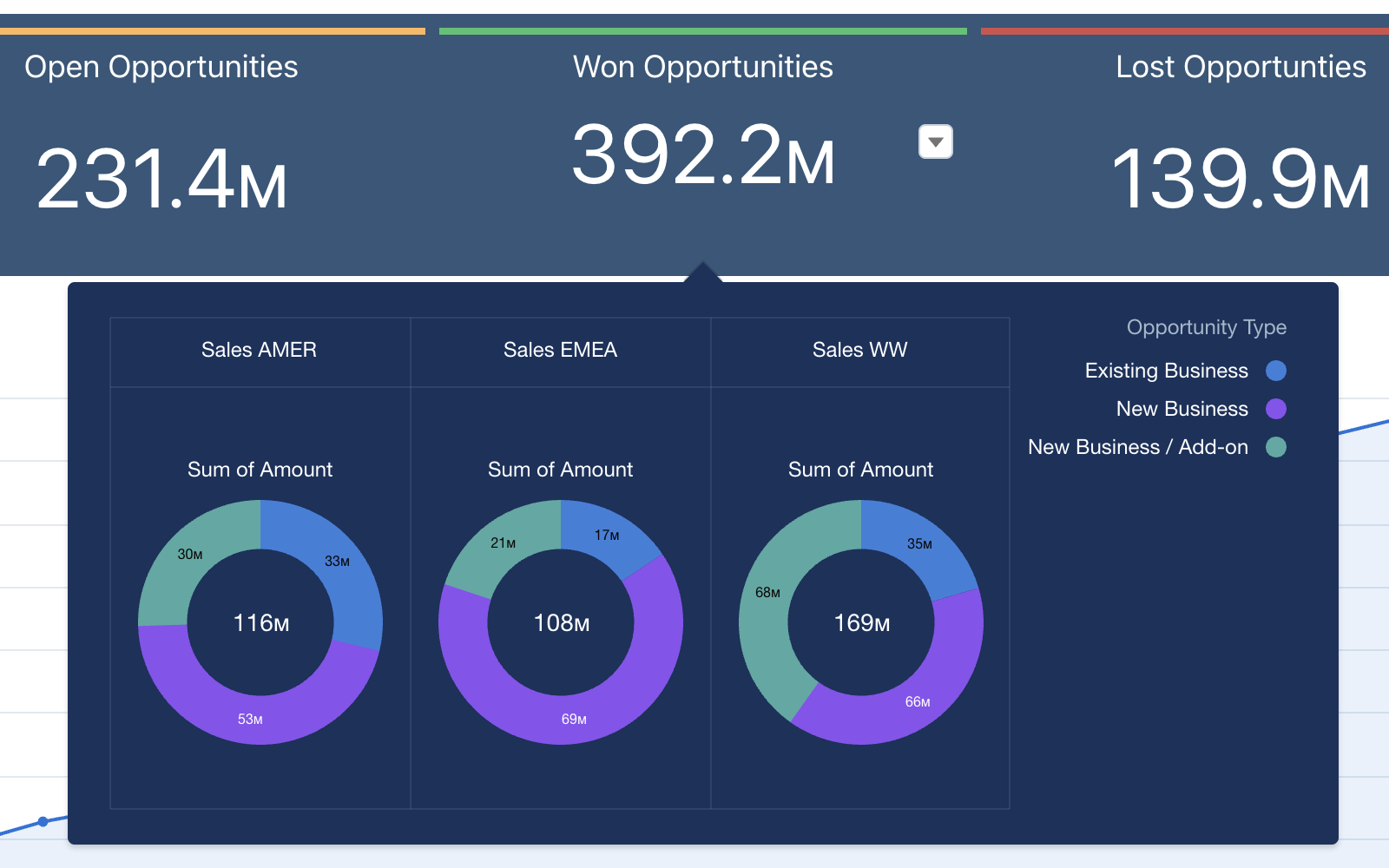
As you can share assets between pages, if one asset is updated, this change is reflected on all pages. This means you can keep multiple assets the same across pages and only change certain elements. You can then use the navigation component to move between pages. This can allow you to show different charts on the page. By changing the formatting of the navigation widget to look like a toggle, users feel like they are interacting with a chat when in fact they are navigating to another page.
Reusable Components
There are currently two types of reusable components, Lightning Web Components (LWC) and CRM Analytics components. Both allow you to create something that can be used across multiple dashboards saving time and effort. As this post is focused on no code, we will look at CRM Analytics components.
These components are dashboards that can be embedded into a dashboard. As they are a dashboard they have most of the capabilities such as pages and components. This allows you to create something that you can add to a page that does not affect the structure of the page. However, it does react the same way as other components on the page applying filters and faceting (selecting items on a chart to filter the dashboard).
As components have pages you can replicate the method described above, however, this time using multiple versions of the same chart. This type of functionality has been possible for some time using Interactions (previously known as Bindings). Bindings are incredibly useful and I would recommend learning about them. However, this alternative does not require you to edit SAQL.
Repeater widget
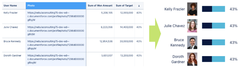
The repeater widget is one of the newer tools available. This allows you to create a single view of data that is then replicated for each row in your table. This allows each row to be represented with images, text and graphs without writing any code.
Formatting Tricks
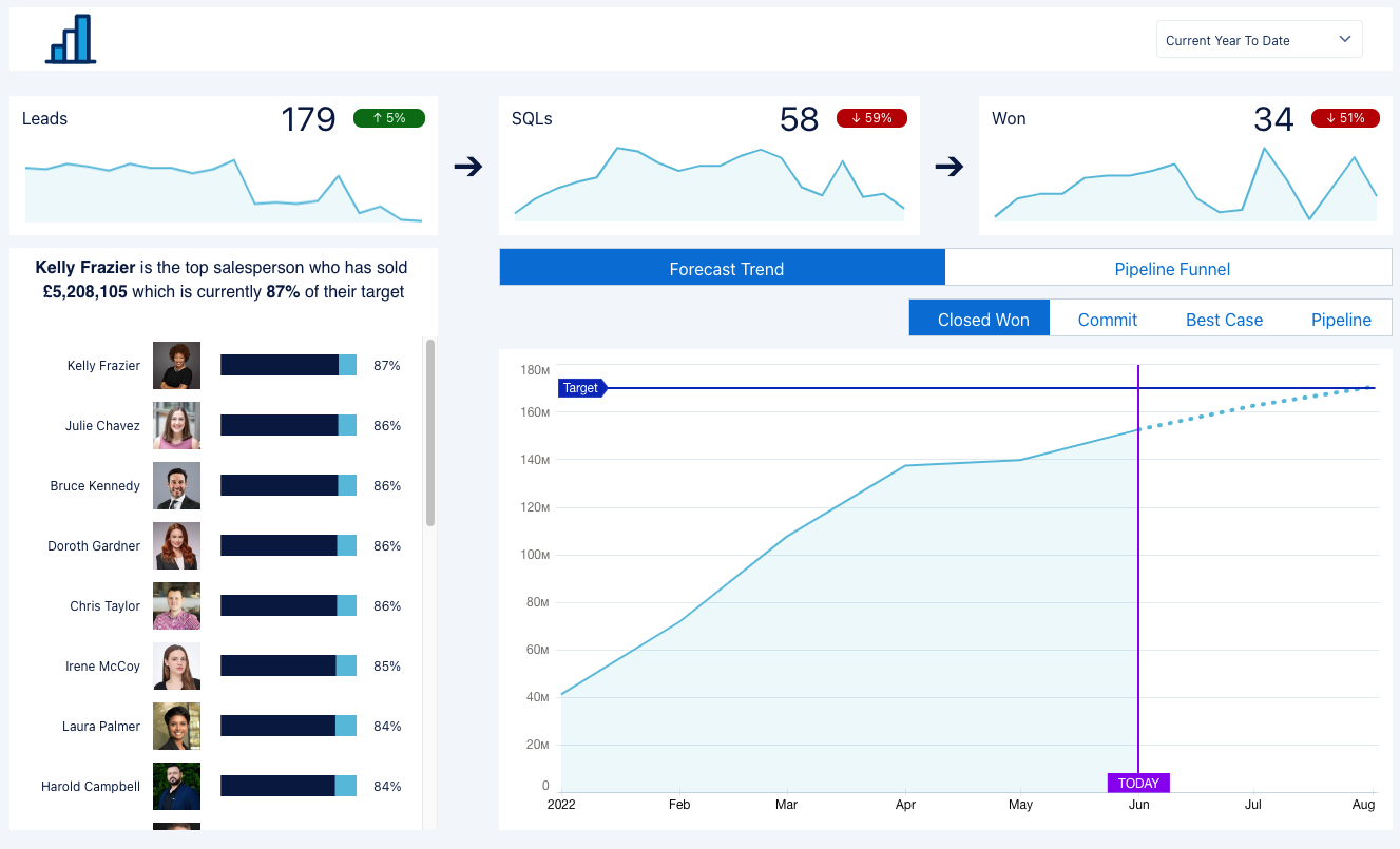
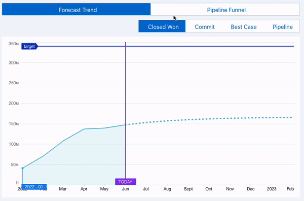
As well as components, there are other ways that you can enhance the way your metrics look. Conditional formatting is available in many places. It allows you to change the colour depending on metrics. In CRM Analytics you can change the text and background colour depending on metrics within the query. That does not have to be the metric you are using, it only has to belong to the same query. For example, you can display a number of leads and change the colour of the text based on if that is an increase or decrease from the previous month.
![]()
In addition to colours, you can also change the way numbers are displayed. This takes your visualisations to the next level. As well as being inclusive, it can add additional context. By changing the number format to ↑ #,###%; ↓ #,###%; ⮂ #,###%; a arrow represents the number as up, down or steady. By using a combination of colours and icons you can clearly indicate that down is a negative or positive thing. But why stop at icons? Why not throw emojis or text into the mix?
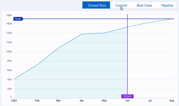
They say a picture is worth a thousand words. However, sometimes text can help convey what a graph is telling you to ensure data is being represented correctly. Text widgets can contain the results of queries. This means you can build a sentence together to tell the story. Combine this with conditional formatting and icons and you have all bases covered.
![]()
Next Steps
With many possibilities, it can be a bit overwhelming to decide where to start. That is why our certified CRM Analytics experts are on hand to support you in getting the most out of your data, whether you are new to CRM Analytics or you are looking to enhance your capabilities. So why not get in touch.