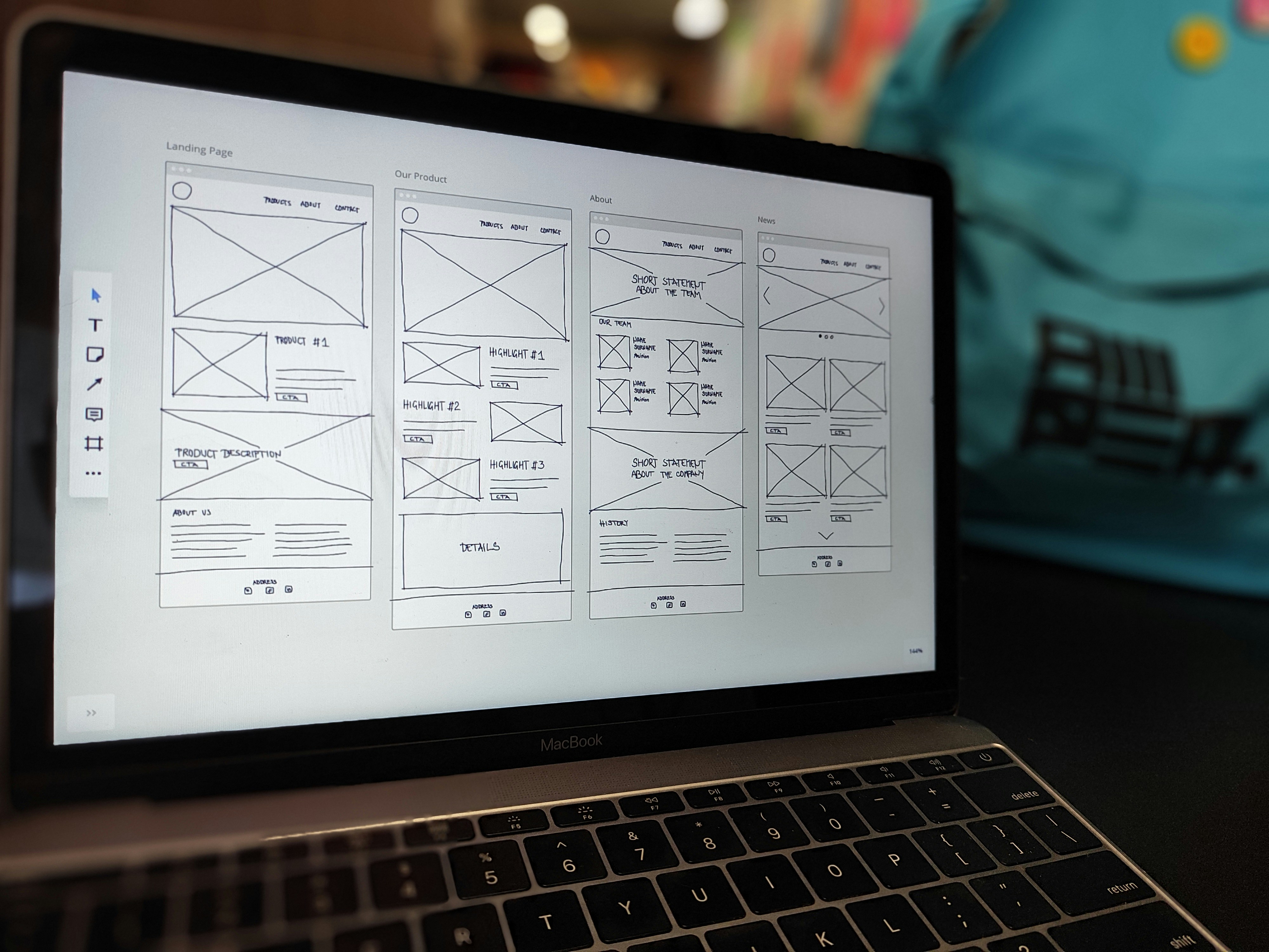
As part of our UX Guidelines series we’re going to take a deep dive into the different types of assets and their best practices. You may have already seen our previous blogs on How to improve User Experience on Forms or Build your Landing Pages with UX in mind, however we’re going to look into some specifics within these assets.
This blog takes a look at how to optimise your form fields for the best user experience. Within this topics, we will deep dive into some of the specifics.
Let’s start with…
Field label placement on forms
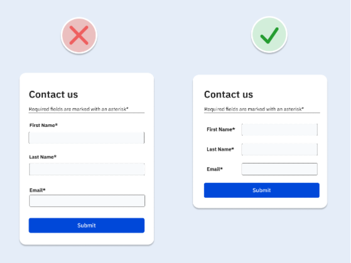
Most of the time, forms are located within a Landing Page or embedded on the website, which will often make the form appear narrow. If this is the case, it’s best to place your field labels above your fields to prevent the data entry box from becoming too narrow. It also maintains a simple and consistent downward momentum when working through the form.
Required vs optional fields and the impact on form length
If you only ask for the information you need for the relevant interaction to occur, you’re more likely to:
- Have a higher number of form completions
- Prevent prospects from making mistakes on your form
- Save time creating the form
- Save time for the prospect filling out your form
If there are many optional fields on your form, there’s a higher chance your prospect will be put off completing the form, as well as be unwilling to give you all this information.
With required fields, it’s always best to mark these clearly to manage expectations. This will also help to reduce error rates on your forms.
Match field width to the expected input
The width of a form field sets people’s expectations for the length of information required. Using a wide field width to collect a small piece of information, eg, the 3 digit CVC number on your bank cards could create confusion for the user.

Display hints and Placeholder text
Sometimes a short label isn’t enough to clearly describe the information required in a form field. There are a couple different ways you can add this information in:
- A hint or help text can be added as a description
- Tooltips – a small icon that displays description text when you hover over it
- Placeholder text – this is a useful way to show an example of the type of data that is being expected
Using tooltips and placeholder text gives you the option to declutter the interface, as hints are hidden until people hover over the icon or the example is located in the field itself.

This blog is part of our series on User Experience. You can check out the other blogs here.