Dark mode, a hot topic in the tech industry, has made its way into email marketing. But what is dark mode and how is it affecting email marketing? Read on to see the challenges emails face with dark mode, and how you can get around it.
What is it?
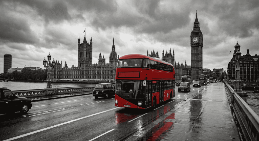
Dark mode is a feature that provides users with a darker themed interface which is more suitable for working in low light environments and at night. It’s easier on the eyes, reduces screen brightness and increases content view-ability. Check out the difference between light and dark mode below.
Three of the largest email service providers have recently designed a dark mode feature and many have begun to use it. While this can be beneficial, dark mode will change the look of your html emails by making dark colours light and light colours dark, all without your permission.
There are ways to hack dark mode, but there isn’t one specifically via CSS. We tried out a MSO conditional statement and the prefers-color-scheme media query, but found neither was working for us. You can’t ever be sure when it will or won’t work, but to ensure it always does, I would suggest to work your way around dark mode. Therefore, email marketers must learn how to optimise their messages for both light and dark themes.
Top Tips
Use transparent images – Many of the images placed in emails have a white background to match the background of the entire email. In dark mode, images with white backgrounds are immediately exposed and no longer have a seamless design. This can really affect readability and the overall design. To fix this, try using images with transparent images or full width image blocks that fit the entire width of your email. You can also get away with adding padding around the image.

Apply light shadows or a white stroke around images with black text – Images with black text end up blending in with dark mode backgrounds as it’s black on black. Email clients won’t pick this up or change it to white. A quick fix is to apply a light shadow around your text or apply a white outline around the text. This will help accommodate dark mode.
Be mindful of background colours – Many of us combine background colours with images and buttons to make our email designs look beautifully crafted. The problem with this is background colours are slightly altered in dark mode and appear with a shadowed overlay. Avoid using saturated colours that are visually vibrant against dark backgrounds. As a good rule of thumb, use of lighter tones have better readability in dark mode.
Test designs in both dark and light mode themes – Once you’ve designed your emails to suit light and dark mode, test, test and TEST again. You might not be able to find the perfect fix, but you can adapt small tricks that will help with both light and dark modes.
Designing for dark mode doesn’t have to be overwhelming or time consuming, but if you feel like you’re struggling get in touch with us today.