You have your newsletter ready to send with the perfect, appealing subject line, an outstanding design that is mobile-responsive and of course some interesting content. But do you have enough people to target?
Expanding mailing database is a common wish amongst both B2B and B2C businesses, and I believe almost everyone’s strategy involves placing a subscription form on the website, maybe as a pop-up window, a message in the notification bar or a new section in your footer area.
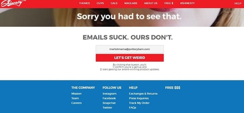
In the article below you can see 8 effective examples of email sign-up forms which might inspire you to improve your subscription strategy.
So, what exactly makes someone want to opt in to a brand email or newsletter? Here’s a look at some of the best examples of big brands enticing customers to hand over their sweet, sweet data.


