Web accessibility has gained significant traction in recent years. Over the past 12 months, here at Nebula, we have shifted our focus to reviewing and discussing accessibility.
We have documented UX (User Experience) methodology and accessibility guidelines to improve accessibility across the business. This guide includes anything from ensuring alt text is included on an image to colour blindness accessibility. We have been incorporating this approach more actively into how we work.
With the freedom to experiment in our downtime, we find that some of our internal developments end up being adopted by our customers. Some developments also come from actively working with our customers to alleviate obstacles and pain points.
Recently we had a customer who wanted to add some additional fields to their forms. One field in particular they wanted to add was a country field, but something more custom and not revolving around a prospect scrolling through a long list of country values, but still using the default Marketing Cloud Account Engagement country field. This ended in a larger discussion into the layout and functionality of this country field. This led to some development on our side to investigate what could be done.
This collaborative approach steered us to building a solution that we’re proud of from both a UX and functional viewpoint, but also something that the customer was very pleased with. The result was using the default Marketing Cloud Account Engagement country field, but transforming it into a text entry field that returns countries as you type based on the text entered. This solution involves CSS and JavaScript to allow for a more user-friendly and time-saving experience.
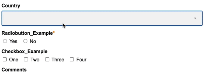
Below you can see comparisons of the standard country field behaviour and the custom solution we developed.
Standard Default Country Field
Custom Default Country Field
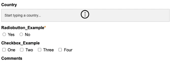
As you can see the standard dropdown field (as most readers may be aware) displays a long list of country values that you scroll through. Compared to our new country field that filters the results based on the text typed. Small changes like this can show long-term improvements in your form submission rates and quality of data.
Additionally, it prevents passing any invalid or bad data through to the country field. To do this, we have included Javascript that prevents users from submitting anything that doesn’t match one of the values listed in the backend. This puts a hard stop on a text field passing bad data through. Think of it as a combination of a text and a dropdown field.
What are the benefits of implementing this solution compared to the default functionality?
- More user friendly than the standard dropdown function
- Save your users time on form submissions and increase form completion rates
- Reduce form submission errors
- Reduce false prospect values based on quick clicks
- Customise the styling of the filtered results
- No custom field is needed; this is all done with the default country field!
At Nebula, we are constantly looking for new ways to delight not only our customers but also the users themselves who engage with our customers’ brands. Striving for UX improvements that solve real business needs. This customer centric solution was a collaborative effort between our customers, consultants, UX champions and developers.
If you would like to explore ways in which you could revamp and improve your user experiences or form data capture, get in touch!