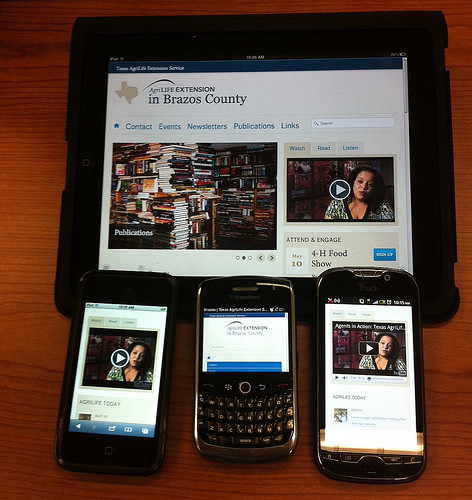
“It looks weird on my iPhone”
I have to scroll sideways to read the text on my tablet”
Is it responsive?”
In the good old days of Visualforce, questions and comments like that never used to arise. We’d write custom pages to work on desktop, and that was the end of it. Most of those pages were for internal users, sitting at their desks.
Now, with Customer Communities on the rise, and large parts of the web doing responsive design well, it’s expected that the custom Salesforce pages we write will do the same.12 months ago, we might have used a framework like Bootstrap to get our designs right. Now, we have that ability directly in Lightning – either by including the Lightning Design System CSS in our Visualforce pages, or by using new Lightning Components in a Lightning application.
Now, the standard parts of the UI are already playing the game – adapting themselves to mobile or desktop. And the design elements in the linked article get us to write responsive components as a matter of course, with little effort.
So, hopefully, it will all look great on your iPhone.
The Lightning Design System grid, based on Flexbox, provides a flexible, mobile-first, device-agnostic scaffolding system.

