Creating an intuitive and organised interface is essential for a positive user experience. One effective approach is to break down information into smaller, related groups. This blog will go into detail about some practical methods to achieve this.
Grouping Related Elements
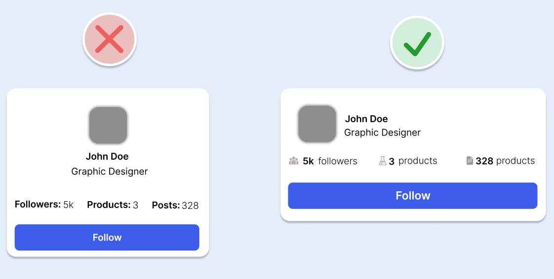
Use Containers
- Place related elements within the same container to visually group them together.
- Utilise borders, shadows, and background colours to define these containers.
Proximity
- Arrange related elements close together.
- Separate unrelated elements with more space.
Visual Similarity
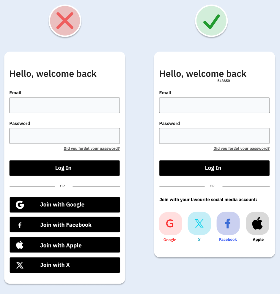
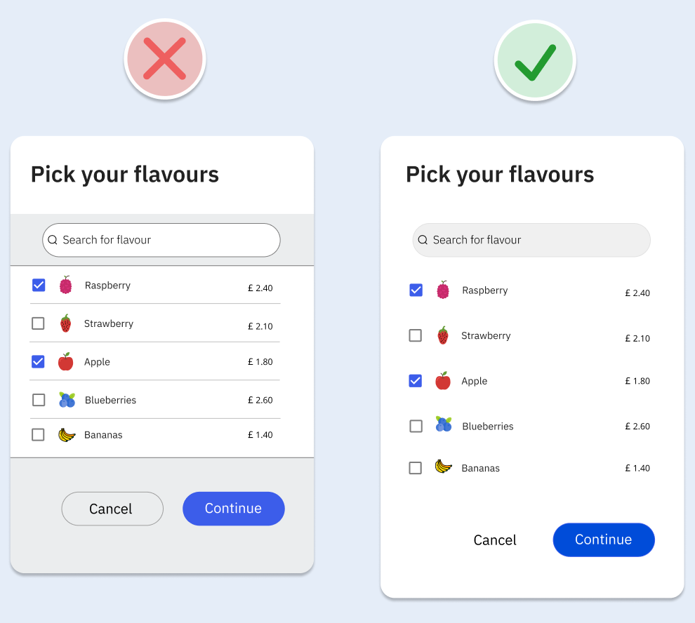
- Make related elements look similar through consistent use of size, shape, and colour.
- Ensure similar-looking elements have similar functions, while different functions should look distinct.
Alignment and Continuity
- Align related elements in a continuous line.
- Use continuity to indicate groupings and disrupt it to signal the end of a group or to highlight a particular element.
Combining these methods will help display groupings more clearly and create a more organised interface.
Establishing a Clear Visual Hierarchy
Not all elements in an interface are equally important. Creating a clear visual hierarchy can guide users’ attention to the most crucial parts. Here’s how to do it:
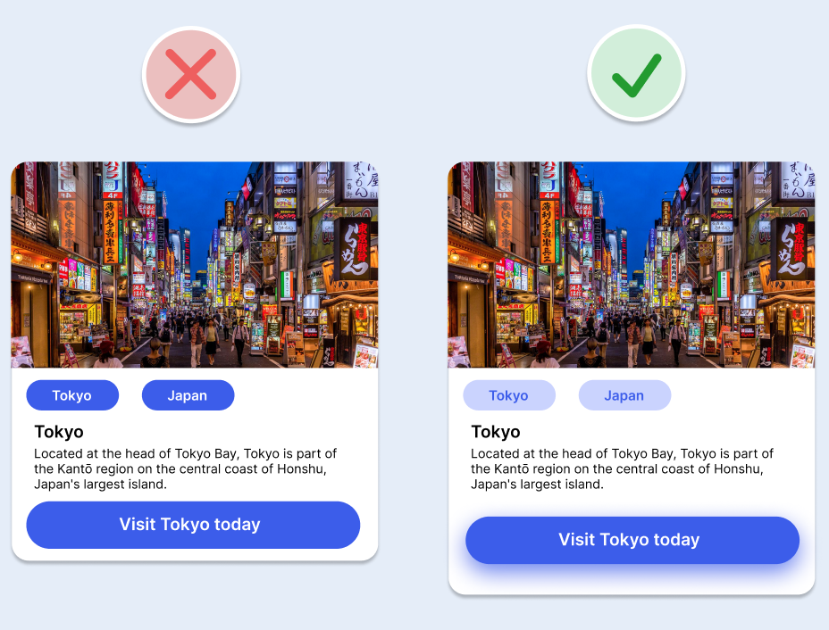
- Size
-
- Larger elements draw more attention and appear more important.
- Colour
-
- Use brighter, richer, warmer, or higher contrast colours to highlight important elements.
- Spacing
-
- Surround important elements with more space to make them stand out.
- Position
-
- Place important elements towards the top of the interface or at the beginning of a sequence.
- Depth
-
-
- Elevate important elements using shadows to make them appear closer and more prominent.
-
Using pre-defined shadows can help create different levels of elevation, enhancing the visual hierarchy.
Utilising Space Effectively
- Proximity-Based Spacing
-
- Group closely related elements together and separate unrelated ones with more space. This method effectively organises information into smaller, manageable groups.
- Generous Use of White Space
-
- White space, which can be padding, margins, or the space between lines of text, helps elements breathe and improves readability. It doesn’t have to be white—it can be any colour, pattern, or image.
Keeping Related Actions Close
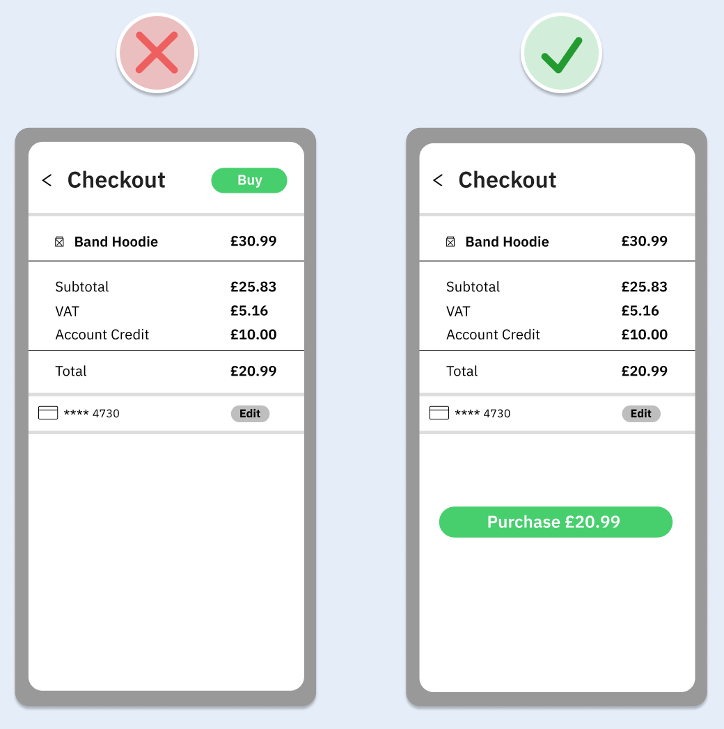
Fitts’s Law states that the closer and larger a target, the quicker it is for users to navigate and select it. Here’s how to apply this principle:
- Proximity of Actions
-
- Keep actions close to the elements they relate to. For example, in a Google Doc, the reply button is right next to the comment it relates to, reducing interaction cost.
- Size of Targets
-
- Ensure action buttons are large enough to be easily clickable. In online shopping, a prominent and easily accessible pay button can increase the likelihood of a purchase.
By keeping related actions close and making targets larger, you enhance your interface’s user experience and efficiency.
By implementing these strategies, you can create a well-structured and user-friendly interface that guides users intuitively and enhances their overall experience.
This blog is part of our series on User Experience. You can check out the other blogs here.