
In UX design, every element, including colours, plays a crucial role in shaping the users’ interactions and perceptions. Colours have the power to evoke emotions, convey messages, and guide users through digital experiences.
However, their usage should be intentional, ensuring inclusivity, accessibility, and alignment with brand identity. Let’s take a closer look at the complexities of colours in UX design and understand how you can use them effectively.
Ensuring accessibility through contrast
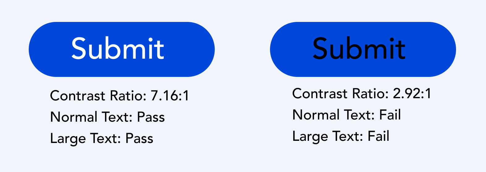
When using colours in UX design, it’s crucial to ensure there’s enough contrast. This means making sure text and elements stand out clearly against their background, especially for people with vision impairments. Guidelines recommend specific contrast ratios, of at least 4.5:1 for standard text readability. Different elements like icons and large text have their own contrast requirements. For example, close icons contrast is more than 3:1 and placeholder text is more than 4.5:1 to be easy to see. So make sure you always use a colour contrast checker tool to identify and fix low colour contrasts on your assets.
Using colours to indicate status
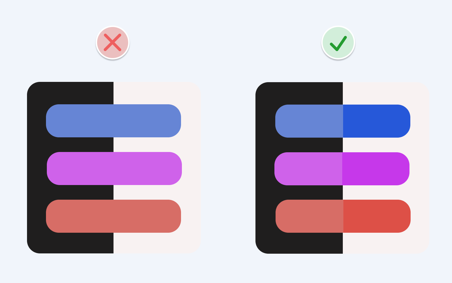
Colours can serve as powerful indicators of status within an interface. For example, red might mean there’s an error, while green means something went well. However, relying only on colours can be tricky for colour-blind users. So make sure you also use symbols or text to make sure everyone understands (example below).
Establishing visual hierarchy
Colours play an important role in defining the visual hierarchy of an interface. By strategically applying colours to elements based on their importance, you can guide users’ attention and streamline navigation. Bright colours naturally draw more attention and are ideal for highlighting critical information. While muted colours can be used for less prominent elements to maintain balance and visual harmony. We recommend you start designing in black and white to focus on the layout, spacing, and contrast before adding colour.
Use bright colours to attract attention, “action colours” (like blue or green) to interest the user’s attention and for the text make sure there is enoght contrast with the background. 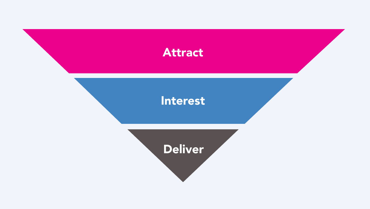
Incorporating brand colours
Brand colours are a reflection of your organisation’s identity and personality. When using brand colours, it’s essential to consider their meaning and impact. Follow accessibility rules and use the most visible brand colour for interactive parts to help keep things clear. Use other brand colours sparingly for decoration to keep things interesting without confusing your users.
Thinking about dark mode
With the growing popularity of dark mode interfaces, you need to consider colour selections that accommodate both light and dark themes. Implement specific HTML/CSS code for dark mode to ensure a seamless user experience across various devices and preferences. Make two colour palettes and use desaturated colours for the dark theme and vibrant tones for the light one. Although this may increase design and development time, thorough testing and optimisation are essential to uphold accessibility and usability standards.
In conclusion, colours are integral components of UX design, they influence user perceptions, interactions, and emotions. By prioritising accessibility, establishing visual hierarchy, and thoughtfully incorporating brand colours, you can create immersive and inclusive digital experiences that resonate with all your users.
This blog is part of our series on User Experience. You can check out the other blogs here.