One of the biggest things that you notice when you move across to Lightning are the differences to Lightning Pages. When Lightning came out, it arrived with the Lightning App Builder. This powerful tool took page layouts to the next level. Giving you the flexibility to update anything on the page, display it in different formats and remove things you don’t use.
Why should I update my Lightning pages?
With Salesforce classic, each page had the same format, and without using other tools or writing code, you had no way of changing this.
Lightning pages are designed to work with components. These little reusable blocks can be moved around the page, giving you a lot more flexibility. This gives you the ability to put the most used and essential things front and centre while keeping things that are rarely used to other areas, so that they are still available, but don’t get in the way.
What can I add to a page?
Lightning pages can be made up of standard components, components you have downloaded from the AppExchange and components you have built yourself. These are dragged onto the page layout and customised.
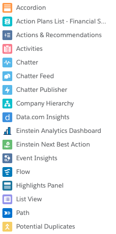
The range of components available includes basic requirements such as the record details, activity timeline and related lists. You also have components such as tabs and accordion that give you different options for displaying data, so you can hide data to make the page cleaner and easier to use.
My favourite features of Lightning Pages
Templates
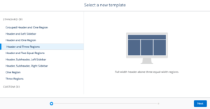
Out of the box, most pages come with a header and right sidebar. However, there are nine templates you can choose from, and if you are feeling adventurous, you can even build your own templates.
Templates give you power over how data is displayed; for example, you can have 3 columns to try and keep most of the content of the page on the screen without scrolling.
Report Charts
Although not new (you could add 2 charts to a classic page). You can add multiple report charts to a page layout. This means that you can have various ways of looking at the records data without going to a report or dashboard.
Flow screens
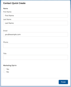
Flows are powerful processes that can perform multiple actions or multiple records at once all without writing any code. The flow screen component lets you add your creations to a records page. My favourite use of these is quick creation screens such as creating a contact or opportunity from an account page.
Getting started
Lightning pages are powerful and can significantly increase user productivity. Not sure where to start? Take a look at the Lightning App Builder and Quick Start: Lightning App Builder modules on Trailhead. Otherwise, get in touch with us here and we’ll be happy to help!

