Knowing the difference between a button and a link is a fundamental skill that can make or break a user’s journey.
While they may seem interchangeable, these two elements have distinct purposes that, when used correctly, create a seamless and intuitive interface. This blog will walk you through the key distinctions between buttons and links, helping you understand when to use each and why these small details have a big impact on usability and accessibility.
Before we get into the buttons and hyperlinks individually, here’s a breakdown of when you should use which:
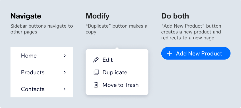
- Links take the user to a new location, such as a new web page or a new section of the current page.
- Buttons trigger an action, such as showing content on the page that was previously hidden, playing a video, or submitting a form.
This distinction matters because it affects user expectations. If a screen reader announces an element as a “link” or “button,” users have expectations about what will happen when they click that element. If something else happens, this can be disorienting.
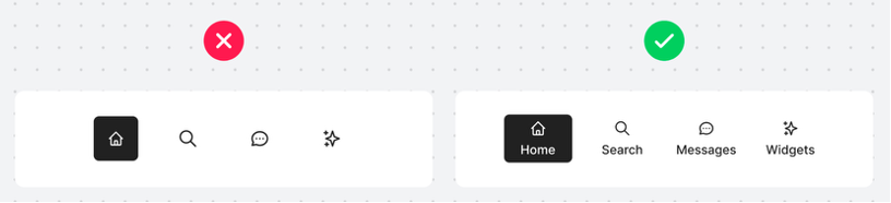
Buttons
Buttons should be located near the copy or image they are referring to, as this will prevent confusion regarding what the button does or where it will take you. Having too many buttons on one page can be overwhelming and negatively affect the user journey.
Be mindful of your buttons, creating pop-ups that include buttons to a second pop-up notification, doubling up on pop-ups can be confusing and frustrating for the user.
Often, there are a couple of different types of buttons in use, for different sections or elements of the webpage. With each button it’s important to make its purpose clear. Once the purpose is clear, keep it consistent with the design so users can progress through the journey easily. For example: the primary button design should be used for the most important actions and the secondary button design for the less important actions. Be consistent with your button shapes too.
Positioning the button is key. Whether that’s to impact the click-through rates of an email or to accept/cancel an action. With assets, it ensures the call to action button appears before the fold in an email. With websites or app notifications, it’s important to think about what buttons the user will expect to see on the left and what buttons they expect to see on the right-hand side. A standard user expects to see buttons on the right-hand side to continue through the flow.
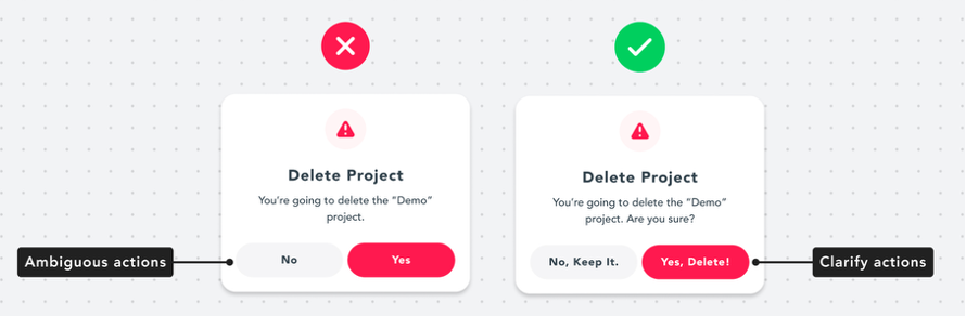
Button labels are another important element to consider. As with any labels on form fields, button labels should be clear and concise.
As with any design element, consider the readability of the button, the colour contrast of the button and the size of the button on all devices. The buttons need to be big enough to click on using your thumb when designing for mobile interfaces.
Links
When referring to links, this is a hyperlinked word or image as opposed to a hyperlinked button as this was discussed in the above section.
Hyperlinking words within the body copy of emails, blogs, web pages etc. needs to be obvious as links to users when scanning through the text. Ways to do this are often underlining links, changing the colour and making the words bold to stand out more. Users are used to seeing hyperlinked words with an underline or different colour word within the text, so ensure these changes are only used for links to prevent confusion. When choosing the hyperlink colour, you will need to consider how this appears on mobile devices and smaller screens.
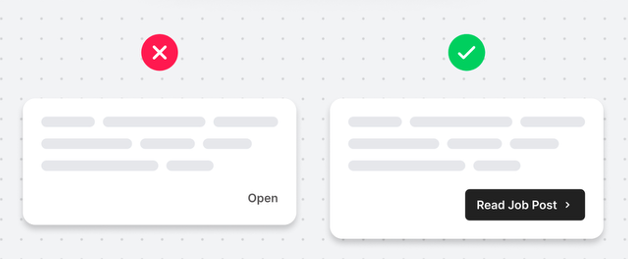
Links need to describe their destination but also make sense without any surrounding sentences or content. Things to bear in mind when writing link text:
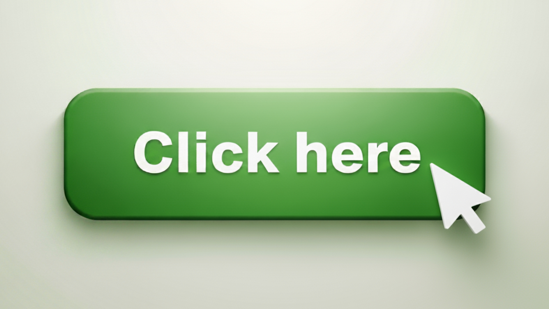
- Avoid link text like “Click Here”, “More”, and “Read More”. These kinds of links can be confusing when a screen reader reads them out of context.
- Use unique link text where possible. Speech recognition software users may have a bad experience with duplicated link text.
- It is OK to link a full sentence, but avoid hyperlinking text that’s longer than a sentence.
- Use judgment when linking full URLs. When linking a URL, consider users who must speak it out loud and who must listen to a screen reader announce it.
This blog is part of our series on User Experience. You can check out the other blogs here.