When it comes to forms, a high submission rate is every marketer’s dream. However, quite often we face bad user experience on forms, which can even prevent the submission itself. Lucky for us, there are plenty of ways to make Account Engagement forms more user-friendly – read on for my top 3 picks.
1. Placeholders on Fields
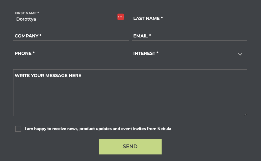
Placeholders are a popular tool to implement when it comes to form fields. Whether it is coming from the field label or description, its main purpose is to reduce the occupied space on the form. In addition, it’s also used to showcase examples of what format of data is expected.
Even though they are created with good reasons, research shows they can actually cause user issues and overall confusion. That can then have the opposite result these placeholders were created for – lower conversion rates than before.
However, with all good things in UX, there’s usually a middle ground. Field labels can be shown as a placeholder only until users start typing, then it’s shown on top of the input. That way, users will still know what that information is for, and what fields still need to be filled in. On the other hand, the used space on the form stays shorter and the design stays intact. Everyone wins!

This solution requires support from your development team – or we can help with the implementation.
2. Specify the Error Message
One of the most tiresome experiences with forms is when you click on the Submit button, and then see lots of error messages coming up. Even though sometimes it is simply a user error, there are ways to make the ‘error experience’ better.
Personally, I think the best way is to be transparent on which fields are required and highlight if you need the information in a specific data format.
For example, with the Email field, you can choose to only accept emails with valid mail servers or non-free email providers. Mention that in the field description or detailed in the error message, like in the example below.

You can configure all of these for every field within the Form Editor, right on the ‘Advanced’ tab.
3. Skip to Form
Whether your form is on your website or part of a landing page, it should be easily accessible to gain a lot of submissions. If it is not at the top of the page, include an anchor link that takes the user to the form directly. Even that few seconds can improve user experience and therefore your submission rate.
Anchor links can be implemented easily. Let’s look at a simple link:
1. Add an id tag to the section that holds your form:
2. Reference that in the link in the following format:
Find more information on Anchor links on HTML.com.
What’s Next?
I hope you feel inspired to make some changes and improve user experience on forms in Account Engagement. But I know how challenging changes can be, so I’d recommend picking only one solution and running a multivariate test on your forms or landing pages. Even though you can have multiple variates included remember to only test one thing – otherwise, your test results will be inconclusive. If you see the solution works and you have more submissions, enrol it on all of your assets!
Do you want to see all three solutions on a live example? Head to our Contact Us page and see how we implemented them to improve the user experience for our customers. If you would like our help with forms or Account Engagement, submit your details and we will be in touch.

